In a world where a brand’s digital footprint is just as important as the in-person impression it makes, great web design is a must-have. Web design is extremely complex and truly an art form in itself. There are many important aspects to consider when designing a website like functionality, usability and aesthetics. Prioritizing one of these aspects can sometimes mean limiting yourself to certain types of design.
But what if one form of design did all of the above? Picture a singular design solution that makes a website more functional, engages the user and just looks good. The answer: website illustration.
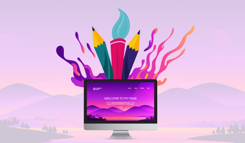
People are tired of website designs that overload them with too much copy. They’re also bored with stock photos and overly photoshopped images. In contrast to these, illustrations are a breath of fresh air.
Here, we’ll review all things website illustrations, from finding the right style for your website, identifying several success stories and showing how illustration can be used as a creative means of storytelling. Remember: great branding starts with showing, not telling—and illustrations do just that.
Table of contents
—
- Finding the right illustration style for your website
- Flat and semi-flat illustrations
- Textures and gradients
- Outline illustrations
- Navigation through illustration
Finding the right website illustration design style for your website
—
Just like there are many different styles of painting or sculpting, there are several different art styles that work well for websites. Website illustrations can be bold and courageous, playful and punchy or simple and straightforward. It’s all about what brings out your brand essence best.
So let’s start there. Begin by understanding what branding is and how to build your brand identity. Once you’re confident in who you are as a brand, you’ll have an easier time narrowing down your ideal website illustration design style.
Cartoon-like illustrations are a great choice if your brand has a fun, easygoing attitude. Sharp, angular illustrations give your brand a cool, modern look. Whatever route you take, illustrations help your website stand out from all its competitors who are using the same photos and graphics.
And just like fonts and colors, illustrations enable you to build up your overall brand persona. Sticking with one illustration style everywhere your brand appears on the web helps you maintain a singular voice, and it’s a very effective way of showing visitors who you are from the moment they click onto your site.
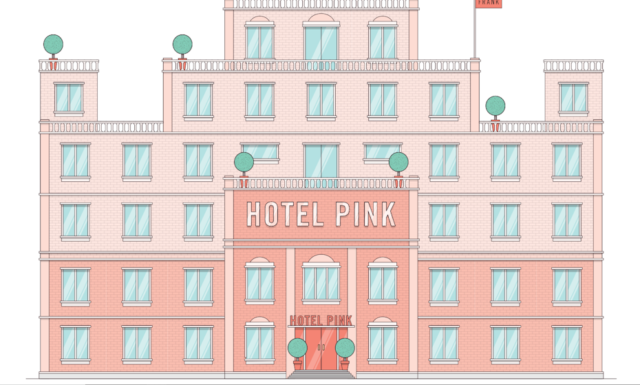

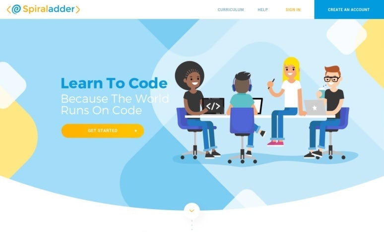
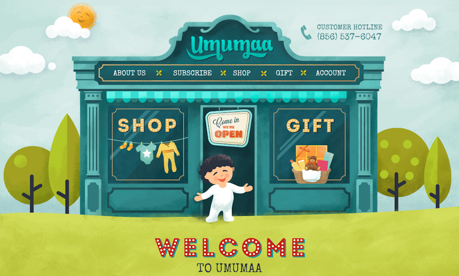
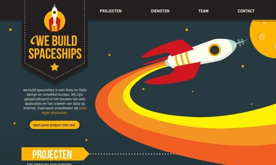

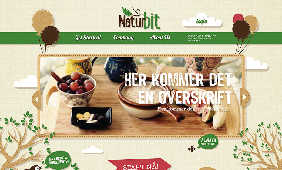

Flat and semi-flat website illustration examples
—
Some of the greatest website illustration designs are the simplest ones, and often, they’re rendered in a flat design style. This style works well for depicting human life, animals, characters and objects.
Flat artwork offers a classic, approachable way to incorporate illustrations into web design, as it all happens on one visual level. Flat design refers to a two-dimensional image that lacks gradients and shading. Even the edges and corners are typically the same shade as the rest of the illustration, emphasizing the two-dimensional effect. Semi-flat design incorporates more elements of gradients, highlights and shading without taking the illustration to a full-on three-dimensional level.
Flat illustrations can be playful or sophisticated, depending on the voice of the brand using them. This style translates well with a cohesive color palette throughout the page design (the semi-flat illustrations on Guarantee Quote, for example). Additionally, flat illustrations can easily take on the form of playful, cartoon-like, recognizable icons. They lend themselves well to website mascots, like the charismatic birds on the Duolingo site.
Another perk to using a flat website illustration is their adaptability. In the case of the Live & Dare website, whimsical illustrations are blended with website photography to create a multi-faceted visual design. By carefully curating the color palette and paying attention to proportions in the landing page design, the mix of photography and illustration feels balanced.


Textures and gradients in website illustration
—
Unless a brand goes all-out with flash animation, the average landing page is a very flat, static space. With website illustrations, a once-flat setting gains a sense of depth. Textures and gradients provide websites with a sense of beauty and scenery that can elevate their brands’ aesthetics to new levels.
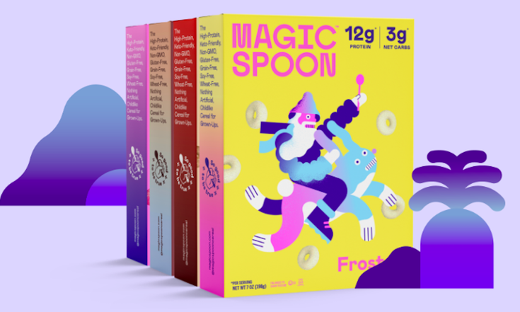
Check out Magic Spoon Cereal’s packaging and website (yes, we’re talking about gluten-free, low-carb, totally hipster cereal here). The gradients on their product information pages echo the vivid color palettes and funky illustrations on their cereal boxes. It’s a rare instance of successful website illustration design in the field of e-commerce because in this industry, we’ve become particularly accustomed to seeing product photography instead of illustrations. But when they’re done right—which means they depict the product realistically—they work. It’s important to show products realistically to make sure the customer knows what they’re buying, and there’s no reason why you can’t do that with illustrations.
For great texture, look to the Wisecube website. A galaxy-esque overlay turns the boring blue background into a stimulating visual display. There are lots of ways to create texture, like designing intricate patterns, using overlays of color or just playing around with opacity. For the viewer, texture helps the flat space come alive. And for the brand itself, texture can emphasize its unique point of view.




Outline website illustration designs
—
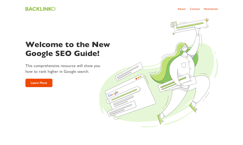
We’ve seen outline illustrations become trendy in recent years (White Claw packaging, anyone?). The popularity of adult coloring books could be the underlying cause of this trend and honestly, it’s great. Outlines feel nostalgic and charming, and when looking at these website illustration examples, they’re some of the most compelling.
The use of white space is a common feature with this illustration style. Depending on the approach, outline illustrations can be scaled down and minimalist or highly detailed. No matter what, an outline illustration has a bit of a DIY feel to it and feels personalized, yet professional. Outlines are easy on the eyes, yet highly engaging. Look to the Rocket website for a straightforward approach to outlines or Brand It Guru for a more intricate interpretation.






Navigation through illustration
—
The term “navigation” applies to web design in two different ways.
First, it can refer to the navigation menu itself. Navigation is the core of any well-designed website, and illustrations can make navigation engaging and clear. Look to GiftRocket for a striking example of an unexpected, illustration-based navigation menu where each product category is represented by an illustration.
Second, navigation also describes the way in which the user explores and visualizes the website’s content. Illustrations can assist with that goal through traditional means of navigation (the menu) as well as through new, creative forms (the infographic). And in cases like Trailhead, illustration doesn’t just help the user navigate the website; it literally maps out an engaging quest.
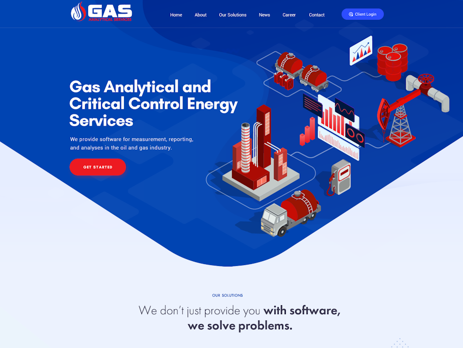
For successful use of visualization in website illustrations, check out Chrysalis. The very first thing the user sees on Chrysalis’ homepage is its chart-inspired illustration that tells the user what the brand does.
Think about classic visualization tools like flowcharts. Website illustrations are great visualization tools and beyond that, an effective way to connect with your audience. Plus, they’re often more mobile-friendly than photos. Keep that in mind when you’re designing the mobile version of your site.



Show and tell your story with website illustration
—
From brand voice through illustration to various illustration styles, there are a lot of ways website illustrations foster engagement, guide users through websites and combine the need for functionality, usability and aesthetics. If you’ve already built your website, think about ways you can use illustrations like the website illustration examples here to make your site the best it can be. And if you’re starting from scratch, consider a dynamic, illustration-based website.
Not sure where to start? Check out our global community of designers to find an illustration-focused website designer who’s perfect for your brand.
Ready to draw a ton of clicks with website illustration?
Our designers can create the perfect look for your brand.
The post 34 website illustration designs that bring brand stories to life appeared first on 99designs.
34 website illustration designs that bring brand stories to life posted first on https://www.lilpackaging.com
No comments:
Post a Comment