When they say less is more, they’re probably referring to minimalism. You might think minimalist web design is just about reducing a design, but it’s an entire mindset and attitude toward how you approach your creative work.
Think about it like this: If you’re trying to reach a mountain top, you need to be as light as possible. At the top, when it’s just you and your necessary gadgets, you’ll get the most space and the clearest view of the world. Minimalism helps you survive the journey with the fewest resources so you get the best experience.
That’s the core of minimalism.
In the web design world, minimalism is all about creating seamless user experiences without extraneous design elements that add distraction. Minimalism can make your website look smart, intelligent, modern, effortless and capable of achieving much more with less. When distraction goes down, action, engagement and conversion goes way up.
Minimalism doesn’t apply to just one aspect of your website. It means maximizing whatever you have. This article explores all of the components of minimalist web design and how to distinguish between good and bad minimalism. Read on!
The 4 essentials of minimalist web design
—
A minimal web design takes the essential design elements and builds them around a lot of white (or any single color) space. Using these elements, designers strip away layers and layers of clutter to create balance that is not only pleasing to the eye, but also delivers a message.
1. Negative space
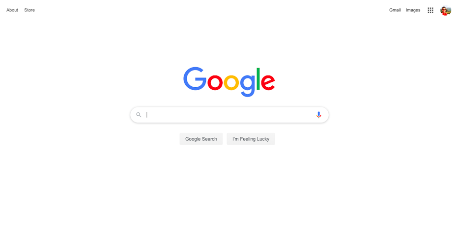
Using negative space correctly is the difference between a perfect and overwhelming design. Sometimes space is used as the background for layout elements, or it may purposefully guide attention to a specific message or call-to-action.
For example, the Google homepage is a classic example of space done right:
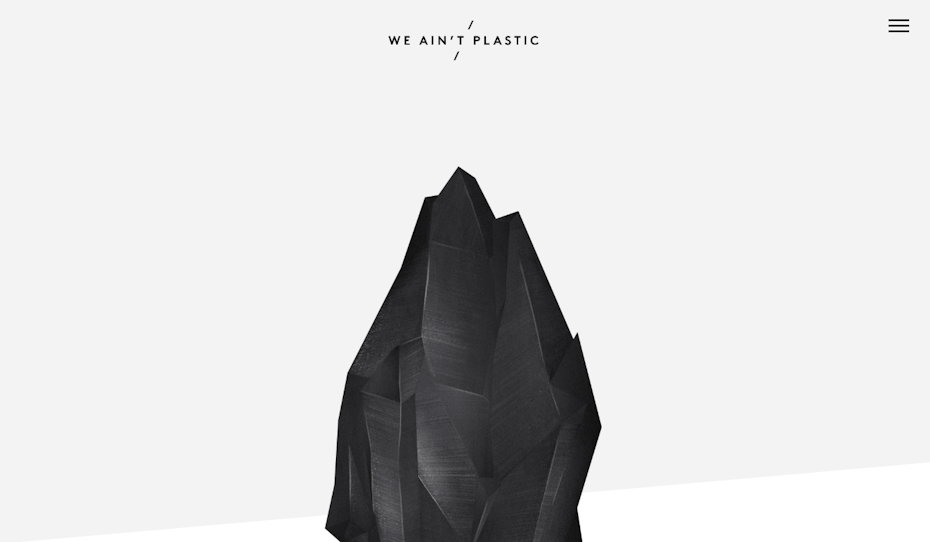
Space also helps to balance the other elements in a design so each one feels like it has its own proper place. For example, the minimalist ‘We Ain’t Plastic’ website uses a lot of space with just a single design element in the middle—simple but striking.
Beyond just creating a sense of direction and balance, space improves comprehension and readability. For instance, readers find short, separate text blocks more appealing than lengthy ones without space. Space gives users a better experience without tiring their eyes.
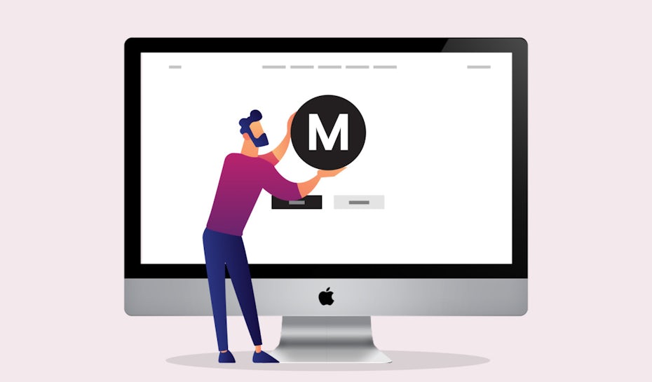
2. Visuals
Big, bold and contrasting visuals sets the stage for an effective minimalist web design. Visuals include all of the images, videos, and even typography that build a first impression of your site.
Google reported that users form their opinions about a website within 17 milliseconds. The key findings reveal that the simpler the visuals, the more they appeal to the users. In fact, first impressions created by visuals dominate usability. For minimalist websites, striking, high-quality, original visuals create that pull.
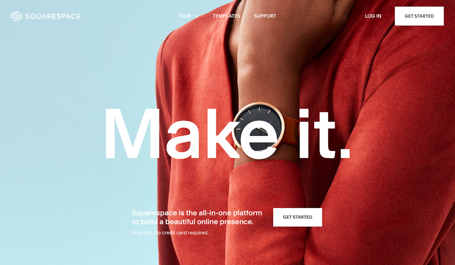
SquareSpace nails effective visuals. Here, strong visuals are the only significant design element. From text boxes to the navigation bar, everything else contrasts with the visuals to draw the users’ eyes to the neat “white” CTAs.
Unique visuals breathe life to your website design, and they can even be used in the background as white/negative space too. Use them to enhance the site’s appearance, draw focus, build accessibility and increase usability.
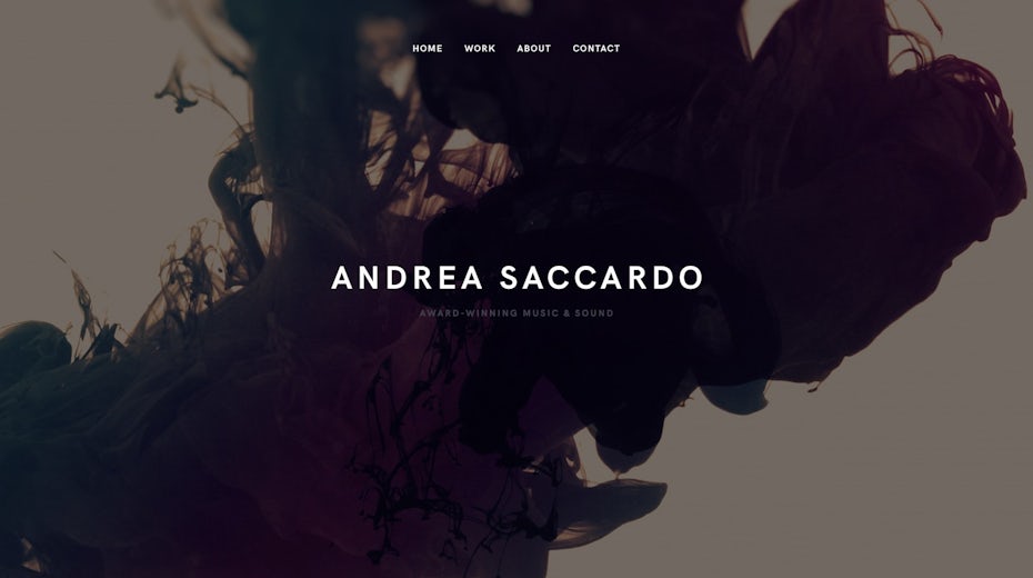
3. Typography
In minimalism, bold headline fonts paired with smaller, legible body text makes a huge impact. When users visit a website, they want to learn what it’s all about. Typography adds a layer of life and meaning to your dynamic visuals and white space.
Like all design elements, typography has a language all its own: Style, size, spacing and other attributes give every font a specific personality.

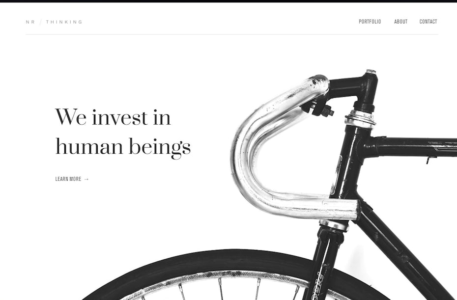
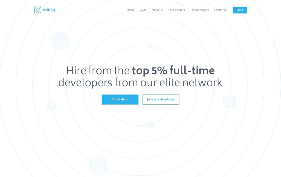
This homepage says it all in just a few words. The message and the minimalism work perfectly together. Everything’s on-point here.
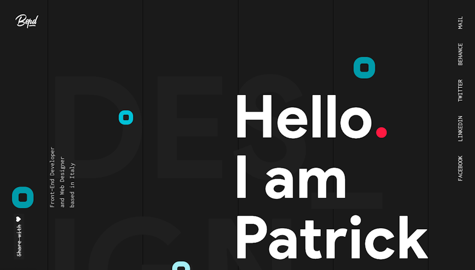
Here’s another example of how bold typography with minimal design elements can make a solid impact. This site has gone big with type and does a great job of visually expressing the designer’s creative approach.
Apart from being so attention-grabbing, great typography also makes navigation and comprehension easier. Choosing the right fonts can improve readability by creating a clear hierarchy of your messaging, which helps the user enjoy their experience.
4. Colors
Minimalist web design employs a wide spectrum of colors—from neutrals and pastels to primaries and neons—which connects all the design elements together to create a seamless visual experience. Color also evokes emotion and helps both your design and copy engage with users on a deeper, visceral level.
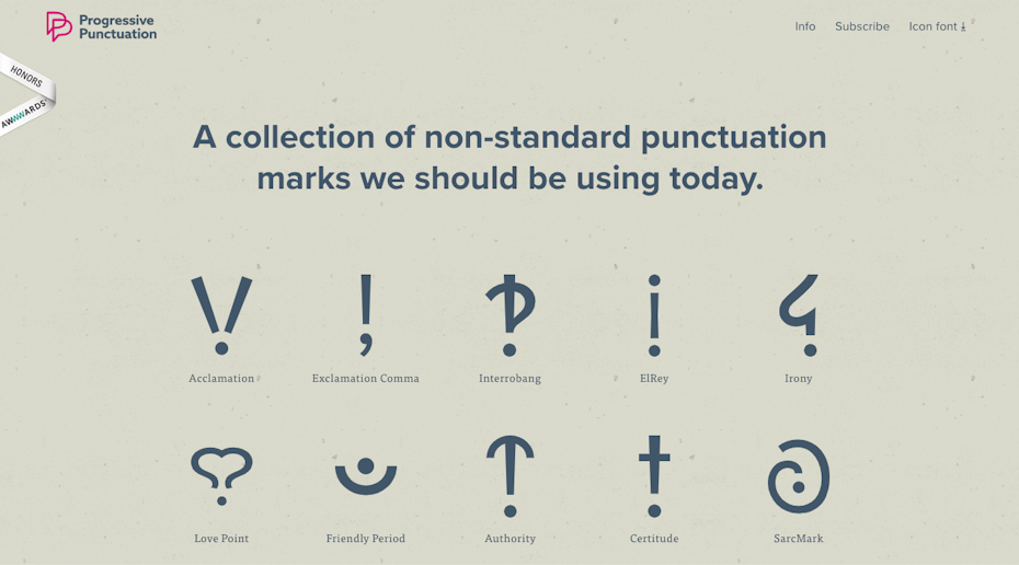
Set against a textured sandy background, Progressive Punctuation creates an ideal minimalistic color combo with deep Prussian blue. The dark text contrasts with the neutral background, which guides the user to the important elements on the site.
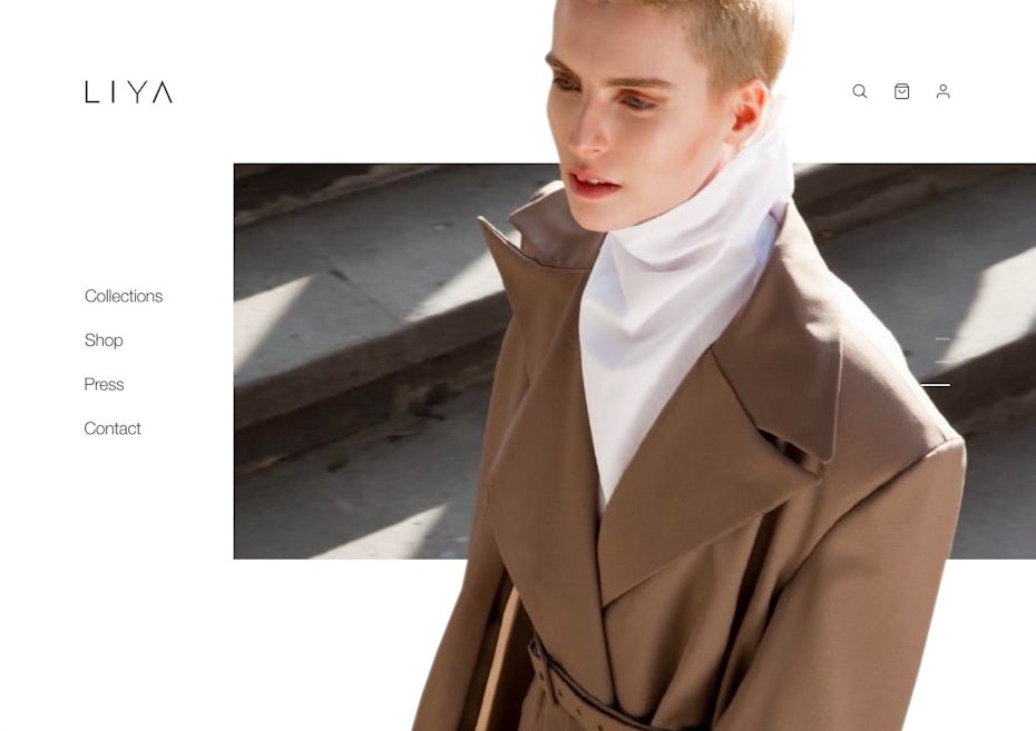
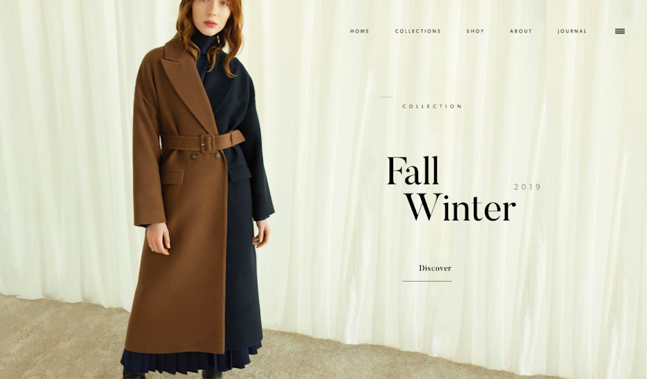
BOUGUESSA makes a modish statement with a neutral color scheme: a model in rich brown and black paired with subtle, cream curtains delivers a sense of fashion and elegance.
In both examples, the color scheme creates a pleasing and inviting user-experience. Subconsciously, users absorb the emotional vibe of the brand and connect personally with the website.
Be a minimalism master!
—
To find success with your minimalist web design, you’ll need sharp vision, an open mind, and the courage to take up the journey from clutter to no-clutter. But the final result is worth it. Minimalism strips your brand down to its essence so potential customers can meet you and engage with you with nothing in their way.
About the author
Ayesha Ambreen is a Creative Content Strategist, a Blogger and Art Director. Best known for her creative visuals and viral content ideas, Ayesha’s work has been featured on Entrepreneur.com, HubSpot, Smashing Magazine, LifeHacker, SlideShare and more. A writer by day and a reader by night, Ayesha loves to explore new realms of creativity and content through her work.
The post The 4 essentials of minimalist web design appeared first on 99designs.
The 4 essentials of minimalist web design posted first on https://www.lilpackaging.com
No comments:
Post a Comment