Real estate websites have to be designed to build trust, given that a home or property is one of the most important purchases somebody ever makes. The buyer has to trust that the real estate agency cares as much about their investment as they do. Once a website does that, it has to convert.
A website’s goals depend on the kind of company it’s for, and there are a few different strategies real estate websites use to drive conversions:
- Bringing viewers inside the listed properties and showing them around so that they’re pumped to visit it in person
- Putting a face to a firm’s name, making the viewer feel like they already know the agent or team before they first meet
- Giving viewers a crash tour of the area the real estate’s in and everything that’s awesome about it
- Using maps to show viewers exactly where listed properties are located, down to the block
Take a look at the ways successful real estate websites put these design strategies into action.
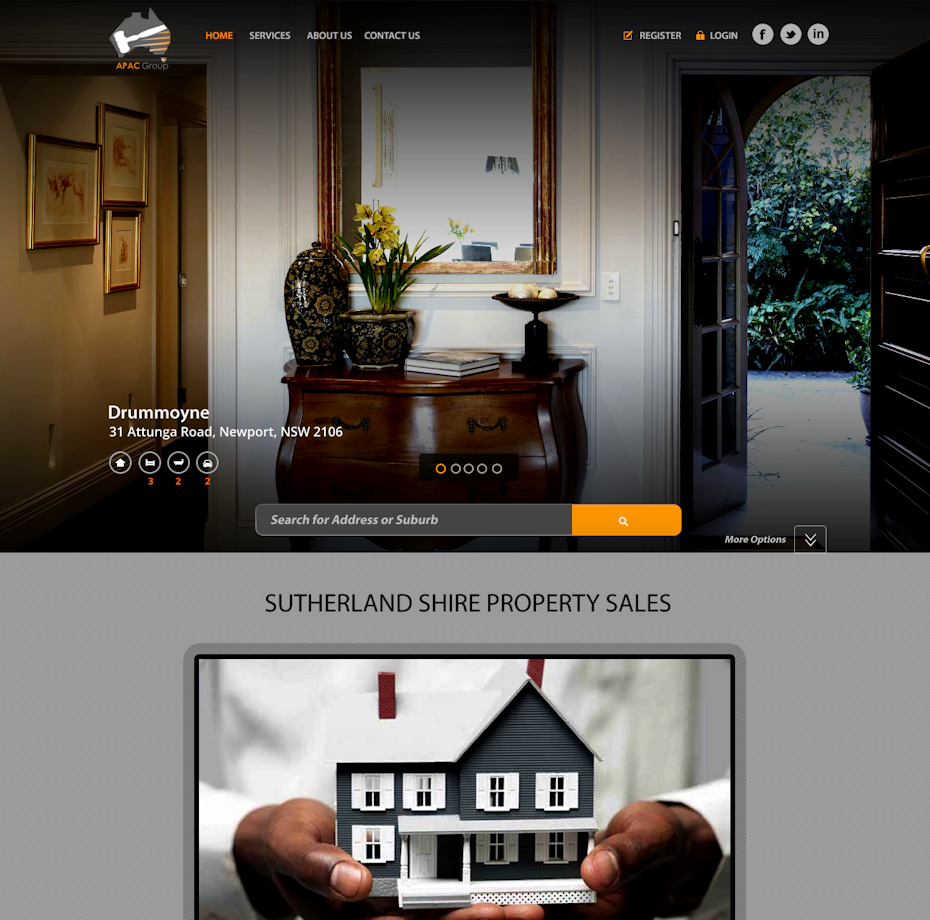
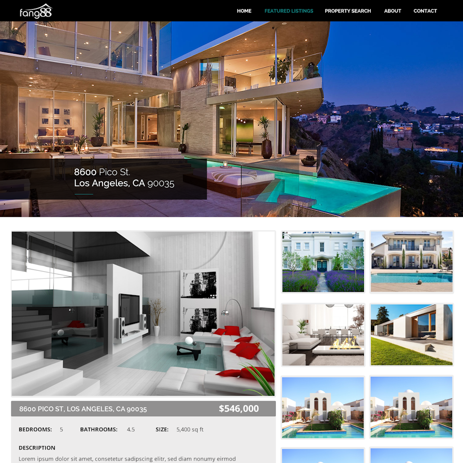
Real estate websites that bring you inside
—
Real estate agencies’ primary goal is to sell (and lease) properties. It’s a whole lot easier to get attractive properties sold and leased, and a website that highlights on beautiful spaces can make sales a cinch.
While this approach requires hiring a professional photographer, the investment is well worth it. When viewers look at spaces online, they’re imagining themselves living and working in those spaces. They’re picturing their families gathered around the dining room table for a meal lit by the crystal chandelier or their teams working together in a fun, comfortable work space that gives their brand a home.
Thus, these viewers need to see authentic, high quality photos of the place. Once you have these images, make sure other site elements like typography and color schemes are toned down so that the photos can really shine.
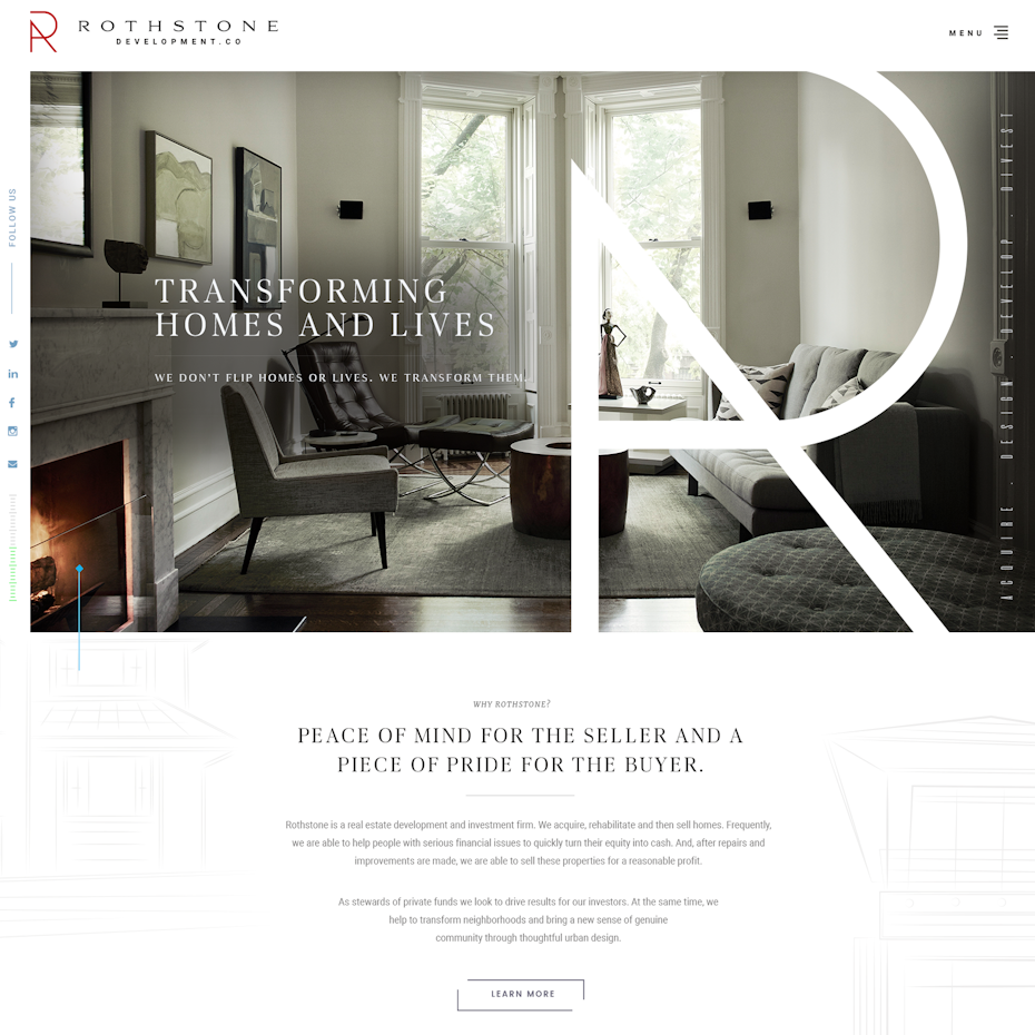
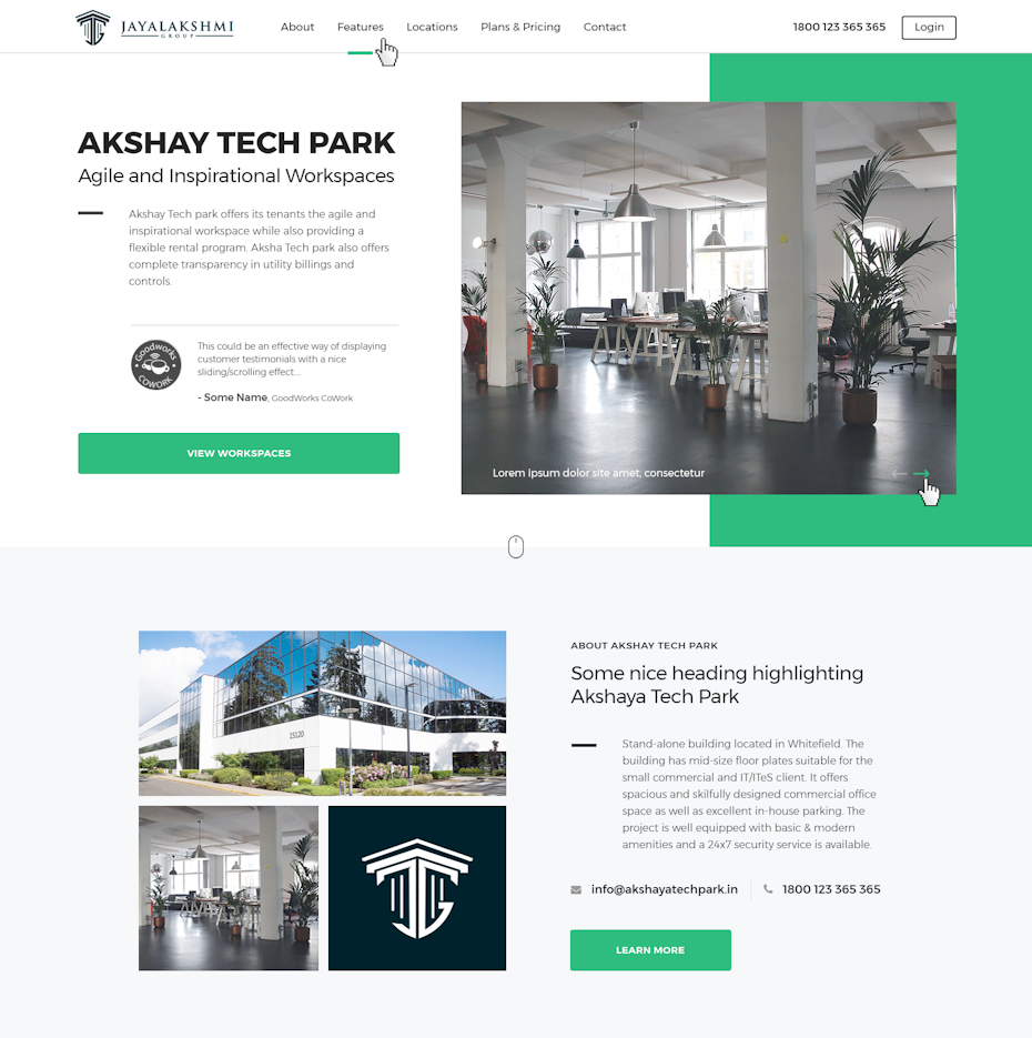
Website designs that give viewers a walk-through are perfect for real estate agencies that specialize in luxury homes and rentals. The design for Rothstone Development Co. above accomplishes this by putting the viewer inside of a home from the moment the site loads–placing the viewer right in the living room where she can take in the window view of the garden outside. The design for Jayalakshmi Group similarly takes viewers on a virtual tour with a big slider image from the point of view of having just strolled into the office.
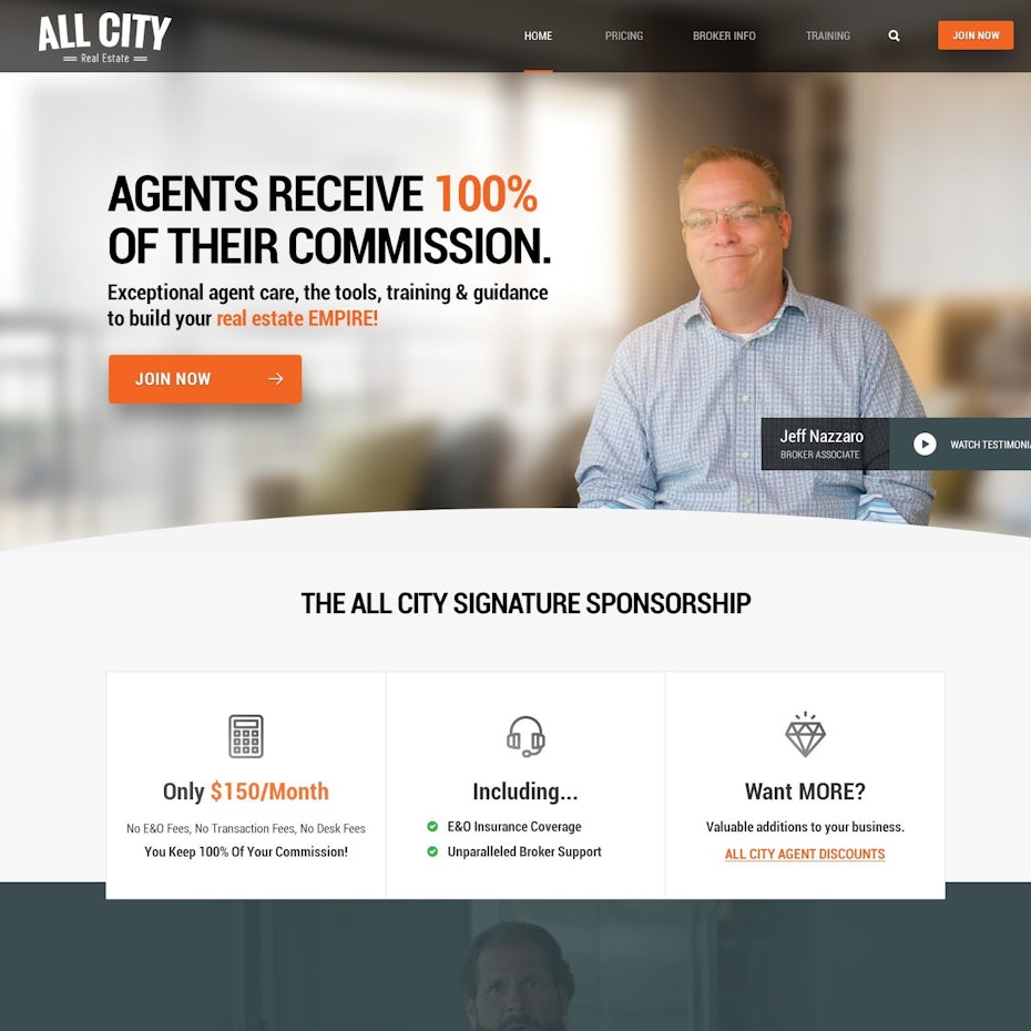
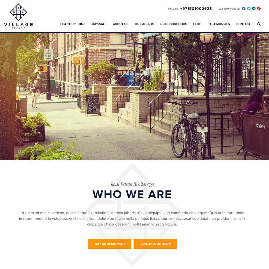
Websites that personalize real estate shopping
—
Real estate transactions can be intimidating, partially because they often feel so impersonal. You’re reduced to a bunch of numbers like your income and your credit score, and then they push a mountain of paperwork across the desk for you to sign.
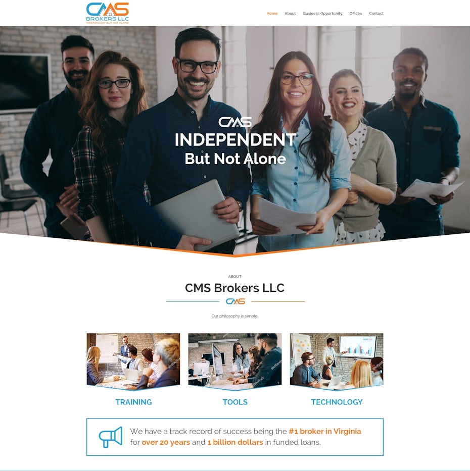

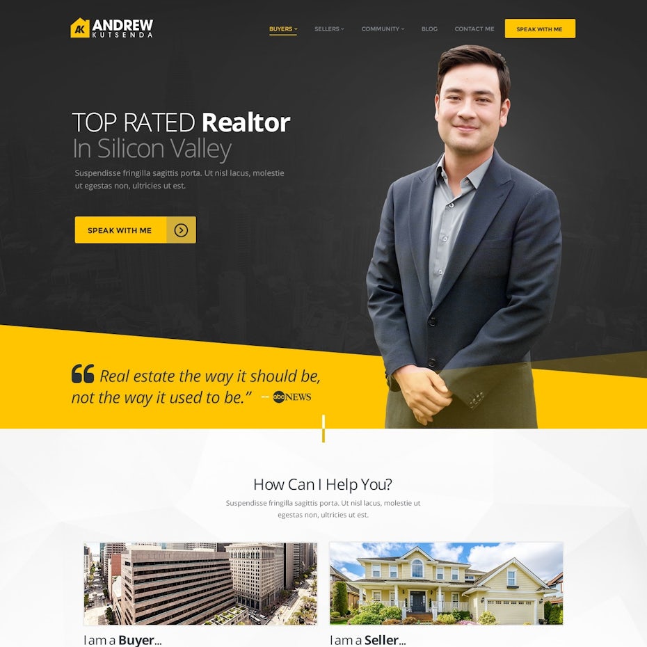
Real estate websites can cut out the intimidation factor by designing with approachability in mind. This means choosing inviting colors like the soft blue used in CMS Brokers’s website or an open-feeling, scannable layout and warm colors like those featured on Ed Ryland’s website.
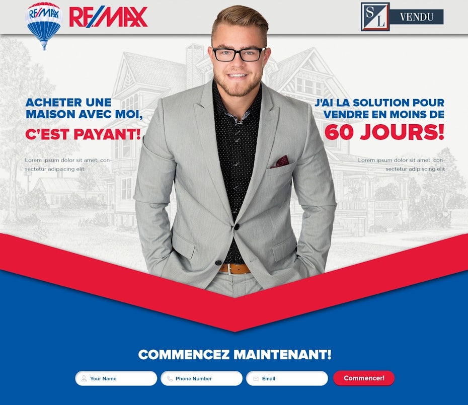
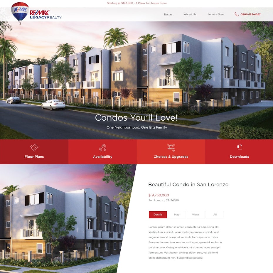
One thing all these website designs have in mind is that they give their services human faces. When you’re greeted by a warm smile, like the realtor in the ReMax web design above, instead of a bunch of buildings or stats, it’s easier to build a relationship with a brand from the moment you log on. This design keeps the friendly feeling throughout the website with icons that make the interaction feel casual, like a thumbs up reminiscent of Facebook’s Like button.
Although any kind of real estate website can benefit from humanizing design, brands that work with clients going through emotionally charged transactions, like downsizing empty nesters and young families buying the homes where their children will grow up, get the most mileage out of this type of website.
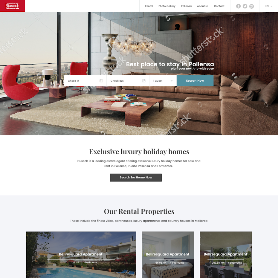
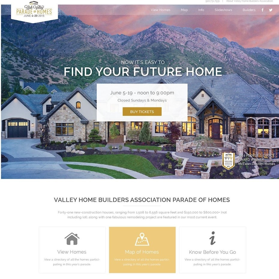
Real estate websites that showcase the locale
—
When you buy a home, you don’t just move into the house—you move into its neighborhood. Real estate companies that work in highly desirable places can capitalize on this by showcasing the locales on their websites. This kind of design tends to feature big, crisp header photos that persuade the potential buyer to move into (or even spend a weekend in) the area.
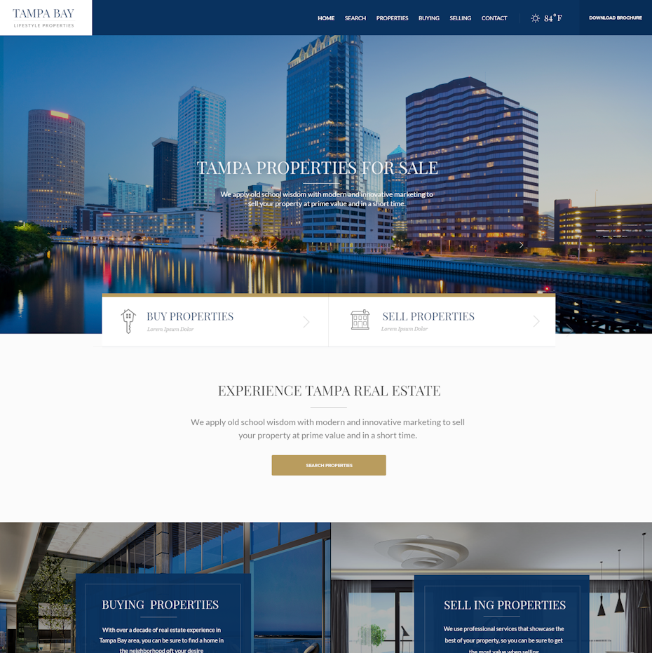
The design for Tampa Bay Lifestyle Properties keeps the beachy theme consistent with a color palette of dark blue and sandy tan without losing the upscale identity it communicates through serif fonts in its headers. It even has a widget showing the current temperature in Tampa—just a little nudge to anybody way up north, all bundled up for the winter, to imagine themselves in their new Tampa home.
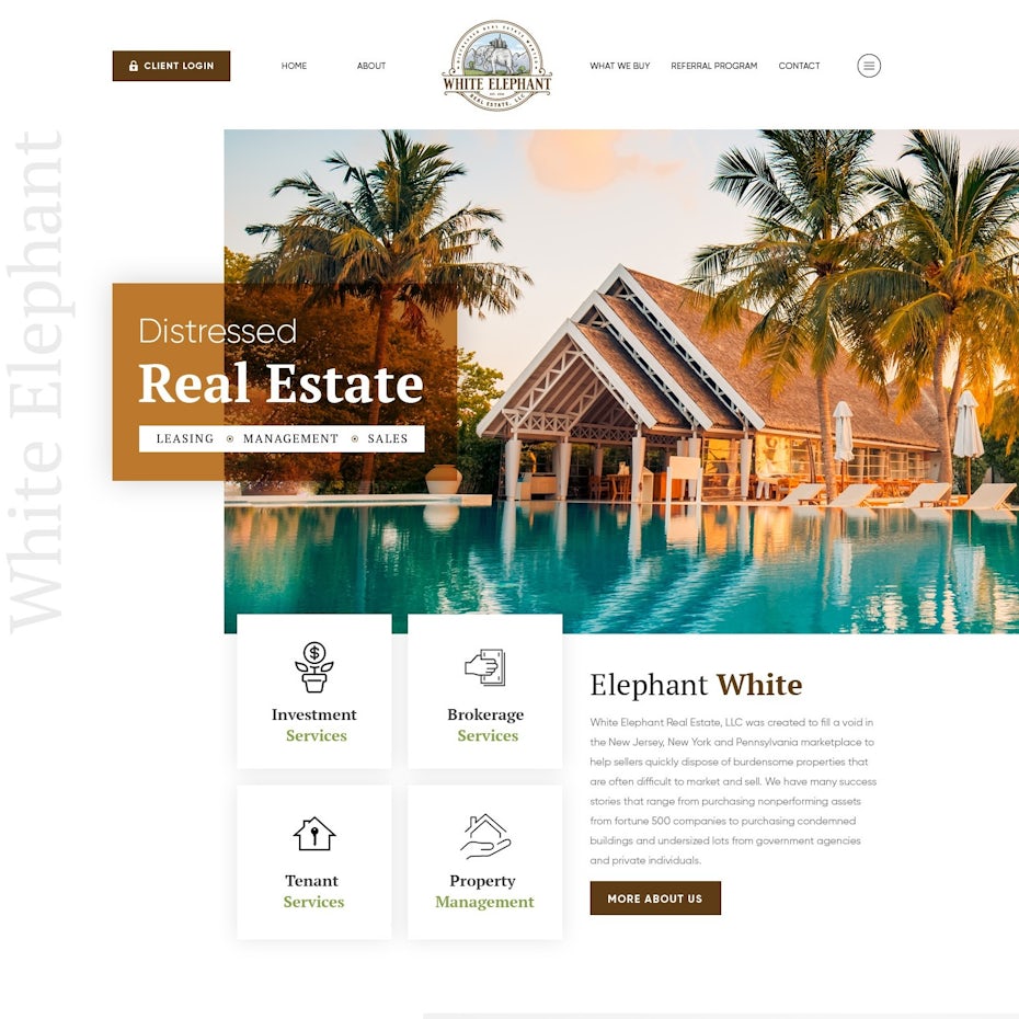
In the website for White Elephant Real Estate, a vast white background communicates that the sky’s the limit for rehabbing the properties they deal with. The brown serif font suggests trustworthiness, and the clear navigation up in the header makes it super easy to get started on selling a distressed property in the Mid-Atlantic—a market the viewer probably didn’t realize could be home to serene, tropical-looking getaways like those in the website’s pictures.
This type of design is ideal for a brand that’s selling experiences, like a vacation rental website or a roommate directory aimed at young professionals moving to a major city. When the lifestyle an area offers is just as important as the actual real estate there, an effective website shows it off.
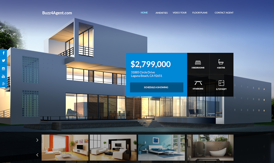
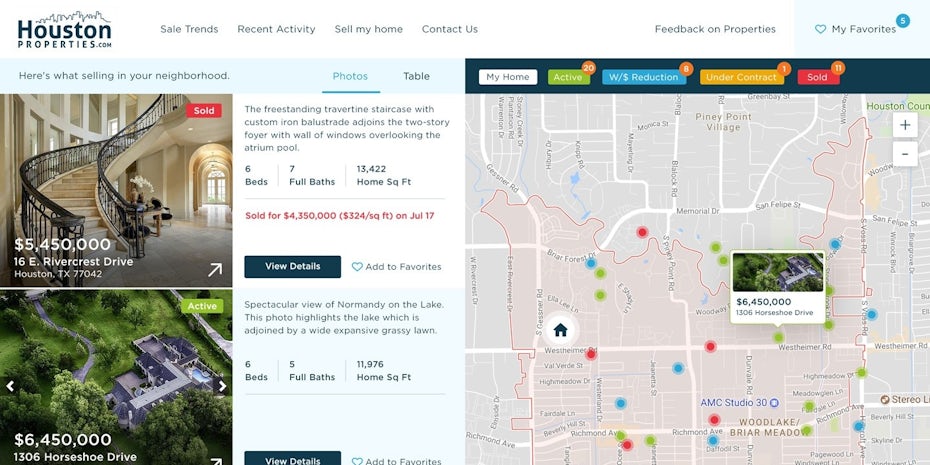
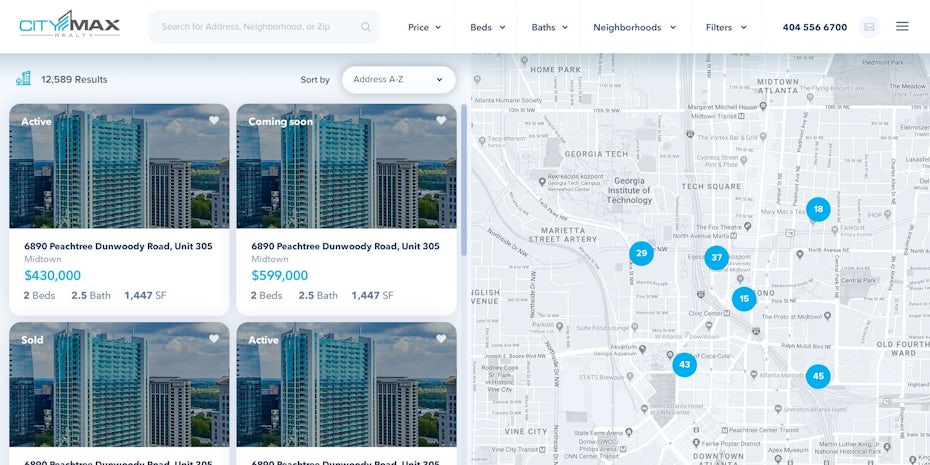
Real estate websites that put their properties on the map
—
For a lot of real estate clients, location is key—not just the specific city but right down to the block. With this in mind, many real estate websites make maps their focal points, showing visitors precisely where each property is located and what it’s located near.
This kind of website is especially helpful for commercial buyers who don’t just think about rent prices and maintenance costs but about access to thoroughfares and available parking. By seeing exactly where a building (or an empty lot) is on a map, a business owner with specific location needs can decide in an instant whether the property fits their criteria. Helping buyers filter out properties based on logistics isn’t the only way these kinds of websites work—they also make it easy to compare a lot of prices and a lot of property specs quickly.
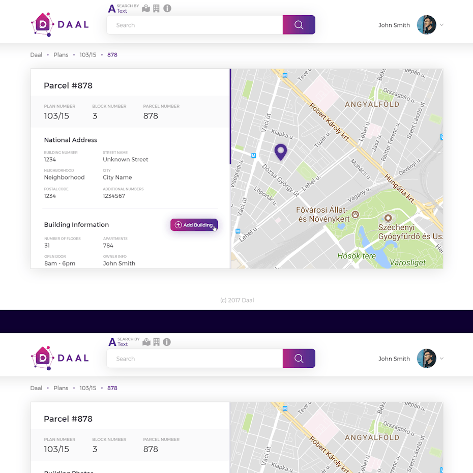
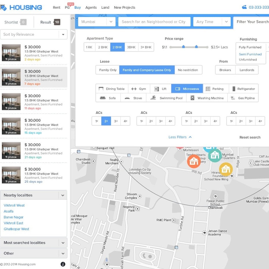
The website design for Daal breaks cities down block by block, then parcel by parcel. After zeroing in on a particular building, the viewer can get all of its vital stats like the number of floors it has, the number of apartments in the building and even the hours its main door is unlocked. The design for Housing makes the house hunt super customizable, giving viewers tools to filter their property search results by lease types, apartment amenities, whether they’re furnished, semi-furnished or totally empty and whether they’re listed by their landlords or by real estate brokers.
All kinds of buyers can get a ton of valuable information from this kind of website. For commercial listings, a great website design makes it easy to see information like loading dock accessibility and the amount of employee parking available. Beyond filtering results and making it easy to compare, websites like these can show residential buyers what’s near the houses they’re considering, like schools or nightlife.
House your business in a great real estate website
—
Each of these types of real estate websites work because they spur interest in the target audience. When you’re planning your website design, determine exactly who your target audience is and how your brand appeals to them. This will help you understand which kind of design, or combination of design types, is most effective for your website.
The post 28 best real estate website designs that make you feel at home appeared first on 99designs.
28 best real estate website designs that make you feel at home posted first on https://www.lilpackaging.com
No comments:
Post a Comment