Landing pages help dictate a marketing campaign’s success: they’re what convert visits into sales. That’s a lot of pressure to put on a single web page! It’s also why it’s important to come up with great landing page design ideas before you get started. Luckily, we’re here to help you avoid any crash landings. With the right landing page design inspiration you can take your project to the next level.
But first things first: What is a landing page? It’s similar to a website, but it usually lacks navigation or links. Instead, it will often feature a bold action-oriented headline, and upon scrolling will feature some key points to emphasize the value of a product or event. This is typically concluded with some method of converting visitors to consumers and participants—often an email capture or purchase method. Sounds simple right? But there’s many ways to design a landing page, only some of which will be right for your project.
Below, we’ve outlined some of the most popular styles and collected some outstanding landing page design inspiration to help you stick the landing!
Minimal, type-only landing pages
—
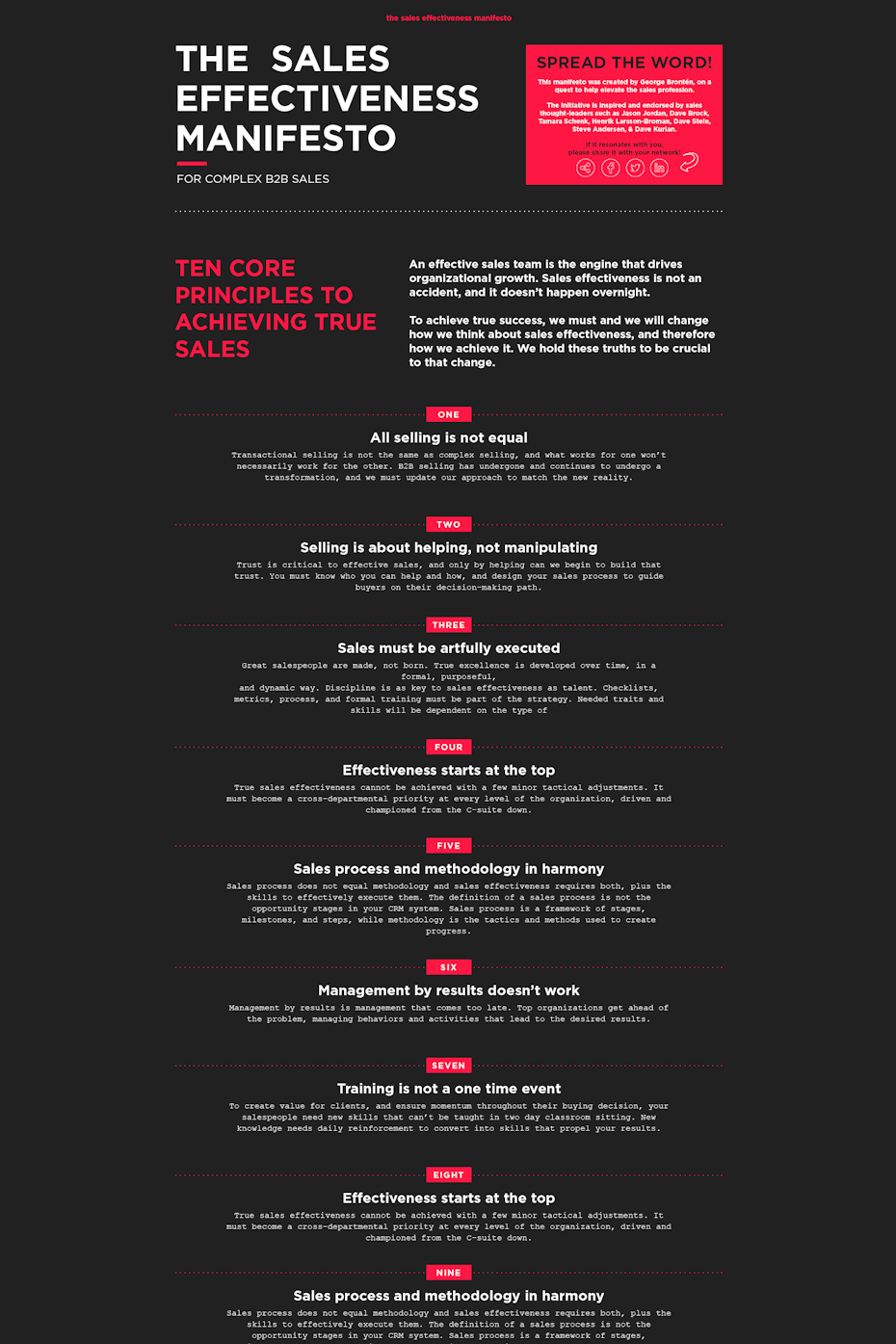
The most basic style of landing page design is type-only, or lacking images. This type of landing page creates variety and aesthetic intrigue primarily through font choice, font size, color choices and typographic layout. This design style sends straight-forward message, and will appeal to customers who think logically and methodically, or those who appreciate messages which are simple and straight-to-the-point.
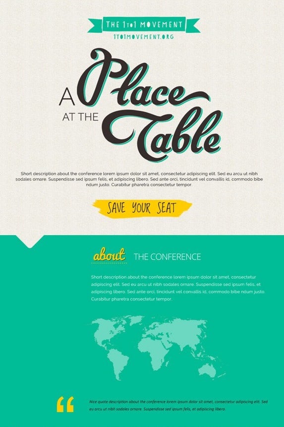


A great example of this style is the “A Place at the Table” landing page for a youth-based environmental education conference seeking event sponsors and attendees. The headlines on this site are in a large, hand-drawn cursive font, gives the page a youthful feel. The lack of images adds to the simplicity of the message, which aims to simplify our lifestyles or reduce our environmental impact. For scrolling rhythm, the design relies on a simple three-way color palette. Some page-sections have off-white backgrounds while others have saturated-teal backgrounds. Ultimately the design is simple and it’s use of type-only design makes sure not to lose the attention of any potential attendees who want to sign up.
Neon landing page designs
—
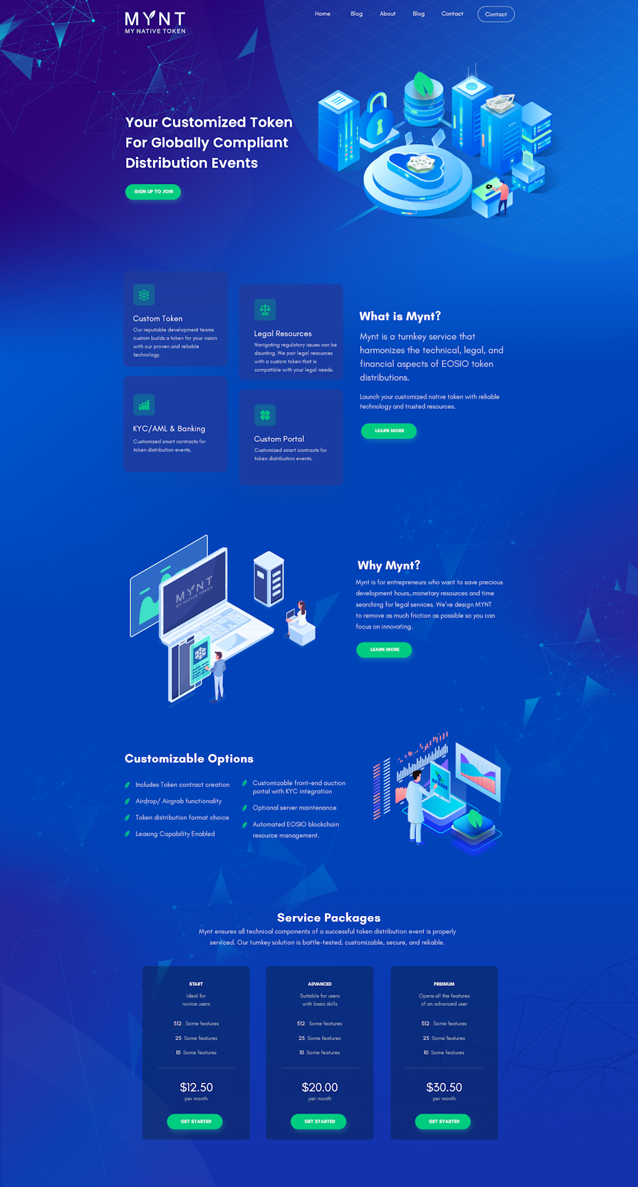
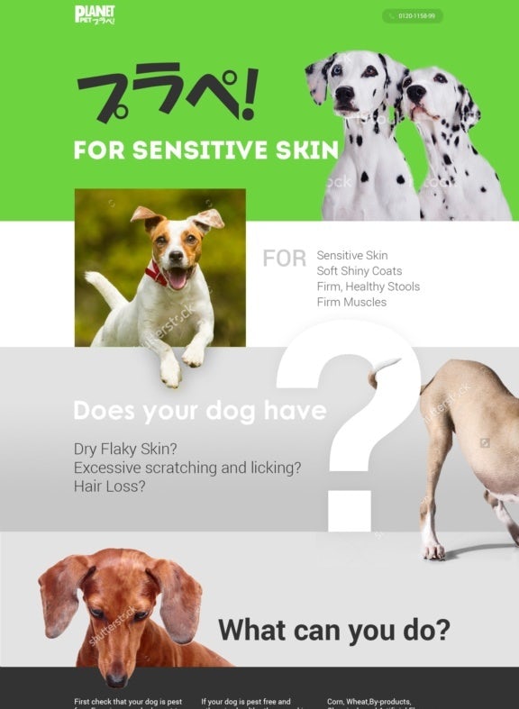
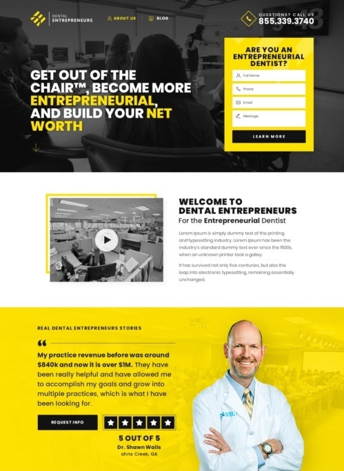
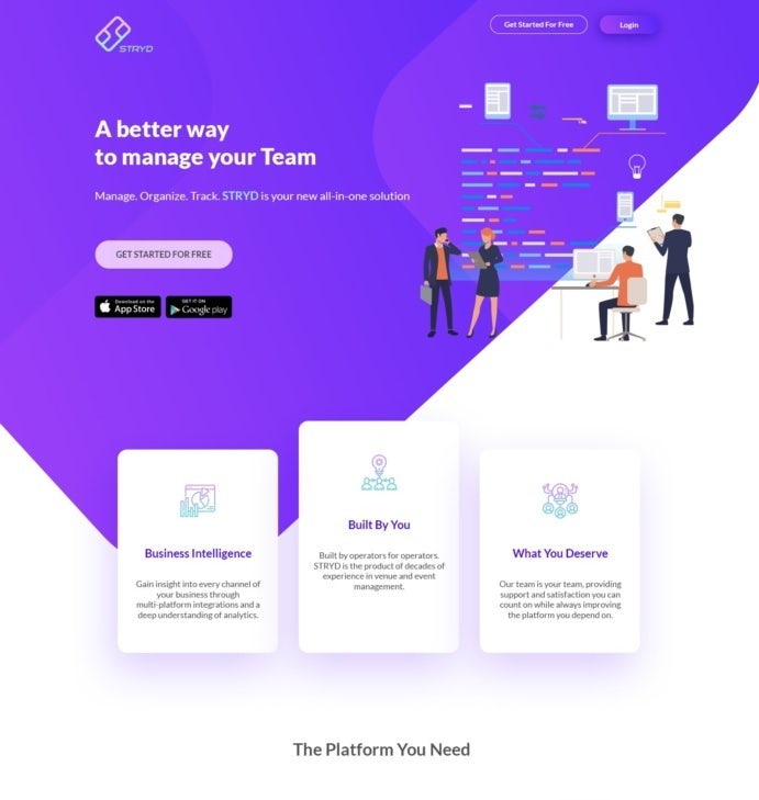
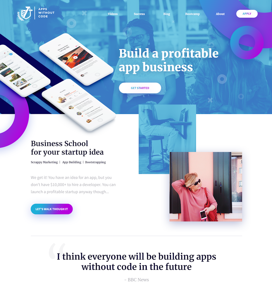
There’s no better way to make your landing page pop than using neons. The glowing, bright colors in the landing pages below really make them jump off the screen.
But you don’t have to go all out when it comes to color. Sometimes, using neons as accent colors for important elements on the page can be just as effective. Check out the eye-catching neon landing page inspiration below:

Dark landing page designs
—
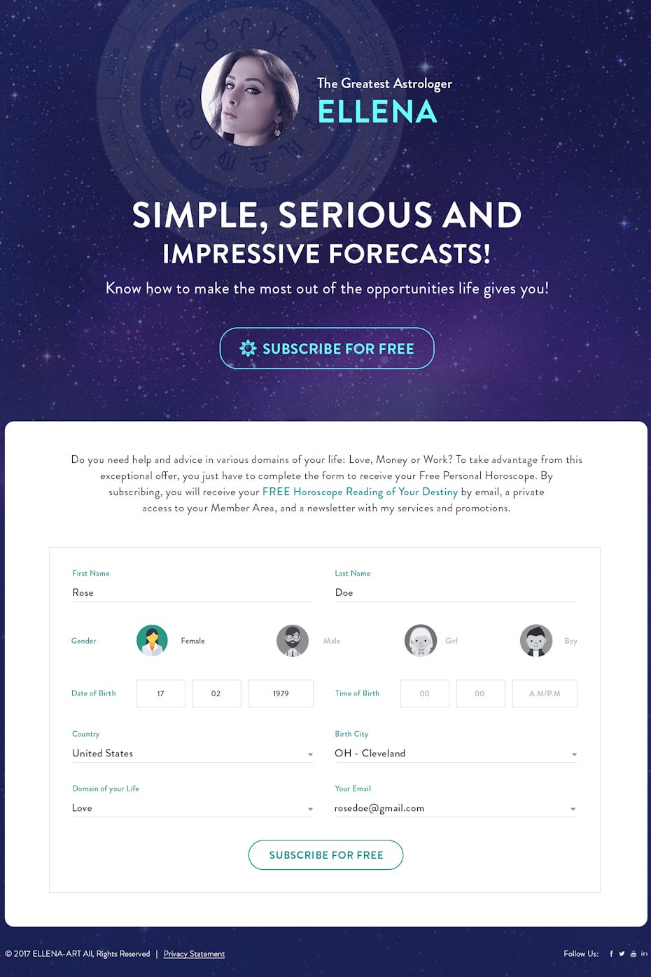
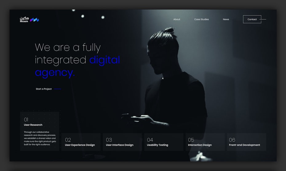
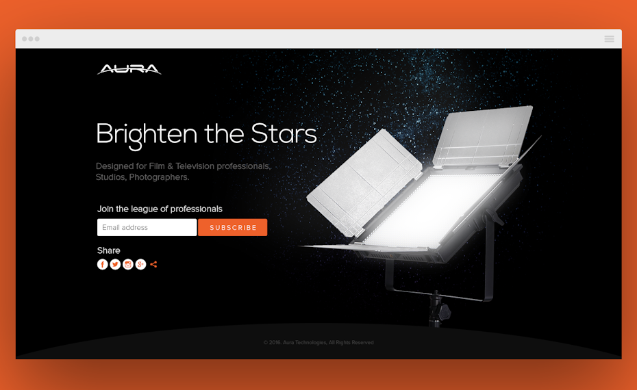
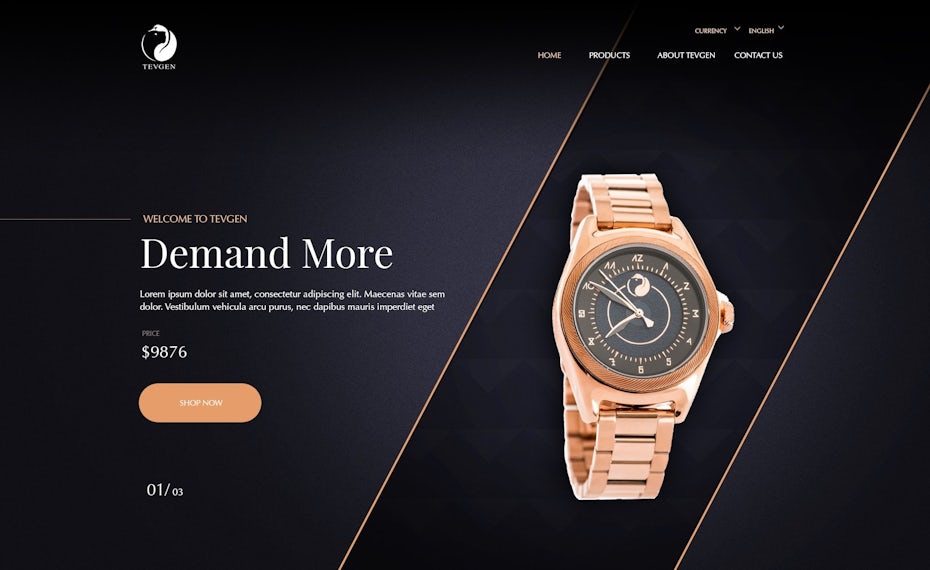
Many landing page designs try to keep things light and bright, but it can pay off to go another way. Dark mode landing pages with gray and black backgrounds and only the occasional pop of color can create a mysteriously cool yet elegant effect. Their striking boldness makes them perfect for brands that want to set themselves apart from everyone else.
Check out how the dark landing page ideas below leave a lasting impression on visitors:


Landing page designs with collage
—
Some marketing campaigns need a design that speaks both visually and viscerally—a design that grabs visitors who are less inclined to read copy. One way this can be accomplished is through the use of collage, or a cut-and-paste style of imagery. In other words, product-specific images can be combined into “surreal” environments that are tailor-made for the product or event. The juxtaposition of these images work together to create a deeper meaning.
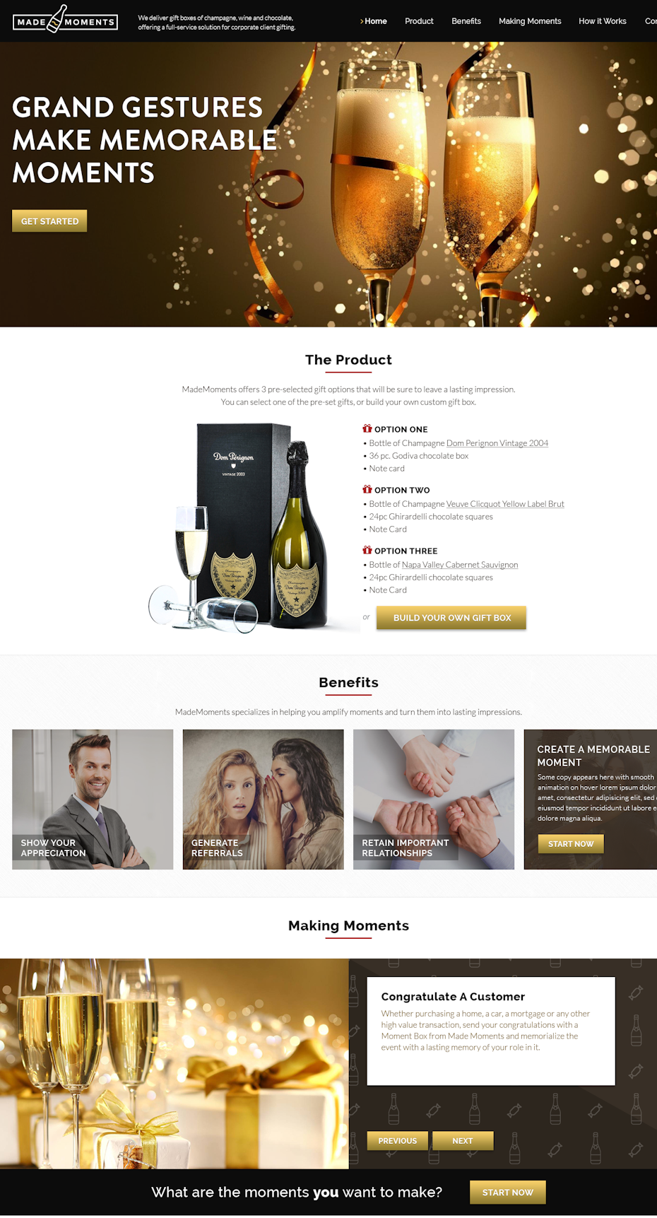

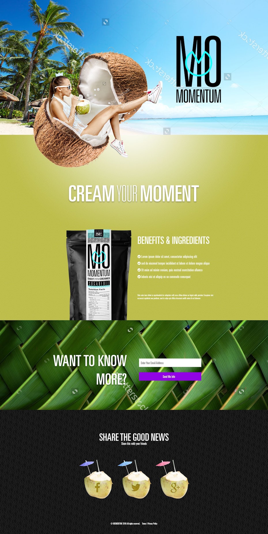
On the landing page for customer success event Pulse, three elements are collaged: the golden gate bridge, a smiling woman and the pulse logo. Here, the use of collage allows the women to appear as if she’s gesturing towards San Francisco and welcoming you in—something that would be costly and hard to pull off in a simple photograph. Visitors who connect emotionally with these three combined images on this page are very likely to register.
Landing pages with flat illustrations
—
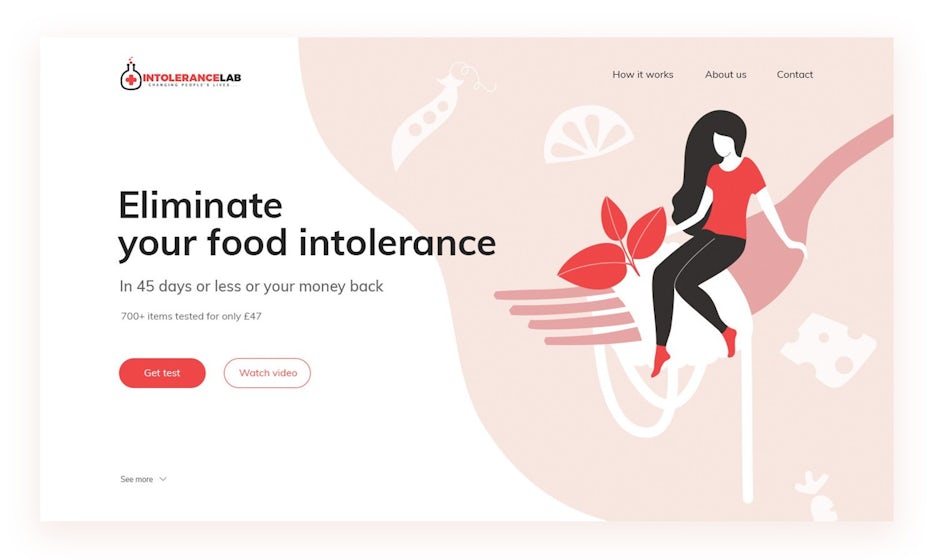
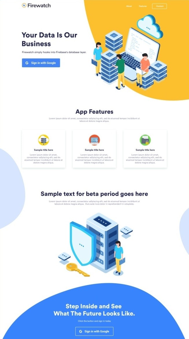
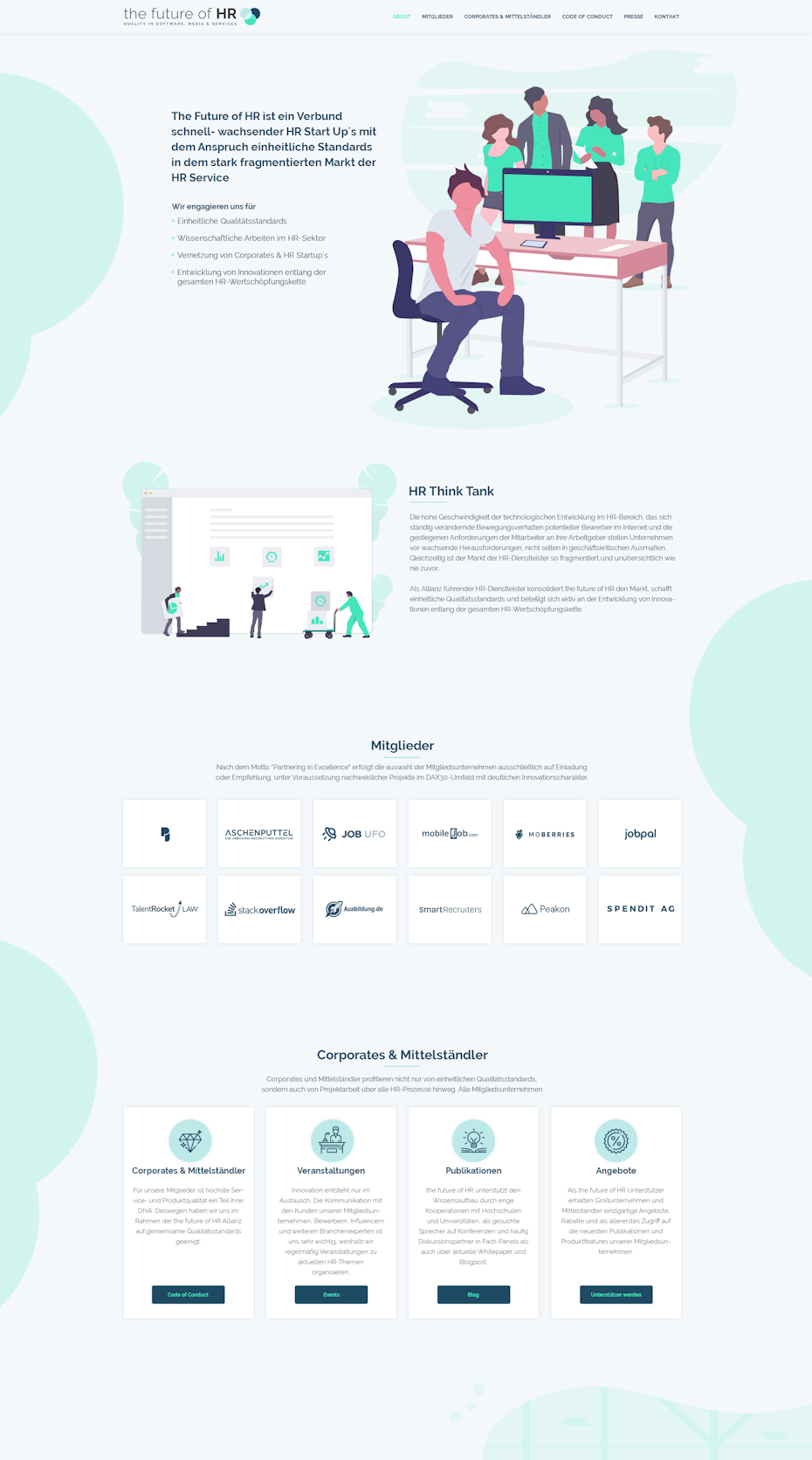
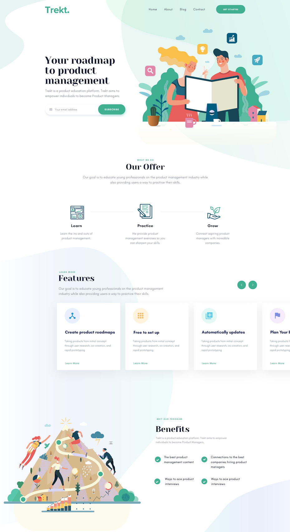
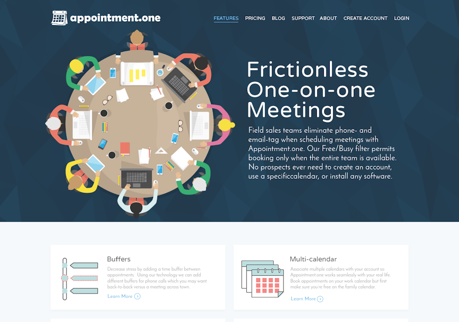
Flat illustrations are super popular right now when it comes to landing pages and that’s because they’re extremely versatile. Flat design can give your landing pages a modern look that’s both simple and colorful, plus it can be made to fit practically any industry imaginable. Here’s some great landing page inspiration using flat and semi-flat illustrations:

Photographic landing pages
—
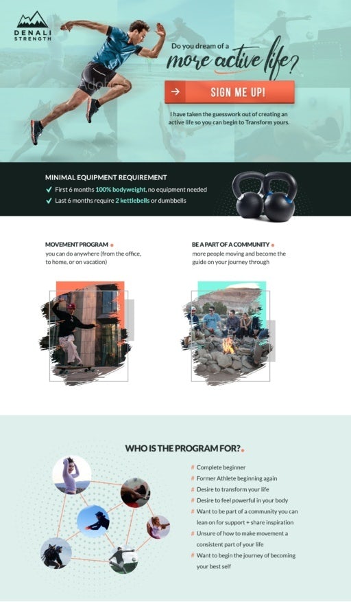
Photographs create an emotional connection with an audience. Stirring up the desired emotion in a potential buyer can put them in the right mindset to buy. Sometimes all it takes is a simple background photo to make your visitors feel a sense of familiarity or need.
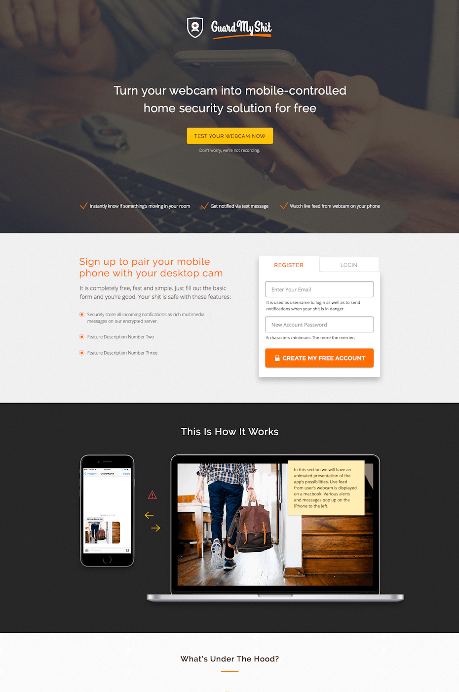


The Guard My Shit security app pages simply features a photo of someone holding their phone next to their computer. Visitors who own phones and computers will see this and automatically relate.
Not all photographic landing pages need to be that literal however. Check out page for Pylon peer to peer lending. It simply features two young adults standing above a city. We can interpret that the message here is that Pylon allows users to feel like they are on top of the world. The photo creates a feeling of freedom. It’s aspirational. People who land on this page want to feel that, and that’s what encourages them to sign up.
Does your landing page need to showcase a product that can easily featured in a photograph? Or do you need a metaphoric representation of your product like on the Pylon page? This style of landing page might be for you!
Gradient landing page designs
—
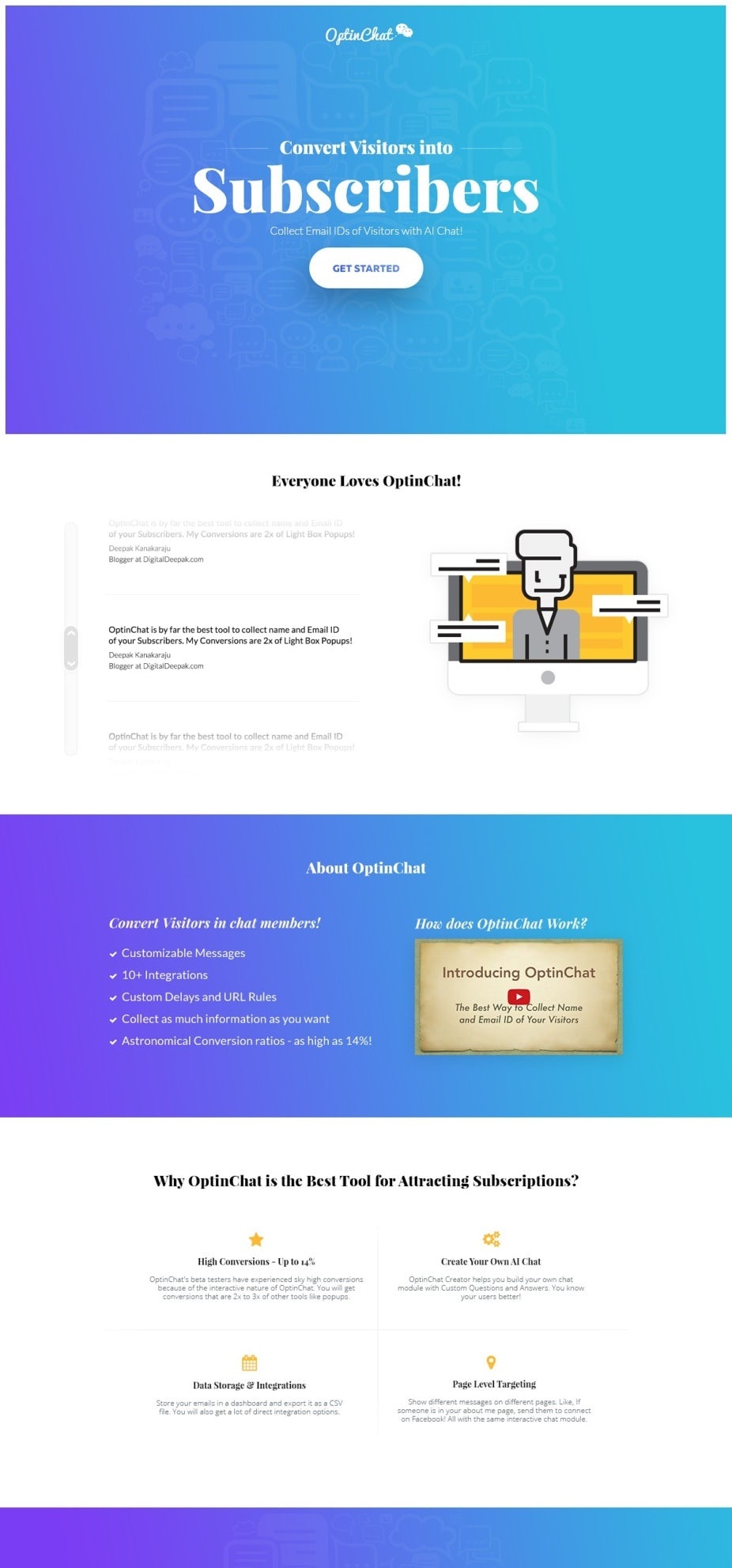
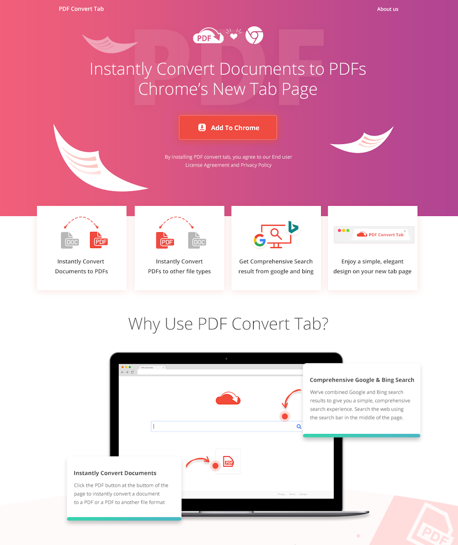
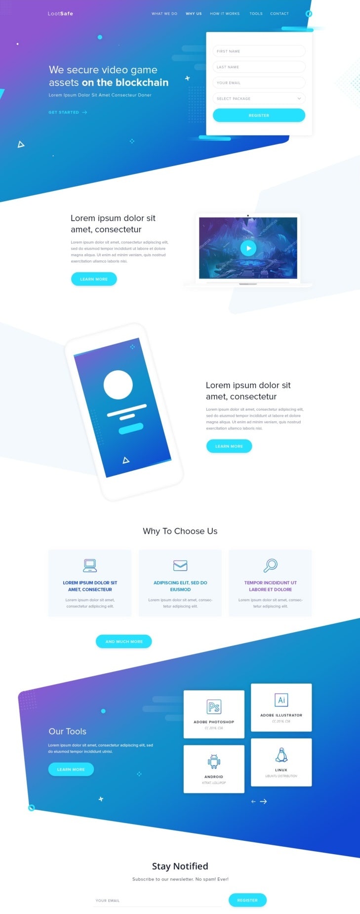
Gradients are a beautiful way to inject color, energy and movement into your landing page without overloading your design or taking away attention from your CTAs and headers. The gradient design trend is extremely versatile depending on the colors you use. Take a look at the landing page ideas below that use gradients in various different ways.




Landing pages with isometric designs
—
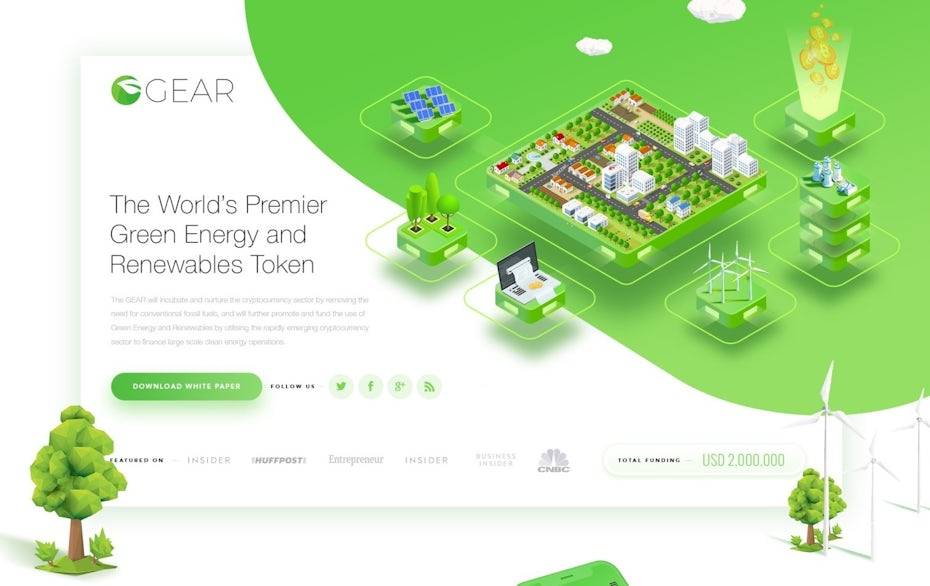
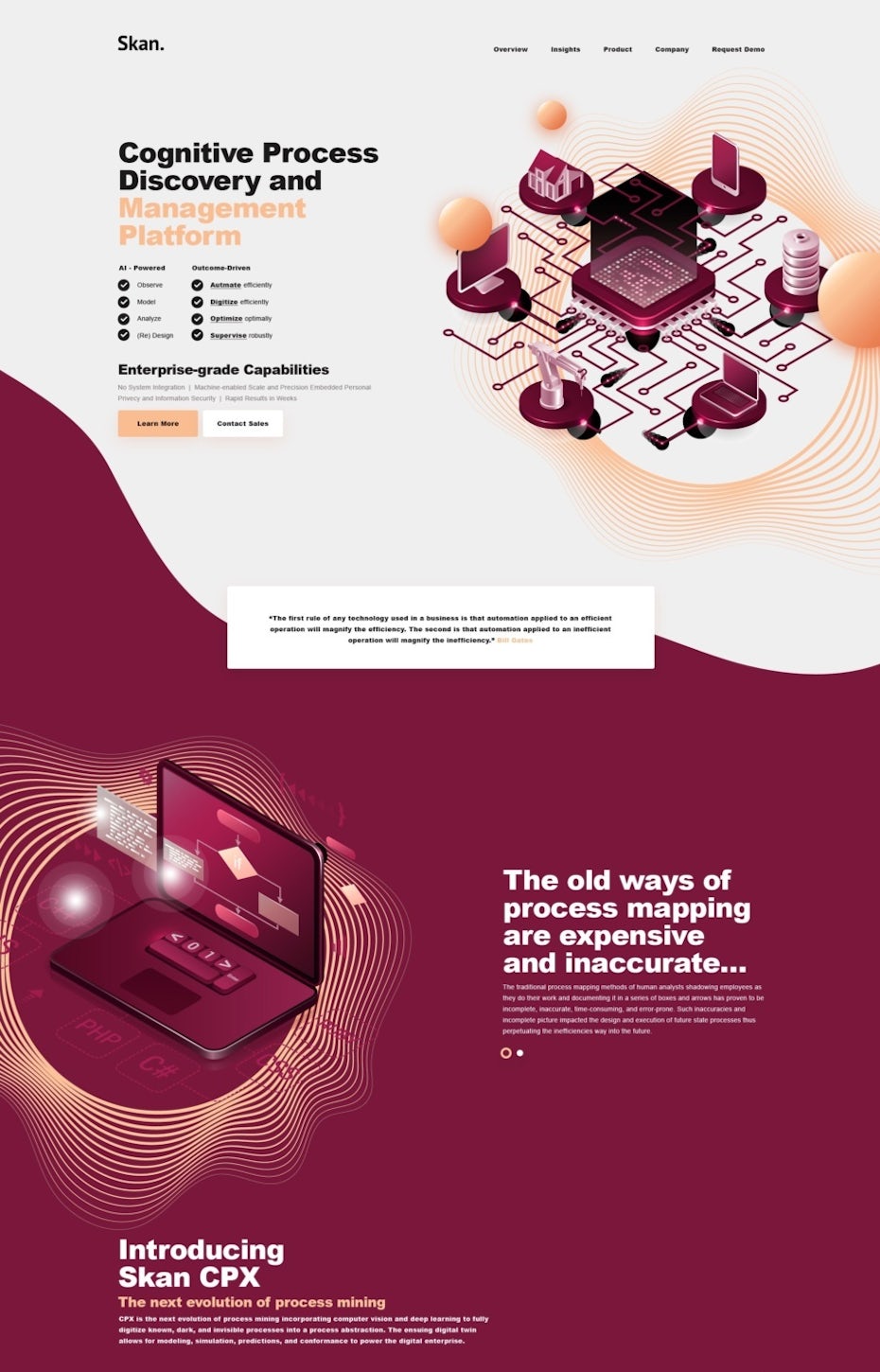
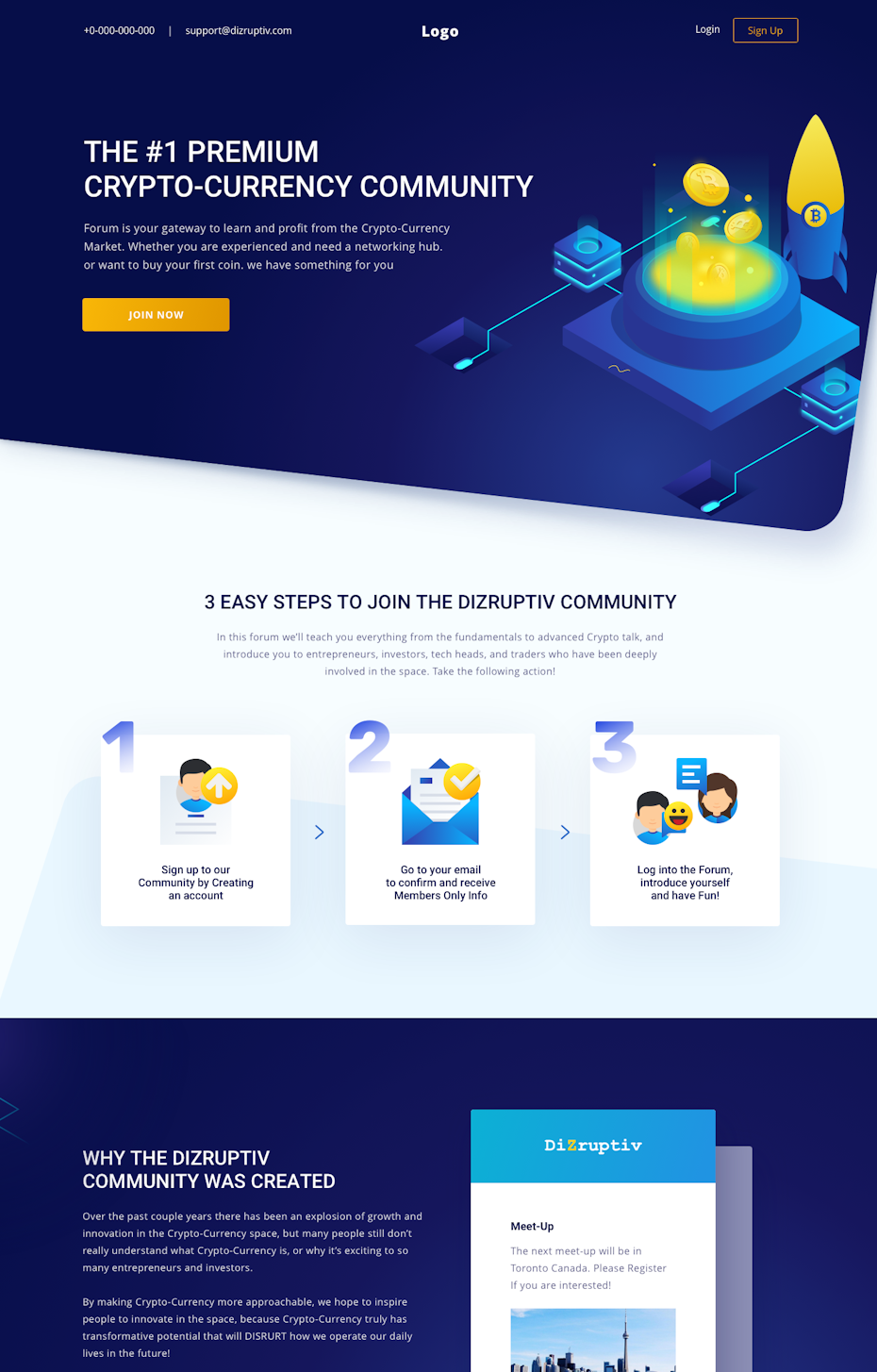
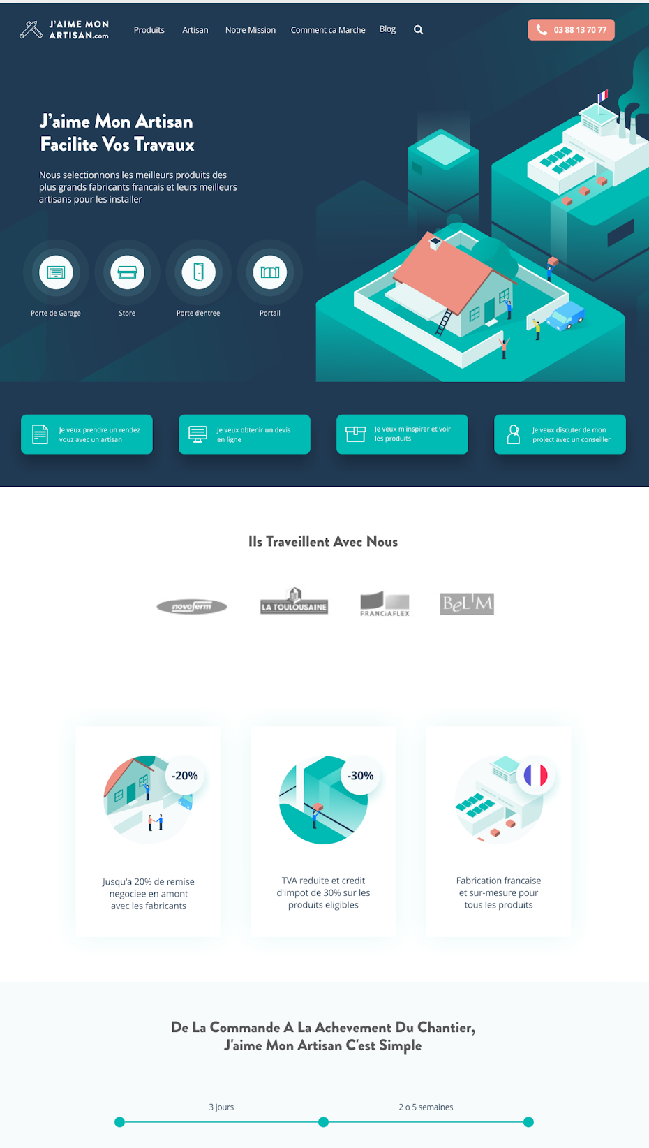
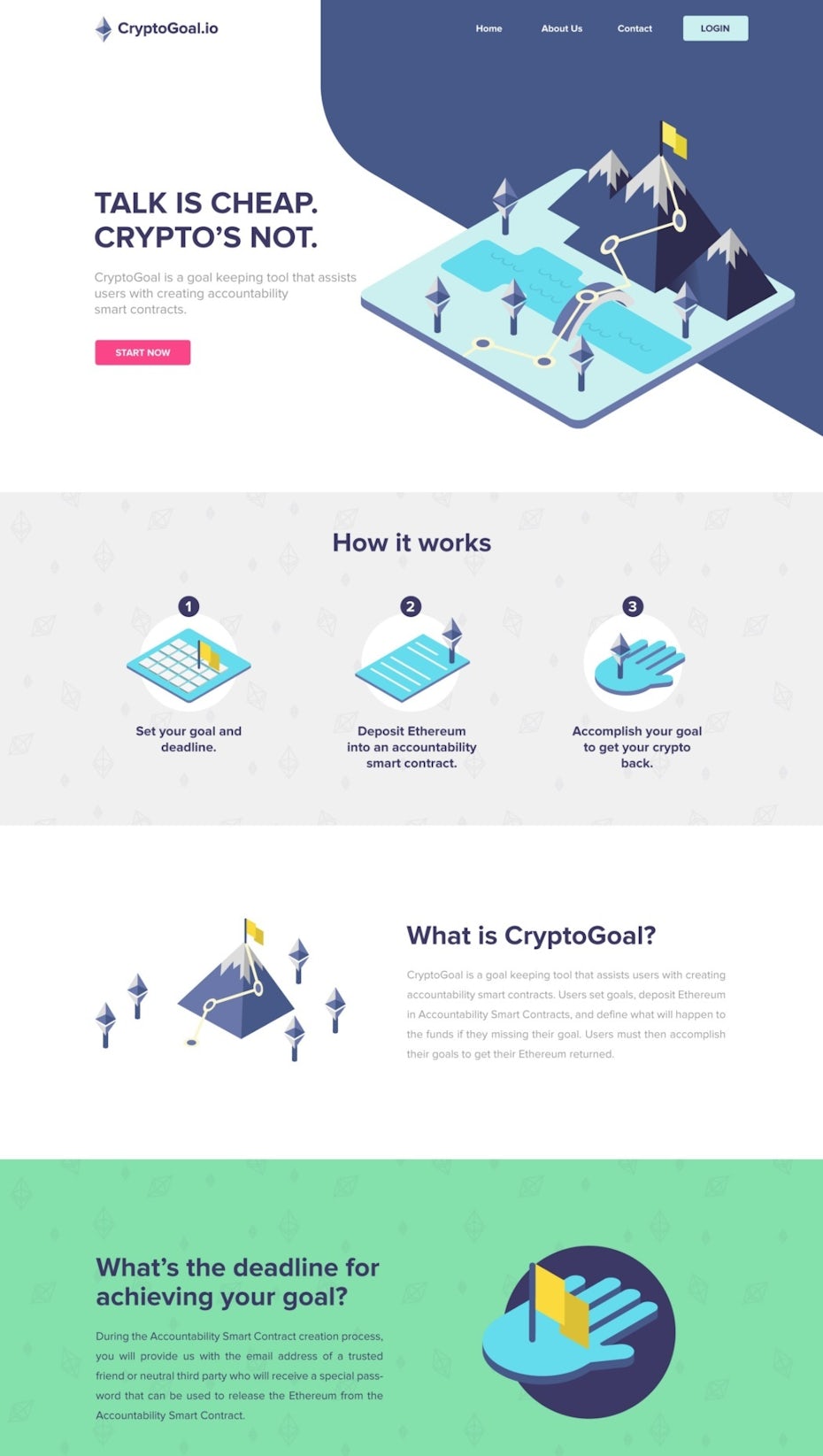
Isometric design is a great way to explain complex ideas through graphics on your landing page. Isometric designs give you more perspectives on a subject. Being able to see the side and top of a design within your landing page makes visitors want to know more about it. Landing pages with isometric graphics also allow you to show more details with less clutter, which makes them perfect for brands that want to show that they’re approachable, transparent and trustworthy. Take a look at some great landing page inspiration with isometric designs:
Landing pages with computer and technology graphics
—
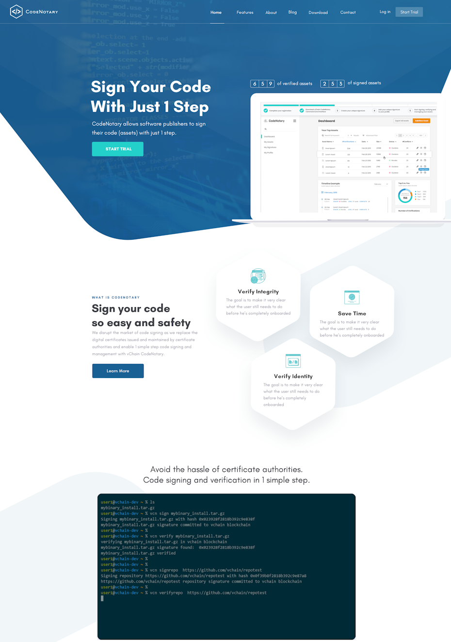
Computer technology and science related industries market to customers who feel a sense of awe and who are impressed by feats of technology. To stir up that sense of astonishment, many technology companies are going with a style of design that features computer generated graphics. Think 3D renderings, graphs, interpretations of data and representations of computer components. This style of visual will often impress the viewer and instill a sense of awe at the technical level or the advanced attributes of a company’s product or service.
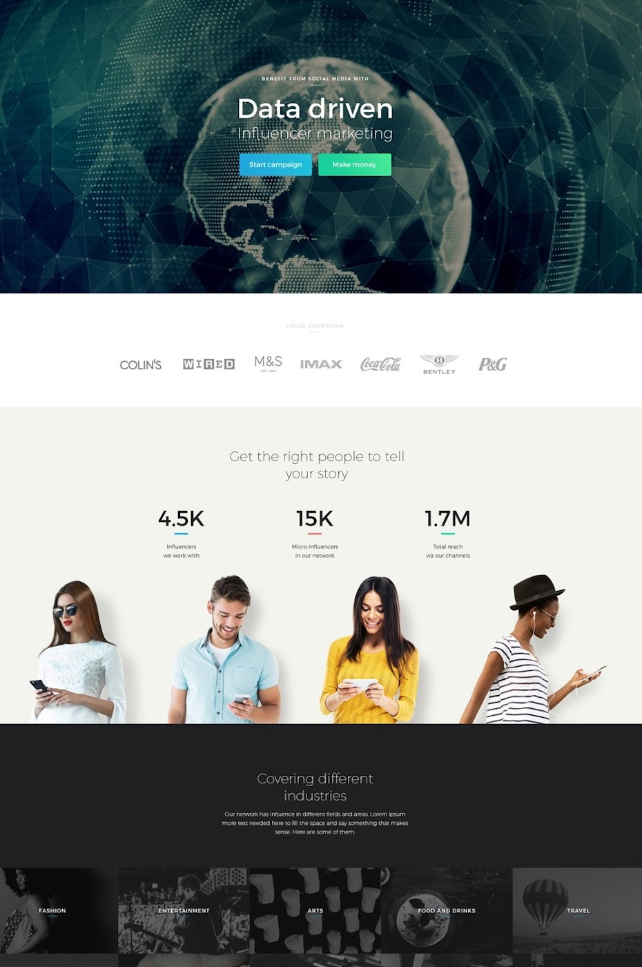
Take for example the landing page for Renerauld which features an extremely digitized interpretation of a globe. It’s a graphic style which was created with advanced computer software. Simply using a graphic in this style can give your customers the sense that you hold advanced capability, which in turn makes them want to buy-in.
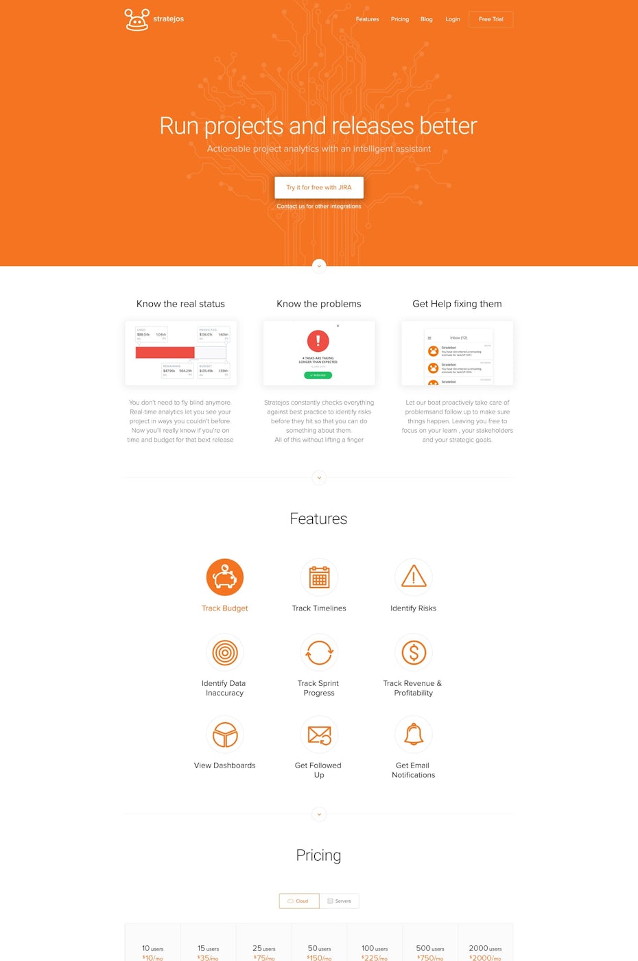
In a more minimal design, the Stratejos landing page uses a subtle “motherboard” design in the background with an off-orange hue. This design is less technical from a design standpoint, but it still clearly sends the message that this company offers a product that relates to computer hardware and/or software. In the end it will surely still impress a customer who is less familiar with computers, and might just inspire them to click!
Illustrated landing pages
—
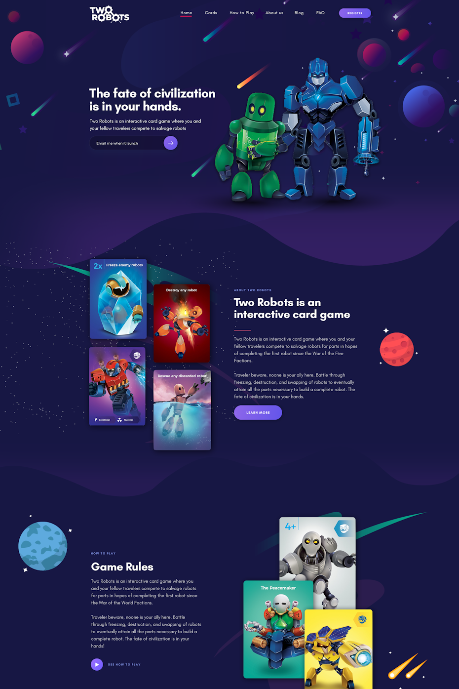
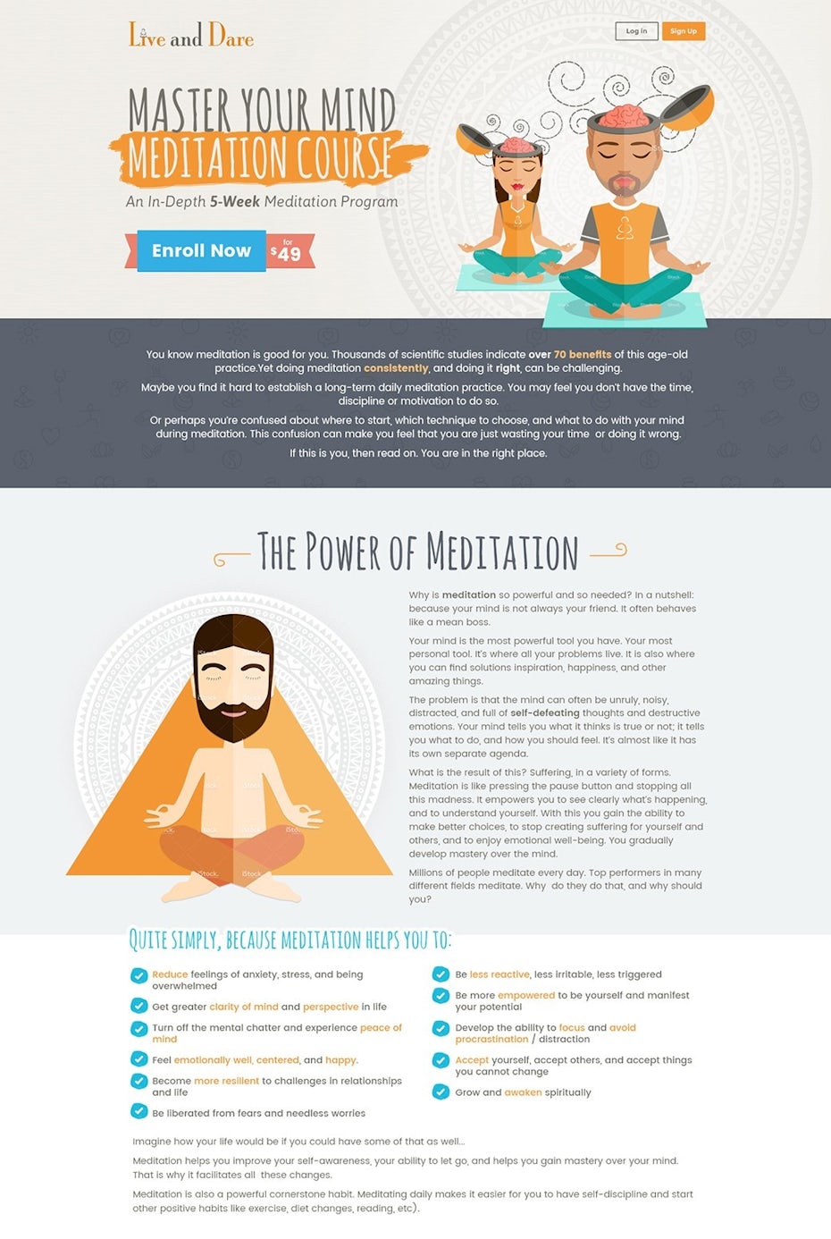
Last, but not least, is the widely versatile illustration style of landing page. Here, we’re talking illustration in general, so any style goes. You can use anything from 3d illustrations or line art to hand-drawn designs—simple choose the style that best represents your brand’s personality.
These designs are often friendly and colorful, and use fictional characters which in many ways often feel more approachable than actual humans (who are sometimes awkward). If your brand stands for approachability, or if your service requires extra-friendliness, an illustrated landing page might be for you.

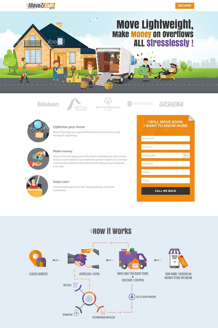
Take for example the Move’n’Cash landing page which features a jolly crew of illustrated movers having the best day of their lives! It feels approachable and the fact that they are illustrated almost feels as if you never have to even deal with them.
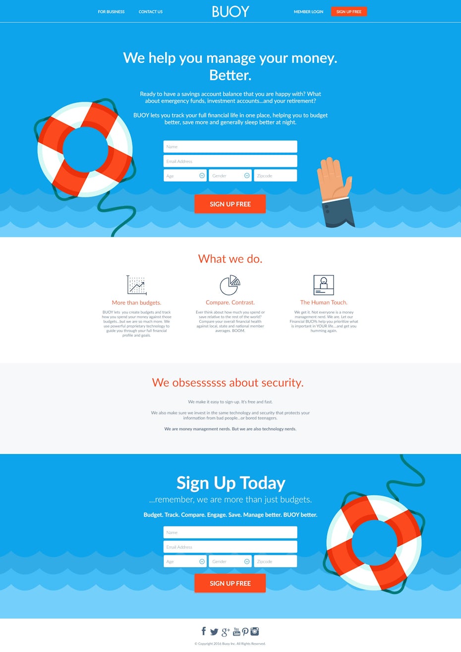
Illustration can also allow companies to visually demonstrate points that would be difficult to express in other styles. On the Buoy landing page, a drowning person’s arm is reaching up for a buoy. This imagery is used to hint at the idea that the company Buoy helps you stay afloat if you feel like you are drowning financially. Illustration is a great choice here, given that any realistic representation of someone drowning might feel too intense. This design will definitely come across as light-hearted, friendly and helpful to someone who is actually drowning in debt.
Time to create your own unique landing page design
—
So there you have it: lots of amazing landing page design inspiration and some of the major styles of landing page design to inspire you. All that’s left to do is ask what your startup or business is trying to communicate. If it’s a simple message go for simple typography. A TV ad? Use a collage. Looking for familiarity and comfort: try a large photograph. All about advanced technology? Why not use computer graphics. Let’s not forget about illustration for colorful and friendly looks. Now it’s time to go land some new customers!
This article was originally written in February 2017, it has been updated with new images and information.
The post 54 inspiring landing page design ideas appeared first on 99designs.
54 inspiring landing page design ideas posted first on https://www.lilpackaging.com
No comments:
Post a Comment