The best business logos strive to act as a brand’s calling card, its face, the way it greets and interacts with the world. Whether you’re planning to launch an entirely new business venture or you’re retooling an existing business, your business logo should be front-and-center in design development.
You may think your business is too small to benefit from a professionally designed logo, but every business needs a great-looking logo, no matter its size. Your logo is a major component of your branding. It’s your one shot at a good first impression and if done well, your logo will be at the forefront of your small business’ success for years to come—so it’s worth investing in.
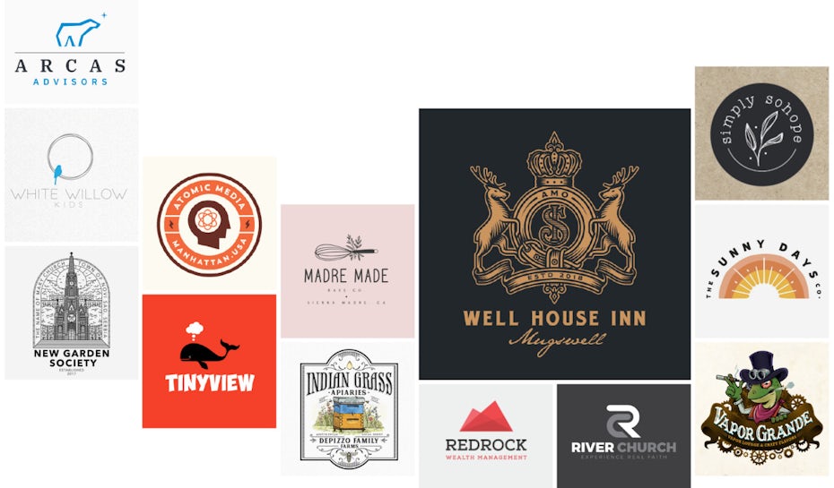
Ready to see the ways your business can stand out from the crowd? In this article we’ll walk you through the main considerations and show you some of the best business logo ideas to inspire you.
5 steps to designing the perfect business logo
—
When you’re designing your business logo, following this order can make it super easy to keep your thoughts organized:
- Define your brand and brand identity
- Pick a logo type
- Pick a logo style
- Identify how your brand looks, considering color palette, shapes, imagery, font
- Design the logo using the visual elements you identified
To give you an idea of the different types and styles of logos you can choose from when it comes to creating your business logo, we’ve summarized it all for you below.
A quick guide to logo types for businesses
—
There are seven unique types of logos. When you’re in the process of creating a business logo, understanding these types is a great place to start.
Mascot logos are, as their name implies, logos with mascots. Think of the Wendy’s logo or the Michelin logo. In both, a friendly, approachable character is the logo’s focal point. For family-friendly brands, entertainment brands like sports teams and brands that do a lot of public interaction with their audiences, a mascot is a must-have. A mascot logo will transform the mascot into the company’s public face.

Wordmark logos are words made into logos. A few famous examples include Google, MasterCard and ebay. A wordmark logo can make your brand’s name instantly recognizable, which makes it the perfect choice for a business with a unique, catchy name.

Lettermark logos, also known as monogram logos, are similar to wordmark logos. The difference is that instead of turning the brand’s name into a logo, a lettermark turns its initials into one. This type of logo works if your brand name is a real mouthful, like the National Aeronautics and Space Administration, aka NASA.

Emblem logos are logos framed by some sort of badge or shape. These logos take their design cues from traditional seals and crests, but they don’t have to be stuffy. Harley-Davidson and Starbucks are two well-known emblem logos. This kind of logo works for any brand that makes prestige part of its identity, whether that’s prestige in the established, traditional sense or the prestige of being the best in its industry.
Pictorial logos are logos that make an image, but not necessarily a mascot, their focal point. The image can be modeled after a living being, like an animal, but here’s the difference: with a mascot logo, that animal has a name, a voice and a personality. With a pictorial logo, it’s a static image, like the WWF panda or the batter in the MLB logo. A pictorial logo can also be an object, like Apple’s apple.

Abstract logos are similar to pictorial logos in that they, too, focus on a graphic. But instead of a recognizable image, an abstract logo incorporates an abstract shape. In many, but not all, cases, an abstract logo is derived from something related to the brand, like Spotify’s logo that represents soundwaves.
Then there’s combination logos. These logos take two or more styles and combine them. One famous example is the Burger King logo, which combines a wordmark with an abstract image of a hamburger.
Top logo styles for big and small businesses
—
Once you’ve found the right type of logo for your business, you need to settle on a logo style.
Any one of these logo types above can be designed in a specific style. For example, a wordmark can be written in a loopy, asymmetrical font that feels like handwriting, or it can be written in a complex, ornate font that would feel right at home embossed in gold on a fancy invitation. Or it could be written in a blocky, forward-slanting “techy” font.
The right style choice for your logo depends on your brand and the clientele your brand attracts. Here are some great business logo ideas in the most popular styles:
Illustrated business logos
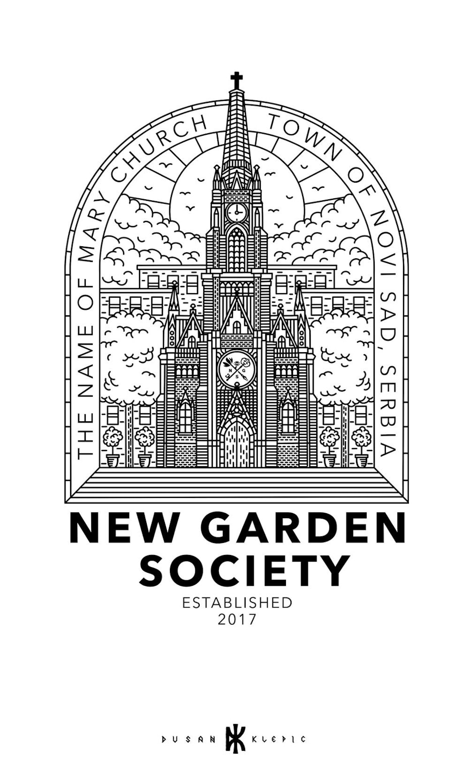
An illustrated logo is just what it sounds like: a logo that looks like it has been drawn by hand.
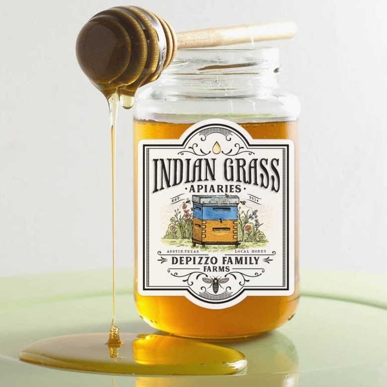
Illustrated logos can go in a few different directions. They can be simple and minimalist, creating an image with just a few lines. Or they can be highly detailed, creating rich textures and engaging characters. Often, these kinds of logos have a homegrown, organic feel, which makes them perfect for any small-scale, artisan business. The common feature here is that they look like they were drawn on paper, rather than on a screen.

There are a lot of different ways to design an illustrated logo. RotRed went with a watercolor design in their logo for Les Arterres, giving the tree depth.

Often, illustrated is the go-to choice for small business logos because it has that do-it-yourself, built-from-the-ground-up feel. It’s a great choice for startups and for small community-oriented brick and mortar businesses.

Minimalist business logos
Minimalism is one of those trends that’s never not popular. Minimalist trends evolve and come into the spotlight, but minimalism as a concept remains popular with logo designers because it can give any brand a straightforward, clean look.


Any type of logo can be a minimalist logo, and this style works especially well for brands that opt for wordmark or lettermark logos. That’s because when you’re focused on just a word or a few letters, it’s easy to keep the overall image simple. But you can also create a minimalist pictorial or abstract logo—minimalism and abstract images often go hand-in-hand because abstract images are often created by distilling a more complex image down to its basic shapes or elements, like how cindric turned a polar bear into a geometric outline in their logo design for Arcas Advisors.

Brand persona-wise, minimalist logos are often the style of choice for luxury brands. Less is more with a minimalist logo, as svart ink demonstrates with their gold and black geometric logo for Tandm.

Retro-inspired business logos
There are a few different ways to do retro. You can go with a two-toned letterpress logo for a super old-school look, or you can go a bit less old-school with a quirky, colorful midcentury look. It really depends on what your brand’s all about. Just make sure if you decide to go retro, you do it right—the world doesn’t need another black and white badge logo with initials between crossed arrows (unless you’re going for a vintage 2012 look, in which case, it’s probably best to wait a few years).

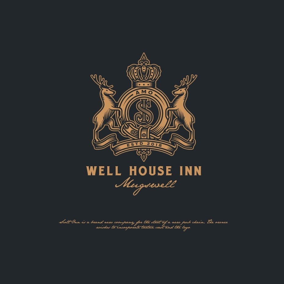


Retro-inspired logos can be great if you’re an established business in your community or if trips down memory lane are part of your business model, like if you’re an antiques dealer or you run a bed and breakfast from a Victorian home. Retro-style business logos are also a great choice for a quirky or irreverent brand.
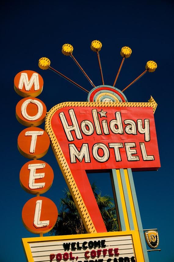
There are also lots of different ways to get the retro-inspired look. One is to go with a color palette that feels like it’s from another era, like thisisremedy does in their logo for Atomic Media. The earth-tone color palette is just part of the retro package here, though. To complete the look, thisisremedy went with an emblem with an abstract head shape reminiscent of the PBS logo for the main version and a wordmark version that would feel right at home on a groovy midcentury googie motel.

Another fun way to do a retro-inspired logo is to create a character who looks like they stepped out of an old movie or cartoon, like Anastasia S. did in their logo for Big Shot Coffee House.

Modern business logos
If a retro-inspired logo is the complete opposite of what you’re after, go with a modern logo. Modern logos often make use of 3D and abstract design elements to create a techy, forward-thinking feel. This kind of logo is perfect if you’re a tech startup, aiming to appeal to a younger demographic or if your business is built on embracing new technologies and processes, like a cleaning business that has blue light disinfection in its arsenal.
Generally, an emblem style logo isn’t what you want if you’re looking for a modern logo. Emblem logos tend to feel like they’ve existed for centuries and represent long-standing institutions—and the baggage that comes with them, like restrictive policies and traditions that don’t really fit our modern world. But if you’re strategic, it’s possible to give an emblem logo a modern look. Neatlines accomplished this in their logo for Brasserie du Bayou by using a range of colors and illustrating a scene, rather than a crest.

It’s easier to pull off a modern logo if you’re doing a pictorial or abstract logo. Geometric shapes, sharp lines and simple, abstract images are all hallmarks of modern design. If you’re going modern, these are always great choices—as are gradients, metallics and neons.
![abstract business logo of red mountains, with colors overlaid in the full-color version]](https://99designs-blog.imgix.net/blog/wp-content/uploads/2020/07/9a91ec5c-be65-418c-8d4a-b194cea0e019-e1594655071775.png?auto=format&q=60&fit=max&w=930)

Mascot business logos
This category’s a little different from the others because a mascot logo can also be retro-inspired, minimalist, modern or drawn in a style that feels like a book illustration. But it doesn’t have to be, and because mascots are an effective way for small business owners to give their brands friendly faces, we’re giving them their own category.


Mascot logos work best for businesses that are fun and friendly, like ice cream trucks, children’s clothing stores and doggy daycares. If you’re considering a mascot logo, start by determining who your mascot is. Is your business best represented by a wide-eyed, observant bullfrog, or is it more accurate to characterize it as a slick, speedy robot on wheels? Once you’ve translated your brand persona into a character, you can create a mascot logo that feels authentically you.


If your mascot’s unique, your brand will be memorable. Think about it, would you have an easier time remembering a vape shop with a generic-looking lizard on its logo, or one with a steampunk lizard looking down his nose at you like the one Aga Ochoco designed for Vapor Grande?

We know which one we’d remember.
Take your business to the next level with an outstanding logo
—
When your business connects directly with your ideal customers, you’ll get more sales, more referrals and ultimately, more profits. Ready to make an investment that’ll pay off? Work with a professional designer from our platform to get a logo that will bring more customers to your door (and your website!)
Get the perfect logo for your business!
Our talented designers will create the ideal logo for your brand.
The post 43 amazing business logos with high ROI appeared first on 99designs.
43 amazing business logos with high ROI posted first on https://www.lilpackaging.com
No comments:
Post a Comment