Fifteen years ago, you may have gotten away with calling social media a fad. But these days, a social media presence is as essential as a telephone number—and a strategic approach to social media design is how you make sure your followers answer the call.

For businesses, social media platforms like Twitter, Instagram, YouTube and Pinterest are excellent spaces to engage directly with the real people who support you. It’s where you create connections with content that entertains your followers while fostering brand awareness. As useful as social media is, it is also highly competitive. Once you publish content, it immediately joins an endless stream of content, where it will compete not only with the content produced by other brands, but also with the platform’s ranking algorithm. In social media, only the strong survive, but the good news is that standout social media graphics are the best tools in your arsenal to create memorable, engaging content.
This ultimate guide to social media design will walk you through the different kinds of social media graphics, how to use them and, most importantly, how to make them matter.
Social media design overview
—
Before you start your social media design
—
Plan your social media design strategy
The first step in social media design is to create your strategy (or review your existing one). Design should act as an enhancement to your content, facilitating the messages you want to get across, so it’s essential to first create a solid messaging strategy in order to perform well.
- Evaluate the audiences for your current channels. You may already have already conducted target audience research for your overall brand strategy, but the audience for each social media channel will represent a specific segment or cross-section of your larger audience. In order to create the most effective social media design, understand who is currently following your content and what they are looking for. Make sure this is backed by target market research—conduct interviews, surveys, use the platform’s analytics to find demographic information, notate the feedback or comments your followers leave. Next, create user personas for your existing audiences in addition to new audiences you want to reach. Personas are important because it’s much easier to design content for a person than for facts and figures.
- Choose the best platforms to reach your audiences. Social media is necessary for businesses, but that doesn’t mean every social media platform is necessary for every business. For example, recipes perform notoriously well on Pinterest, so while it makes sense for a food brand to invest heavily in that platform, it won’t be as important for, say, a home security brand. Research your many options for social media platforms, and decide on a few based on what is popular within your industry and with your audience. Assuming that you should only use the most popular platforms may lead you to miss out on social media apps with niche audiences that might be perfect for your brand.
- Evaluate the types of content that perform best on those platforms. Narrowing the scope of your audience and social media channels will allow you to focus on the kinds of content to create and eventually how that content should be designed. Some of the types of content you can create will be set by the platform (Instagram favors imagery and video, Twitter favors short messages and clips). Each platform should have a how-it-works page that will explain the media constraints. Other types of content will be based on common user trends: although people have the ability to create videos and written messages on Facebook, many users use the platform to share article links. Spend some time reviewing user activity, paying close attention to your competitors, to get an idea of how to best use each channel.
List, brief and schedule your design assets
Now that you have a better idea of your audience and the channels you’ll be using, you can start mapping out a design pipeline with a series of briefs. This, along with a content calendar, will help keep you organized through the design process. Make sure to document the following:
- Upcoming content plans
- The goal of the content
- Intended audience
- Competitor content examples
- Design medium (photograph, video, illustration, animated gif)
- Caption or text copy
- Design references
Keep a reference of the content sizes and dimensions for each social media platform
A reference of social media content sizes and dimensions is must-have for any designer. This allows you to quickly size your canvases and to adapt designs across different platforms. Social media sizes tend to change now and again, so be sure to update this list regularly. As of June 2020, here are the sizes and dimensions for common social media platforms:
Instagram image dimensions |
Twitter image dimensions |
Facebook image dimensions |
LinkedIn image dimensions |
YouTube image dimensions |
|
Profile picture |
110 x 110px |
400 x 400px |
180 x 180px |
200 x 200px |
800 x 800px |
Square image |
1080 x 1080px |
||||
Portrait image |
1080 x 1350px |
||||
Instagram stories |
1080 x 1920px |
||||
Cover image |
1500 x 500px |
820 x 312px |
1584 x 396px |
2,560 x 1,440px |
|
Content image |
1024 x 512px |
1200 x 630px |
1104 x 736px |
||
FB event image |
1920 x 1080px |
||||
Company profile picture |
300 x 300px |
||||
Company cover image |
1192 x 220px |
||||
Video thumbnail |
1280 x 720px |
Tips on designing your social media profile page
—

Now that you have a strategy in place, you’re ready to set up your social media profiles for success. Your profile is the homepage to your social media account. It is where users will go when they search your name or are otherwise directed via a link. It is also where the “Follow” button will live—a well-executed profile design can make the difference in whether or not they click it.
The goal of your profile page is to tell prospective followers who you are. While your bio should lay this out in a few concise statements, the design of your profile will do so visually, using color, shape and imagery to express your brand identity. This means avoiding graphics that are outside of your brand guidelines or pretty for the sake of pretty. The graphics should say something about you. When deciding on imagery for your profile page, ask yourself critically what story each graphic is telling about you and make sure that narrative is consistent across platforms.
>>Check out our guide to branding yourself on social media
To help you get the most out of your profile design, we’ll go through the common components of a social media profile and provide tips on how to leverage each for branding.
Profile picture design
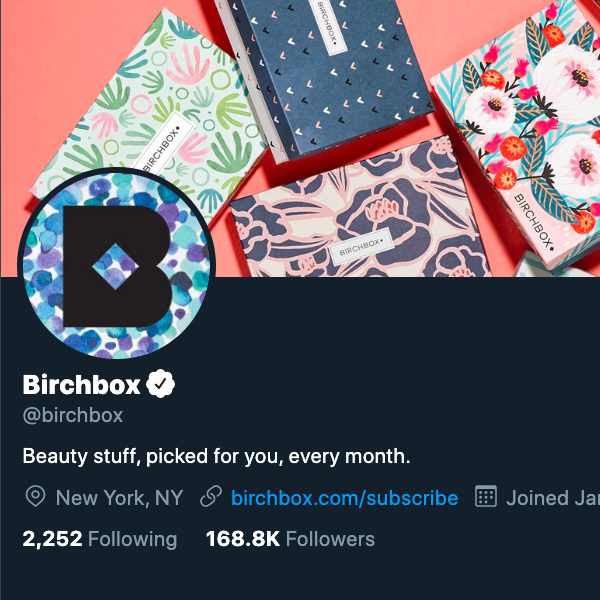
Your profile picture (or avatar) is, along with your handle, your online identity. It is the part of your profile that will be seen outside of your profile page, acting as a signature for your posts. This is why profile pictures are generally small, to give more attention to your actual posts. With that in mind, focus your avatar on simplicity. Some brands can get away with using their entire logo if it’s legible at a tiny size. Many brands will instead opt for an abbreviated version (either the first letter in the brand name or the logomark by itself). Backing this version of the logo with a bold color or pattern can help it stand out. Also keep in mind that although dimensions are given in a square orientation, most platforms use circular avatars.


Cover image design
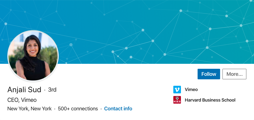
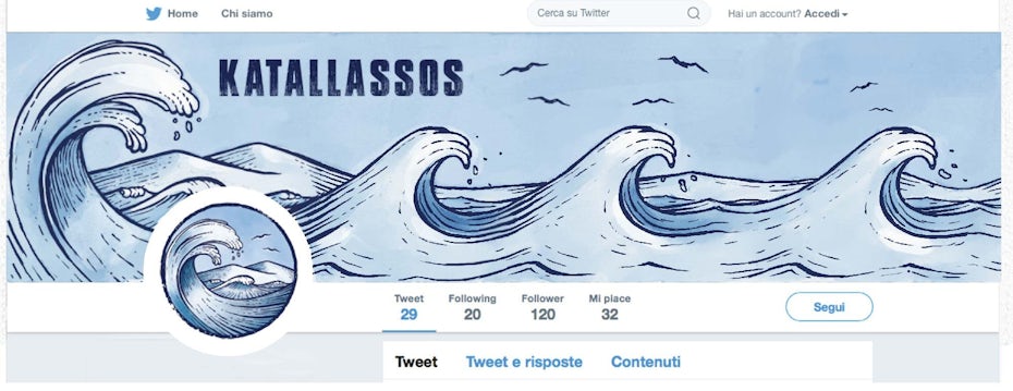
Although not all social media platforms include cover images, it is common enough that your design strategy should account for one. The cover image is the wide, rectangular banner that sits at the top of your profile page. It shares an intrinsic relationship with the profile picture—they are commonly positioned together. In some ways, you can think of your cover image as the expansion of your profile picture, the space in which you can fit more text, photos and graphics.
Many cover image designs go as far as to have the graphics of each literally interact with the avatar, as in the line of color that is sustained from cover image to avatar in the No Co Facebook design. Just be careful with this approach—while clever, it can be a lot of effort for something that is essentially a gimmick and will break when your profile layout is rearranged for smaller screen sizes.

 .
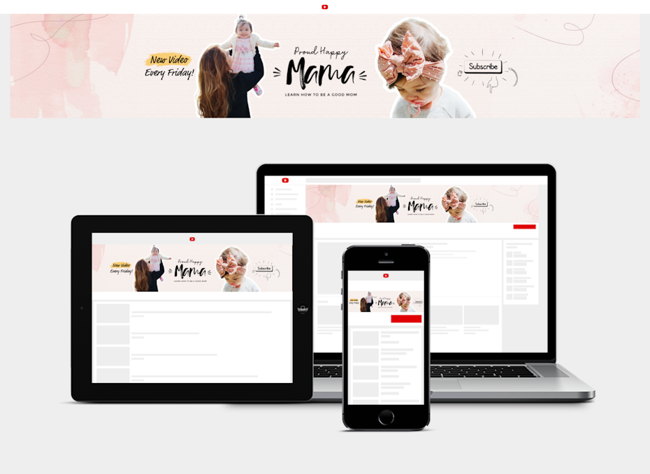
.Although there is more space to work with compared to the profile picture, this is not an excuse to design a busy, over-the-top cover image. As a banner, your cover image does exist for visual impact, but it is also an advertisement, highlighting what sets your brand apart. It is also the perfect space to display additional contact info, such as your website address, phone number or other social handles. All in all, it should deliver a focused message about who you are, and clutter will dilute that message. Consider minimalist imagery that captures your brand values. For example, the Kathryn Mueller YouTube design uses bright and friendly pastel pinks, circular shapes, and a photo of the trainer in workout wear to tell you that this is a woman owned and operated fitness brand focused on wellness and balance.

Profile page layout design
Although the profile page layout is generally dictated by the social media platform and the day-to-day content you publish, you still have some control over how your page is presented. This part of the design process does not involve creating social media graphics, but it does involve the use of spacing and alignment to make your content accessible for users.
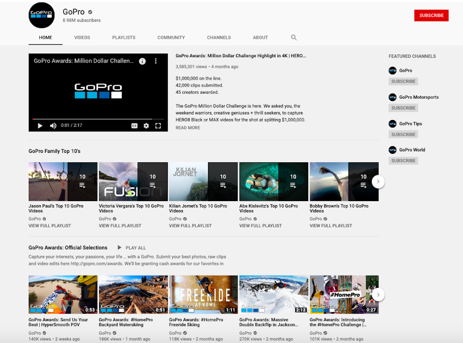
YouTube is an example of a platform that gives you more tools to customize your profile page. One convention is to pin a channel trailer to the top (explaining what your content is about), following that with a feed of recent uploads and following that with blocks of curated video playlists. Similarly, Pinterest is built on the ability to organize content through boards (and sub-boards). Whatever the platform, take the time to arrange your page so that the most important content is up top and that featured images (if applicable) convey the nature of grouped content.


Even with platforms like Instagram and Facebook that display your recent posts in chronological order, with no options for customized profile display, you can still plan ahead for how your day-to-day content will display on your page (more on that later).
Platform-specific profile branding
The great thing about social media is the amount of versatility that exists between platforms. Each social media app has their own unique approach to design and the way they distribute content. So while most platforms share common design categories such as avatars and cover images, each individual platform might have extra profile designs you’ll need to account for.

For example, your social media branding for Twitch will include an offline image (a static graphic that is shown on the video screen when you are not currently live) and screen overlay images (branded graphics that are overplayed on the screen when you are live). On YouTube, you will need to plan for a channel trailer, branded video thumbnails and lower thirds. Make sure to spend some time testing out the profile pages and reviewing those of your competitors on the specific platforms you plan to use ahead of time, and take advantage of these extra branding opportunities.
5 guidelines for social media content design
—
Content is what social media is all about—it’s where you share media and engage with your followers on the day-to-day. While it is worthwhile to give your profile page design plenty of attention, all of that effort will be wasted if your content designs fail to impress.
The nature and design of content will vary depending on who your brand is, what your business does and what your goals are, but the following are general guidelines to help you create social media graphics to earn you followers—and keep them.
1. Design content in a way that is useful for your followers
You would think that tailoring the content to your audience would be a no-brainer. But given that social media is designed for publishing your words and your pictures, it can be tempting to make it about you: consider the criticisms around selfies and projecting a curated life. Your audience chose to follow you for a reason. Whether it’s for information, entertainment or inspiration, your job is to give the people what they came for. Content design, likewise, must be more than visually appealing—it has to be useful.

Here’s an example: you know that most people are following your brand to be notified about sales and promotions. You decide to make a social media event out of a promotional campaign with a special logo, content and ad designs, as Del Marva does with their blood drive. In their case, the bright orange and cascading pineapple pattern make it clear that this is a celebratory event (while also helping the content to stand out in the feed). But Del Marva also uses clear, bold typography supported by bright banners that contrast the background to highlight pertinent information such as the date and how to participate. This is a post that is designed to not only be eye-catching but to compel a viewer to save it or share it with a friend.
2. Incorporate different types of designs in your content
Content variety has to start with your strategy. Your posts should cover various topics (such as behind-the-scenes business content, customer highlights, promotional materials, etc.), but you should also look for and create opportunities to accommodate different design styles to keep your feed dynamic and engaging.

It helps to know what different design styles excel at. Flat design characters and colors are useful for infographics (the vertical or swipeable variety) that convey information or tell a story. Hand lettered typography can be great for inspirational words that people might be compelled to share or for questions that people might be compelled to comment on. Photography is a chance to showcase real people and real products—you want photos to look professional, but resist the urge to over-filter and lose that authenticity.
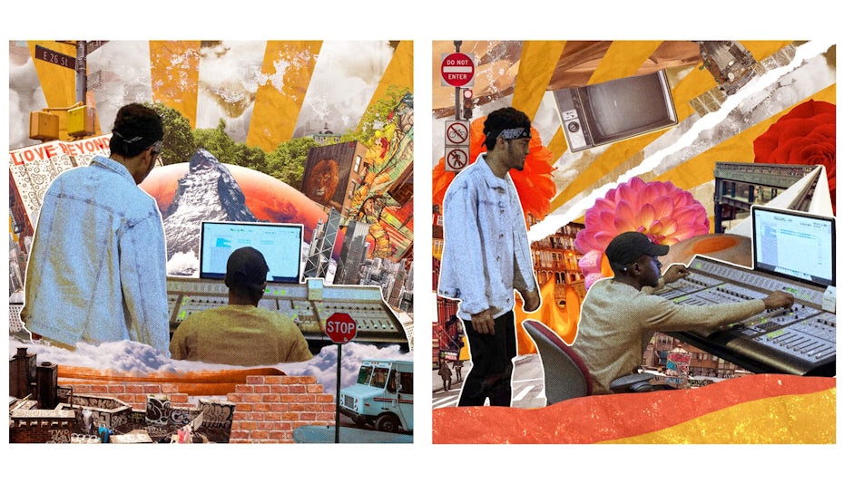
One of the best ways to create variety is to involve your followers in your social media strategy. Consider crowdsourcing methods, like hashtag contests or social media takeovers. This might result in content that is visually inconsistent, but it will be consistent with your brand because it stems from your customers, whom your brand ultimately serves.
3. Balance individual content with your overall profile page
Even as you vary your design content, keep in mind that for many platforms a chronological feed of your recent posts will appear on your profile page. As mentioned in the previous section, your profile page needs to be visually consistent in order to function effectively for branding purposes, and your posts shouldn’t detract from that consistency. It all comes down to a balancing act: your content must be individual, with its own goals and targeted segments of your audience, but it must also contribute to the collective whole of your social media design. The key is branding—design varied content but keep each piece in line with the core principles of your brand guidelines.

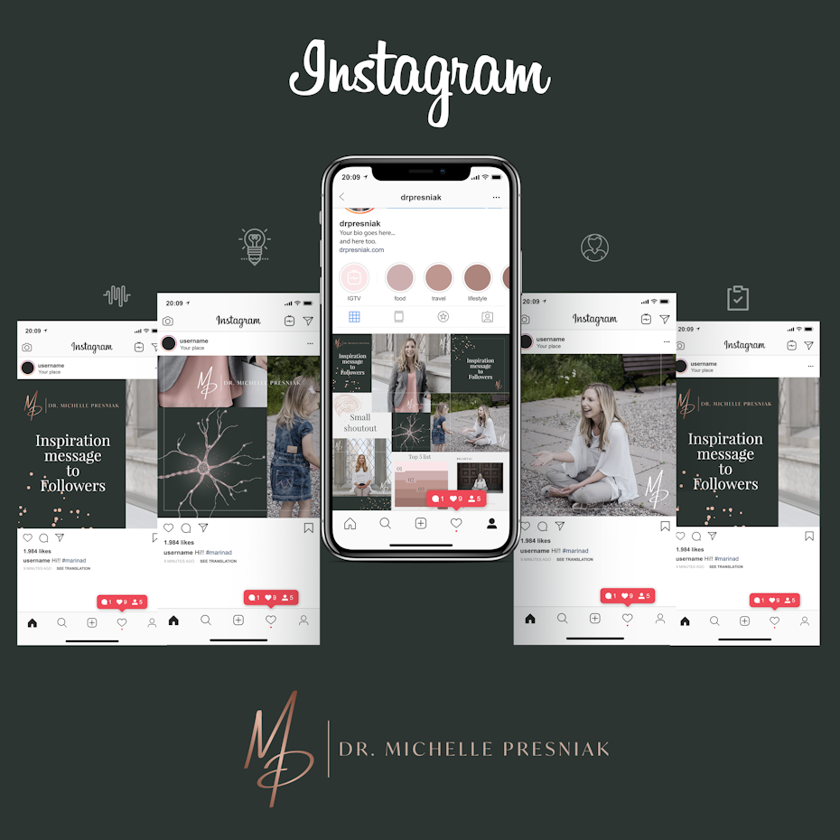
Some brands go as far as to plan their chronological content in a way that it connects to form a cohesive page layout. This works especially well with Instagram which reliably arranges content in three-column square grid on the profile page. By publishing designs with similar styles every three posts, you can set up columns that create a cohesive aesthetic when people are viewing your profile page. On the downside, this method can restrict the types of content you are able to post, lest you break your overall page design. For the most part, you have more design options and opportunities for expanding your content by letting your feed be organic but visually on-brand.
4. Design themed content and templates
Although it might seem ideal to have all of your social media content be surprising and original, often this is not practical or even necessary. Designing templates for some of your posts not only allows you to create content in a speedy and scalable way, it also establishes easy visual cohesion. This convention can be especially helpful for recurring design images like YouTube’s video thumbnails. On the one hand, you want the thumbnails to be unexpected and to make viewers want to click on them. But because the meat of the content is the actual video, it doesn’t make sense to spend time and energy crafting unique thumbnails from scratch every time.
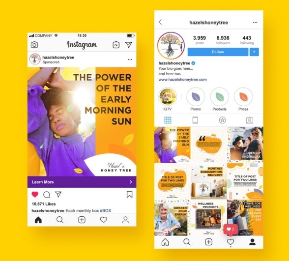
 account create a cohesive and engaging design
’Template’ can sometimes be a dirty word in design, synonymous with boring and generic. Think of these instead as design roadmaps that allow you to skip some of the brainstorming, sketching and trial-and-error of the design process. And you can still vary the templates with each post by changing up the specific imagery or color. At the end of the day, there are times when templates are important for speeding up your design pipeline so that you can give more important content the attention it deserves.
5. Adjust your design based on analytics
Social media moves fast. The minute you post something, you are sending it into a stream to sink or swim with other content posted every other minute. The good news is that the speed with which social media moves gives you fast results. Most content has a lifespan of a few hours to a day or so at most (in which you get the bulk of your impressions, likes and comments). With this in mind, you can test, quickly know which designs work and don’t work and adjust your design strategy accordingly.

From a numbers standpoint, what defines a successful post depends on your own particular following. It is helpful to create benchmarks based on your best and worst performing content to have a sense of metrics that indicate success or failure within the context of your other content. Keep in mind that there can also be other factors in poor content performance—such as the time of posting, the ever inscrutable algorithm, real world events that might have your followers’ attention elsewhere, or plain bad luck. A/B testing is one useful tool that can help you rule out flukes or decide which design variants are the best option. In addition to the platform specific analytics (that usually reveal things like impressions, views and watchtime in the case of video), tools like UTM codes added to your CTA links will let you know which specific posts earned traffic.
The power of social media design
—
Social media is a highly competitive arena, and it takes a great deal of planning and hard work to succeed, both on the content and the design front. But the results are worth striving for. Not only is social media excellent for attracting leads, converting customers, and all around brand awareness, it’s where you get to have real interactions with people. At the end of the day, it’s called social media because it’s supposed to be fun.
The best way to ensure your social media presence is primed to spark a conversation is to work with an expert designer. Good design can convince followers to stop scrolling and pay attention to what you have to say. It can make your messages useful and easy to digest. It can demonstrate your professionalism and commitment to quality. If you want the kind of social media graphics that get your followers talking, an expert designer is only a click away.
The post The complete guide to social media design appeared first on 99designs.
The complete guide to social media design posted first on https://www.lilpackaging.com
No comments:
Post a Comment