When it comes to emails, there are really only two ways to go: the good way, with emails that excite prospective and existing customers, and the bad way, with emails that do nothing but annoy those who receive them. Often, the only thing that separates the two is great email design.

Email design is your chance to get your subscribers’ attention. People today expect more from emails than just a wall of text and uninspired images. They want masterfully designed displays on the same level as a web page that are personalized to their specific interests. It’s not an easy feat for businesses and designers to accomplish, but it’s the price of admission for the marketing channel with the highest return-on-investment.
As you embark on your own email marketing journey, you’re probably wondering what makes good emails and where you can find email design inspiration. We’ve got you covered! Here, you’ll find 31 of the best email designs along with an analysis of what they do right in a series of simple, actionable tips and best practices.
Dazzle readers with artistic photography and effects
—
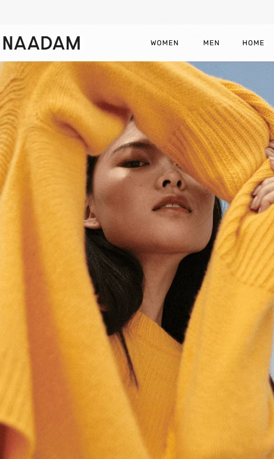
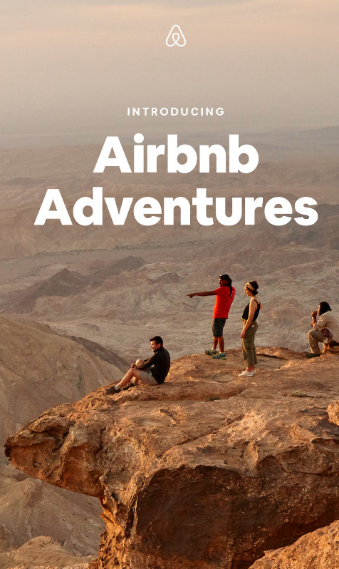


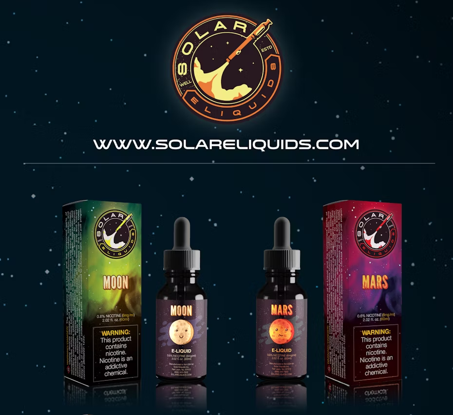
Dazzling photography is something you might expect from Naadam, a fashion company, or from AirBnB, which focuses their branding on adventurous experiences and creating memories that will last a lifetime. But with the right eye for photography, anyone can take advantage of this technique, even a construction company like Anderson.
Likewise, Swag Jeweller’s animated snowfall effect serves the same purpose. It’s pleasant to watch, calming, even, the kind of emotional response that only yields positive actions for your email campaign.
Create a mood with imagery
—
In the same vein as artistic photography, the imagery in your email can create the right mood or atmosphere. Rather than eliciting a specific emotion in your reader (“this makes me happy,” “this makes me hungry,” etc.) atmospheric imagery is more about how people interpret your brand.
The images you use in your emails can influence how people perceive you; while artistic imagery might help with the performance of a current promotion or individual call-to-action, atmospheric imagery is more about the long-game, helping to build the right brand associations and encouraging brand loyalty and recognition.
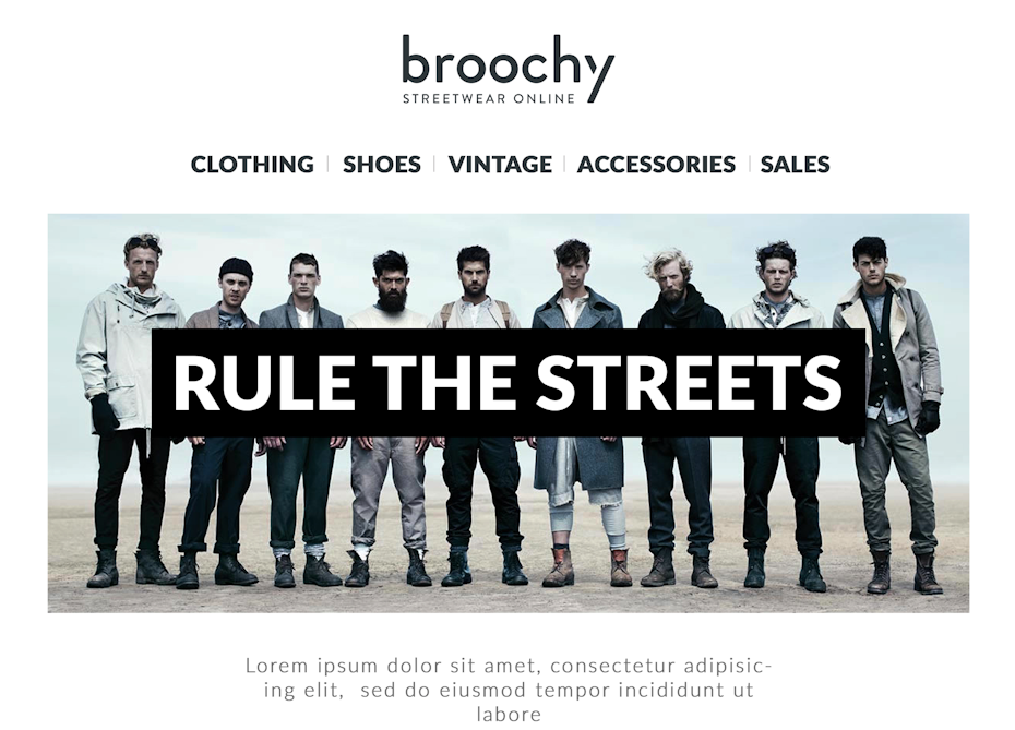
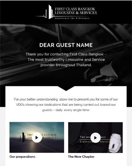
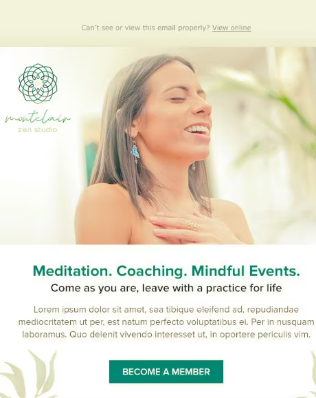
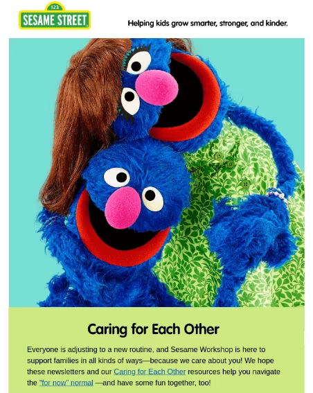
It makes sense that a limousine services company would choose sleek, black imagery, which denote sophistication, elegance and power. Likewise, a spa wants to evoke feelings of serenity, accented by the soft focus, misty white overlay and the focal point of a woman relaxing. And while Sesame Street is already known as a compassionate and loving brand, every little bit of bright and cheerful imagery helps reinforce that reputation.
Use humor and charm
—
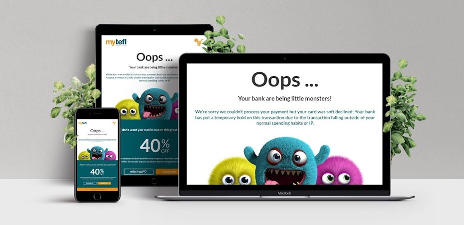
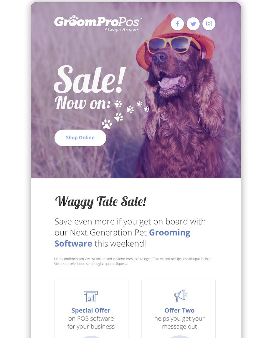
There are other tried-and-true email design ideas for evoking an emotional response. Humor and charm are two common ones. While the comedic timing of your knock-knock joke may not translate into email, all you need is a funny or cute picture to capture your reader’s attention. These include memes, animal pictures and cartoons—the types of images you might see in your social media feed.
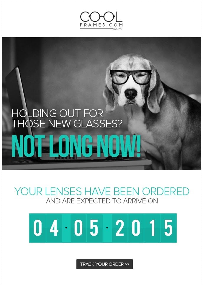
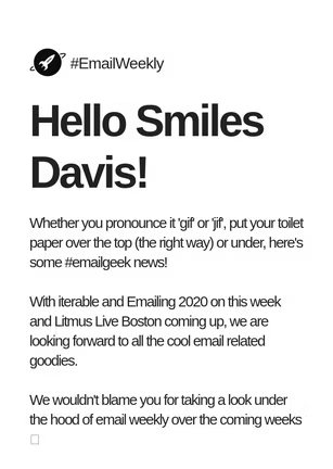

But tread lightly! Comedy isn’t always easy to use in marketing because everyone has a different sense of humor. Your best bet is to use general humor that’s easy for everyone to laugh at, such as children doing funny things or, as with Cool Frames, funny animal photos.
If you’re unable to think of a joke (or your industry is on the serious side), you can still capitalize on cutesy charm. Cartoons like the one used in the Confluence email design cast a wide net, and while they don’t evoke emotions per se, they do put the reader at ease and help them enjoy the email rather than scrutinize it.
Focus on a central image
—
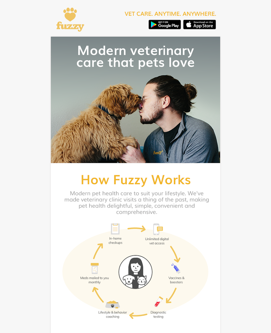
Unlike newsletter design that can have multiple features or calls-to-action, more direct promotional emails work better when honing in on one central idea. What that one idea is may vary—could be promoting a single product, offering a single coupon code or perhaps showing off a single video—but the important thing is that all other distractions are removed. Building your email design around one theme funnels all attention there, and the best way to tie everything together is with a key representative image.
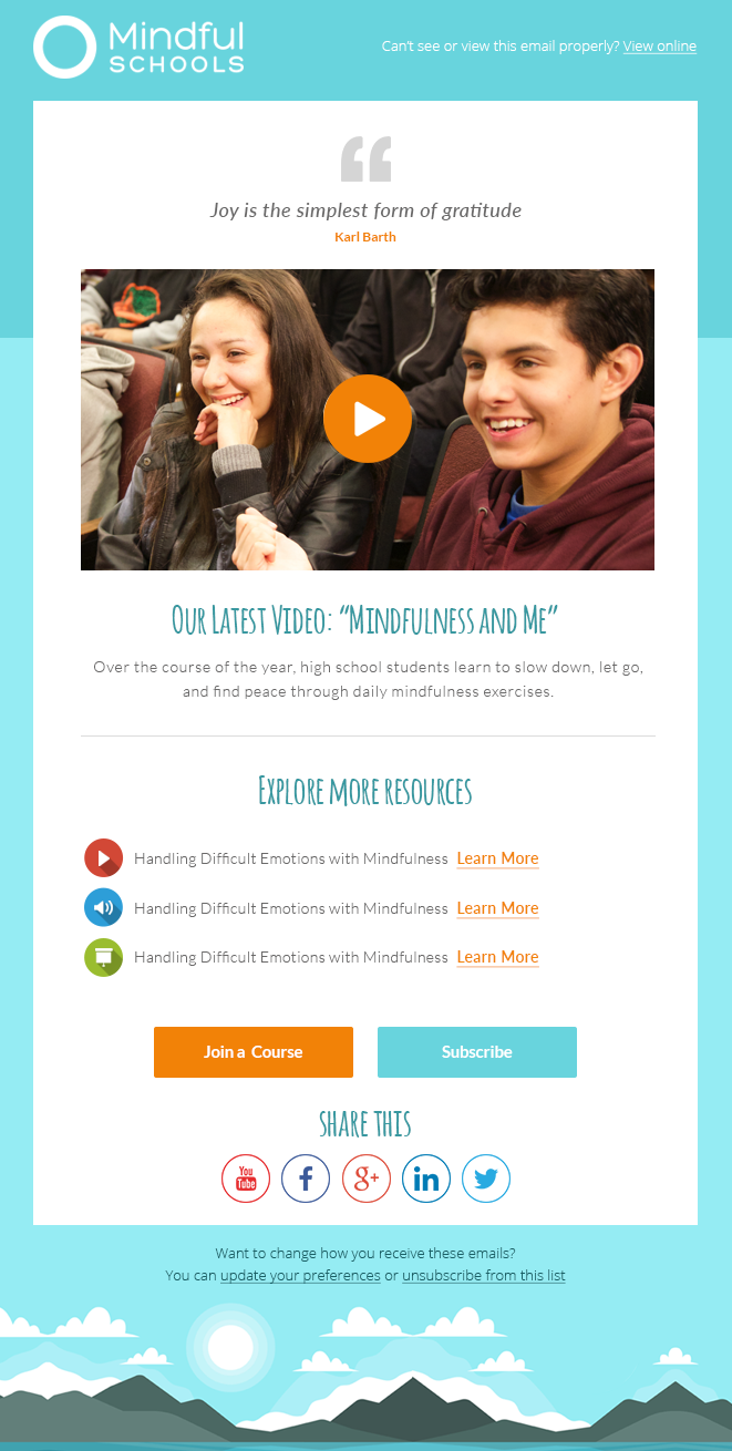
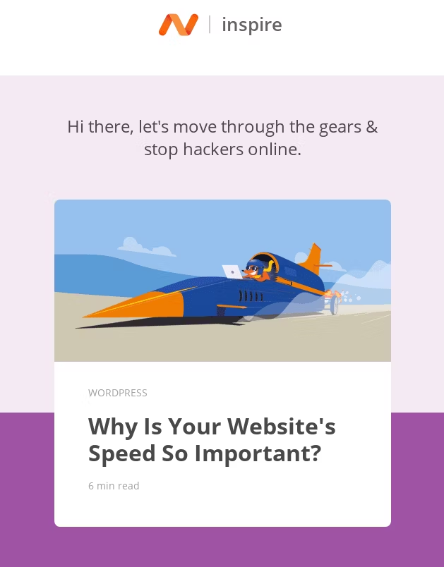
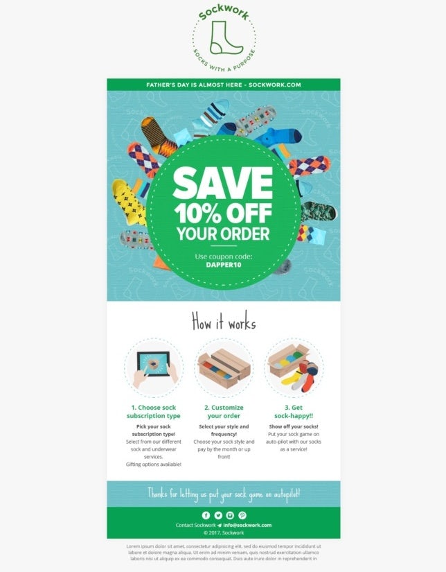
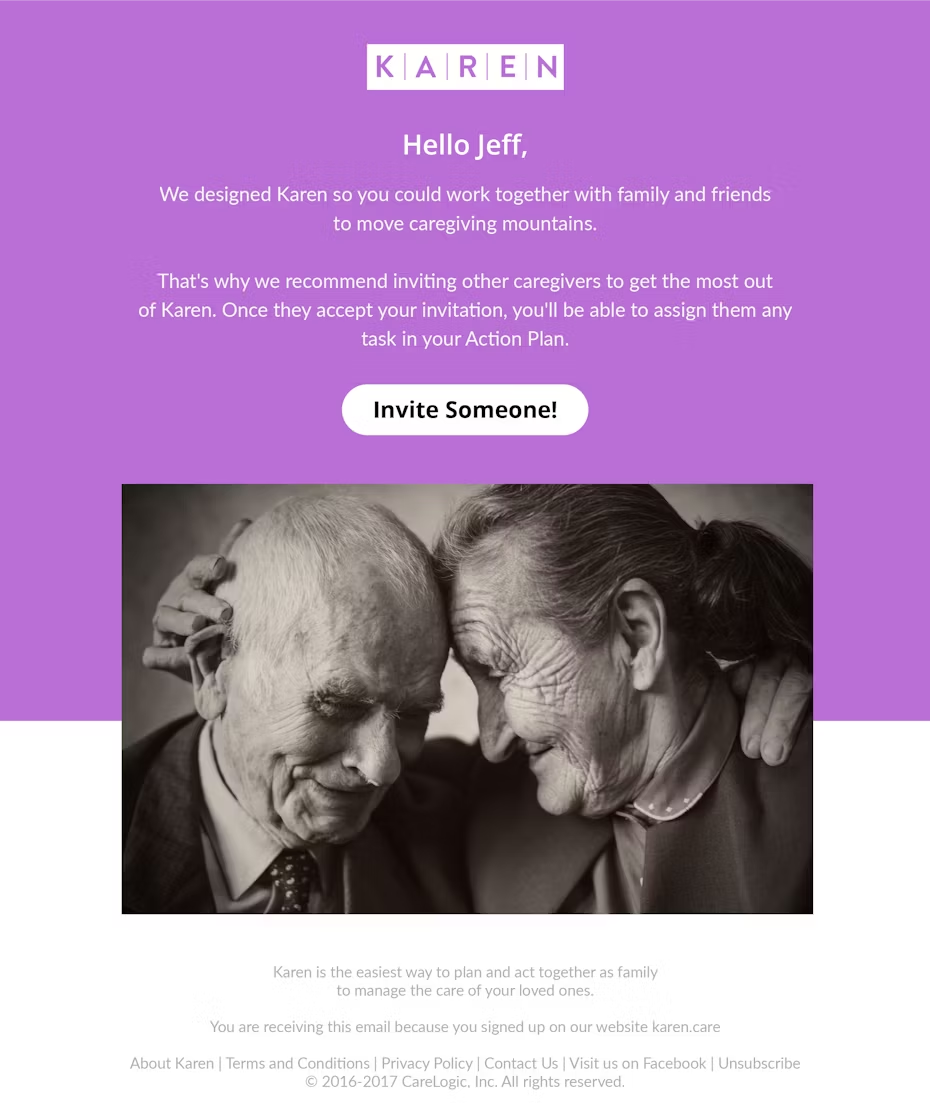
For Sockwork, the central idea is a product; for Inspire, it’s the article’s image; for Mindful Schools it’s a video and for Sockwork, it’s a textual sales pitch explaining the customer’s gain.
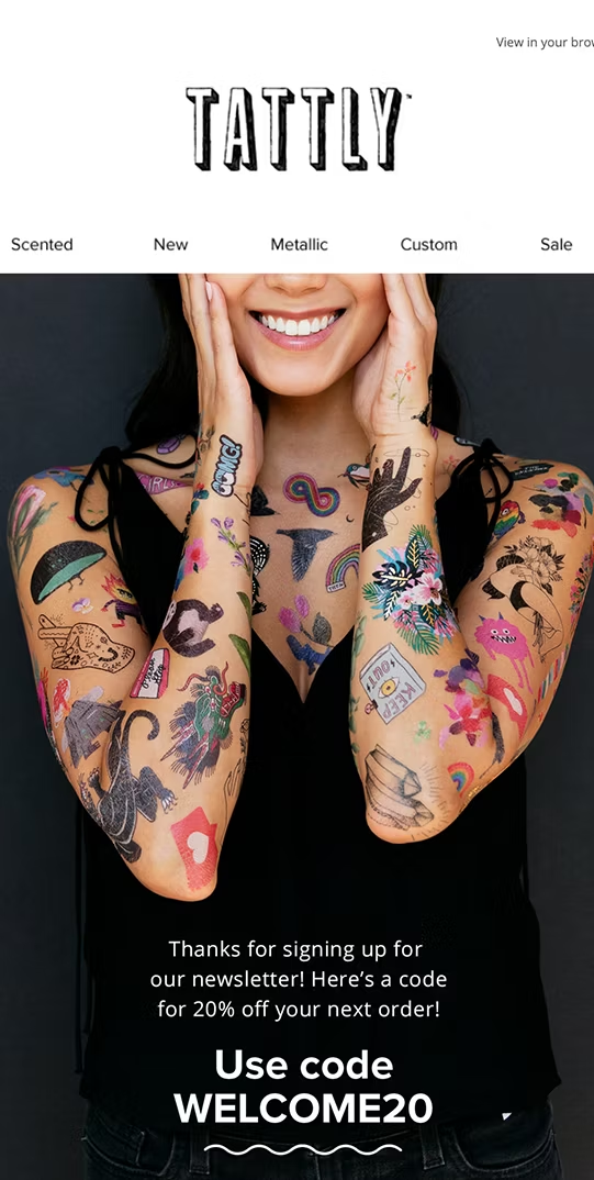
Tattly takes a slightly different approach—using a central image to grab attention first and then gently ushering the reader to the coupon code. While the picture itself doesn’t represent the coupon code, thanks to the email design they are still one-and-the-same.
Keep it interesting with vibrant colors
—
Most emails can be pretty dull, so let readers know immediately that yours is different. If we learned anything from the minimalism trend in 2010s web design, it’s that vibrant colors can do the heavy lifting when other visuals are scarce.
A common trend in current email design repurposes that same technique, using light and bright colors to keep your visuals stimulating. While there’s something to be said about the usefulness of dark colors (as found in the limousine email design above), if your goal is merely to make your email look fun and casual, light colors are the way to go.
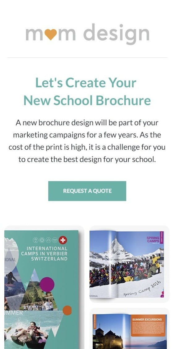
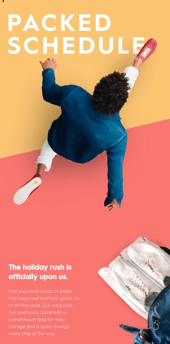
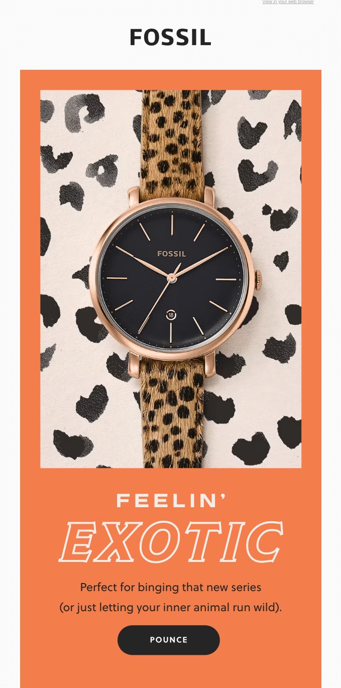
The email design of Mom Design shows how vibrant colors can carry minimalist layouts—it’s hardly more than a plain-text email, but the bright turquoise background, header text and CTA button elevate its appearance to the same level as the other email design ideas in our list.
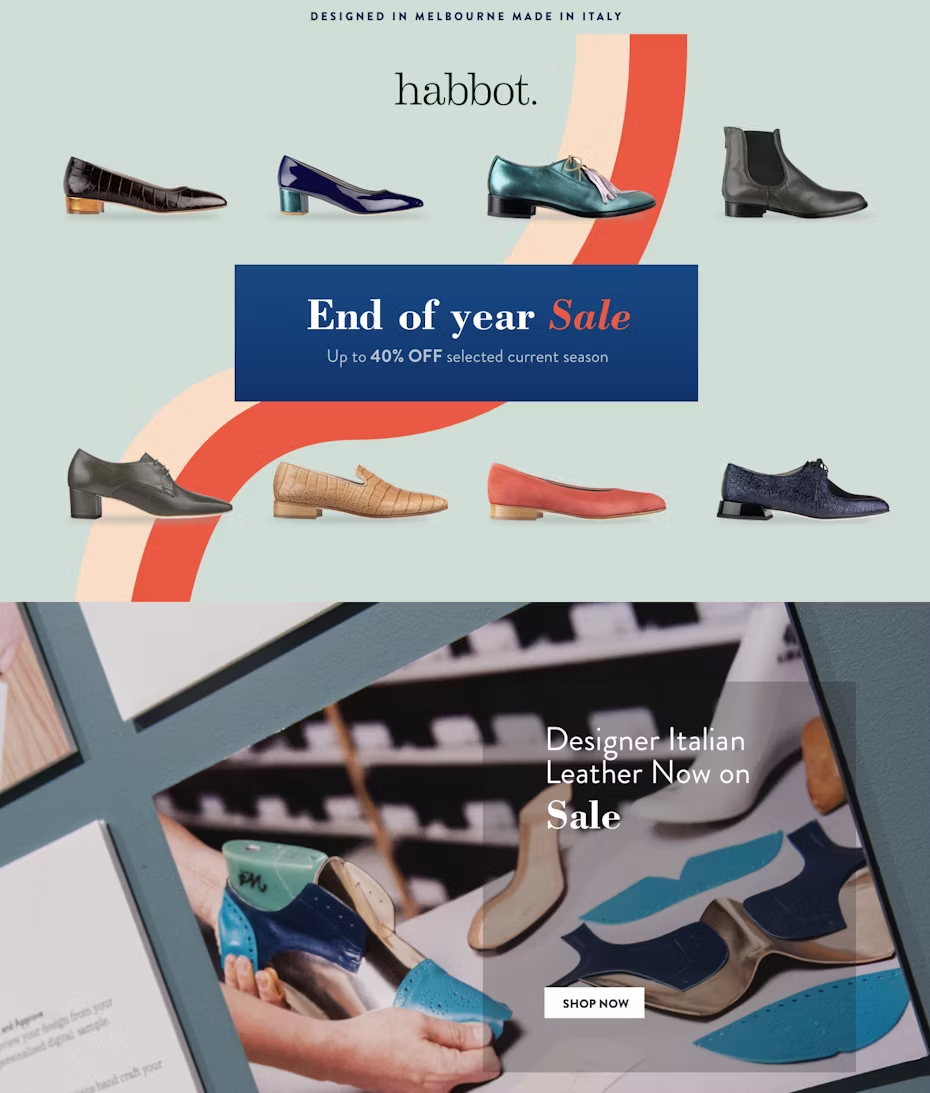
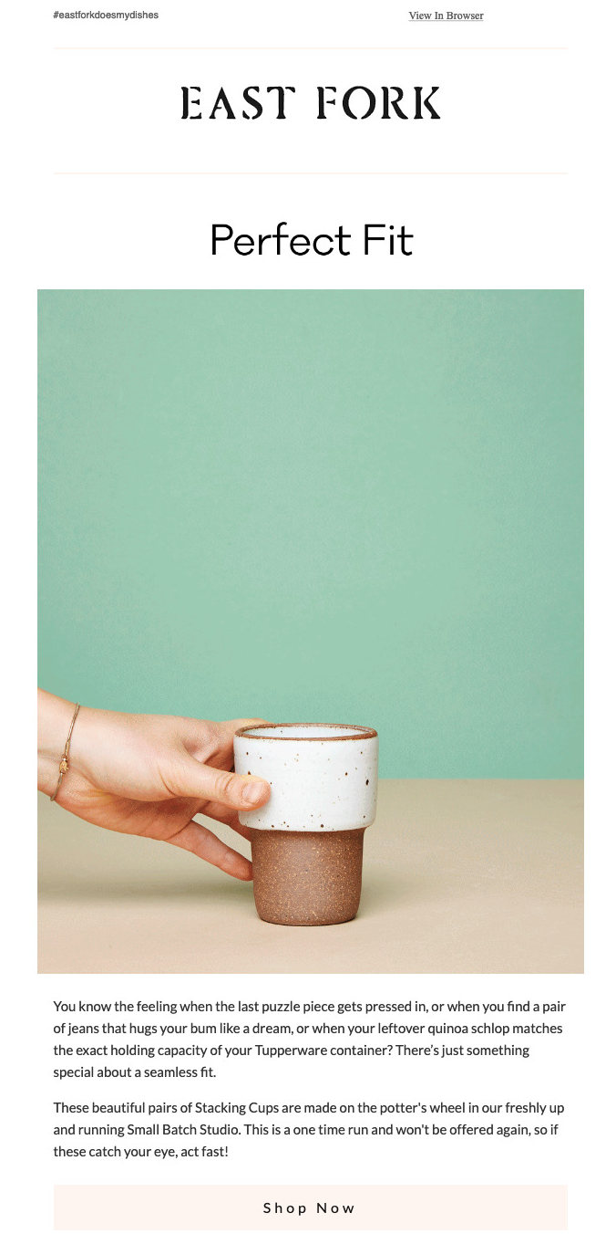
East Fork, Plae and Fossil take it a step further, incorporating vibrant colors directly into their artistic photography, combining two expert techniques for extra effect.
Experiment with typography
—
When done right, typography is a visual element on par with any photograph. Playing with the font, size and color of your words can help you influence what your readers notice—or don’t notice, in the case with the obligatory “view in browser” links. Just like vibrant colors, playful typography can help email designs look their best in lieu of more poignant photography.
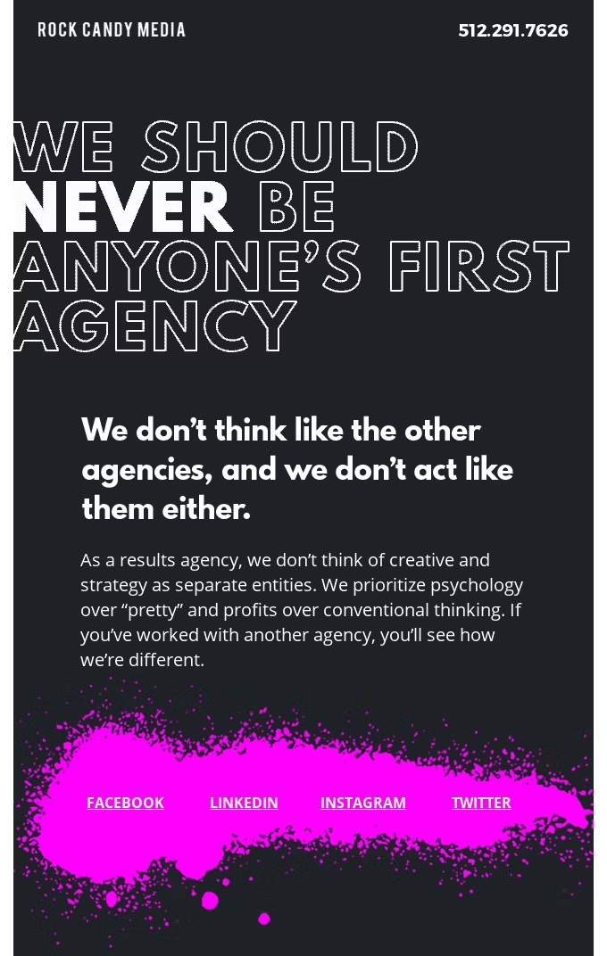
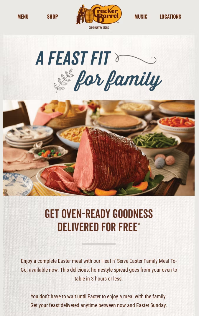
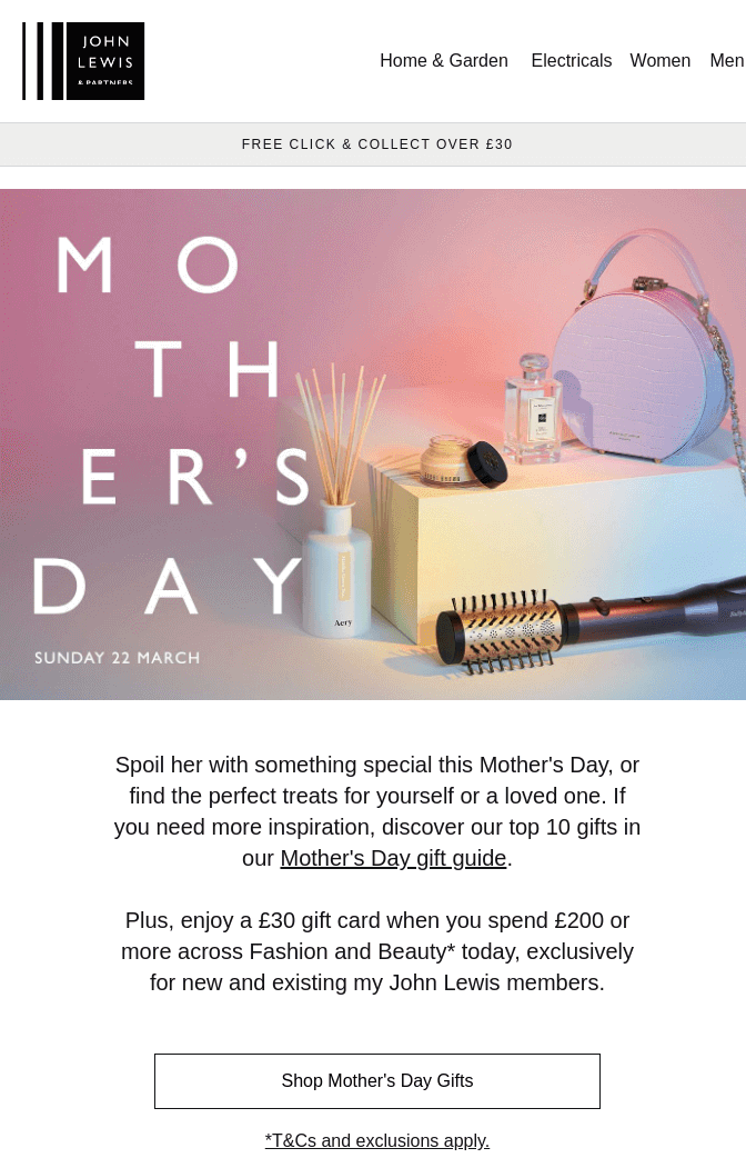
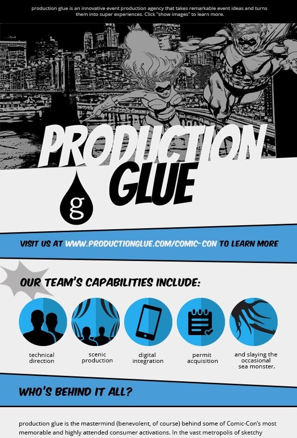
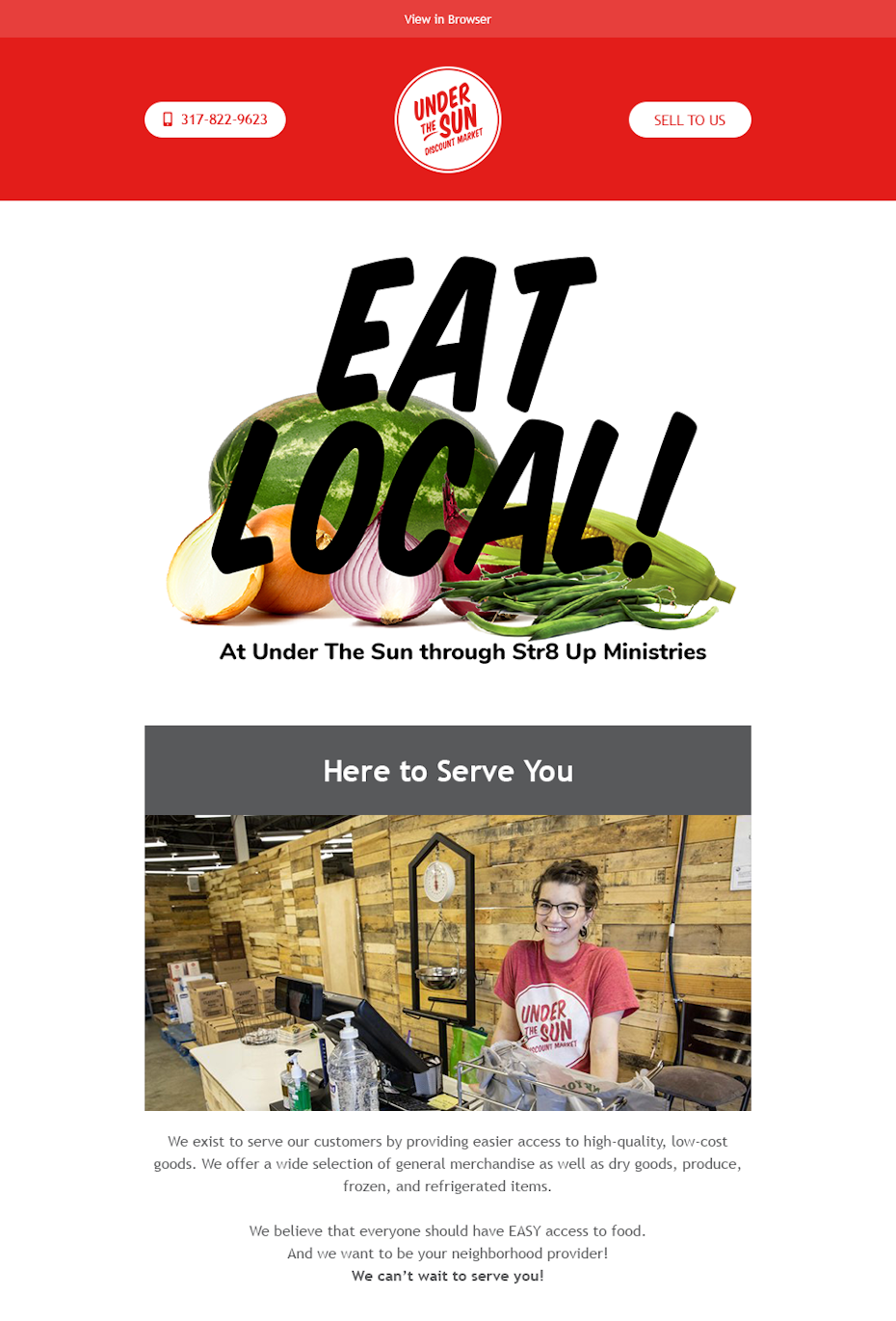
One of the basic typography techniques in graphic design is to highlight operative words. In the case of Rock Candy Media, highlighting “never” accentuates the meaning of the message. Sometimes you can use typography just to spice things up as John Lewis and Cracker Barrel show us.
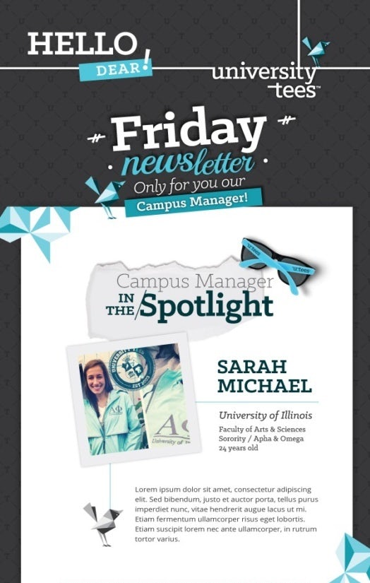
More experienced designers can even integrate typography into the overall layout and visual flow. University Tee’s flamboyant lettering connects into the other graphics, the background and even the layout itself with strategically overlapping layers and extended stems acting as leading lines to segment the email.
Better email design for better business
—
Considering the statistics we mentioned at the start, you can see how better email designs lead to better responses from readers, which in turn lead to better conversions, click-throughs, brand reputation and sales.
To make the most out of your email campaigns, hire a freelance designer who specializes in email design. Or get a custom email template that you can reuse over and over again by plugging in new content—ideal for brand consistency.
The post 31 stunning email design ideas that will have customers clicking appeared first on 99designs.
31 stunning email design ideas that will have customers clicking posted first on https://www.lilpackaging.com
No comments:
Post a Comment