Right now, astrology’s hotter than a Leo’s love affair with themselves. Everybody’s finding ways to understand themselves better using their natal charts as their guides. No wonder the astrology industry is trending these days—resulting in heaps of beautiful astrology design.
Spanning everything from spiritual consultancy to podcasts, apps, books and more, the number of astrology brands commissioning creative work on 99designs has grown 209% since 2015, and in the past 12 months increased sharply by 127%.
If you’re an astrology brand (or even astrology-adjacent), you’re part of the astrology revolution and right now, the stars are perfectly aligned for you to get some amazing new design. Learn how to make the most of it here.
Why is astrology so popular now?
—

Astrology’s been around for millennia, and it’s easy to see why—when you look up at the night sky, you see something that’s incomprehensibly larger than yourself. Yet, you’re part of it. You’re part of this ever-sprawling, mind-bogglingly gigantic universe.

We have a natural need to feel like we’re part of something cosmic, something infinite—this is why we’re still looking to the stars for insight to our own lives today. It doesn’t matter how far science advances; people look to astrology to find the answers science can’t provide. This is why all things astro are enjoying a surge in popularity right now, especially among Millennials and Gen Z, two generations who have access to more information than any generation that’s lived before.
When you look at larger trends, astrology’s popularity surge right now makes sense. Millennials and Generation Z are less religious than older generations, but they have the same need to reflect on themselves and to feel spiritually connected to others. So they turn to astrology and other avenues for self-care like biohacking, meditation and earth-based spiritual practices.
What kinds of brands make up the astrology industry?
—
While many people treat it as a personal practice, astrology is an industry. Astrologers follow the skies to let the world know when Mercury’s going retrograde, websites then publish those reports so the rest of us can start to understand what it all means, new age shops sell crystals and tarot cards and colored candles to support the different signs and apps give you your personal daily horoscope.
The astrology industry is huge and includes:
- Books (and publishers)
- Websites
- Podcasts
- New age shops
- Apparel and jewelry
- Astrologers
- Apps
- Youtube channels
Brands in the astrology industry have a lot in common with brands in other lifestyle industries. Their consumers tend to be individuals who are seeking self-actualization, balance and a more mindful approach to their daily lives. They like visibly displaying who they are—Millennials and Gen Z place a huge value on self-expression and brands that treat them as individuals, rather than providing cookie-cutter solutions and services.

So how do you “do” astrology design?
—
In the 70s, astrology design had a definite look. Bold colors, wavy lines, psychedelic imagery—astrology was a key pillar of the era’s zeitgeist, so it was often paired with trendy design choices of the times.
But we’re living in the 21st century. Astrology branding doesn’t have to use every single color at the same time or feel like it came straight out of your hippie great-aunt’s attic. Maybe you want a clean, minimalist look for your daily horoscope app or an earthy look with wood tones and plant imagery for your moon-tracking Youtube channel discussing how the phases of the moon affect life on earth. In essence, designing for an astrology brand is more about designing for the individual brand than about creating a design that deliberately reads as “new agey.”
What’s your brand’s sign?
Here’s a fun exercise for finding the perfect design for your brand: figure out your brand’s sign. Forget your brand’s “birthday” — that doesn’t matter here; look at your brand’s traits to see which sign you align with best.
Maybe your brand is adventurous, resilient and fun—a podcast that discusses the best travel destinations for people based on their signs. That podcast sounds like a Sagittarius, the sign that experiences serious wanderlust, so you might choose a design that incorporates arrows, bold colors and dynamic shapes.

Or maybe you’re designing a banner for a book that illustrates the best fitness routines for each sign based on their motivations, challenges and the body parts they rule. Everybody can use a little motivation to hit the gym more, and Aries is a natural motivator. With that in mind, a great design direction for your book cover and the illustrations inside might be lots of reds and other warm tones, thick impact font and images of glistening people putting their all into reaching their fitness goals.
If you’re not sure which sign correlates best with your brand’s traits, take a look at an online astrology guide like astrostyle.com. If you’re not sure which shapes, colors and fonts correlate with specific brand traits, check out our design resources on working with them effectively.
Be dreamy
Astrology is part science, part art. It’s touchy-feely and flowy and often, more about interpretations than hard facts. Muted, pastel colors, rounded shapes and illustration-style images are effective ways to show that your astrology brand’s all about the calm, cool, reflective life.
If your brand’s a Pisces, soft and dreamy design choices may the best for your brand, but if the brand’s not a Pisces, that doesn’t mean dreamy is off the table. Any brand that’s calm, starry-eyed and focused on the feels can look stunning dressed in dreamy hues and flowy lines.


Go retro
Like we said before, astrology’s been a thing for thousands of years, but when most of us think of the last time astrology was “big,” we think of the new age movement of the 1960s and 70s. That often conjures up retro psychedelic vibes like repeating rainbow patterns, abstract shapes, earth tones and hand-drawn illustrations composed of geometric shapes with thick black outlines.


If your brand’s a bit retro, playing with 20th century astro design in your branding could be a fun way to differentiate yourself from the crowd of sleek, modern star searchers. It can be the perfect choice for your funky Aquarius brand or any other brand that has an established, even old-school feel like a vintage bookstore focused on new age and spiritual materials or an ecommerce shop that sells vintage astro novelties.

Color, color, color
Astrology is fun and dynamic, so a lot of brands in this space embrace bold colors and fun color combinations.

Every sign is associated with a color as well — these colors reflect the signs’ prominent traits. Once you’ve determined your brand’s sign, using colors associated with that sign can be an effective way to communicate your brand.
For example, mysterious, seductive Scorpio is associated with deep maroon and black, whereas responsible, down-to-earth Virgo is associated with green and dark brown. Following this logic and the exercise you did to determine your brand’s sign, you might choose brown as the main color for your dependable Virgo astrologer booth setup or a gradient of different shades of maroon for the background to your sexy Scorpio lingerie webshop.

Dots, stars and lines
While the average person probably knows their sun sign, it’s less likely they know their moon and rising signs and it’s even less likely that they also know anything else about their natal chart, like where the planets were placed when they were born, which signs are inhabiting each house in their chart and how the angles between the planets impact their personality and life.
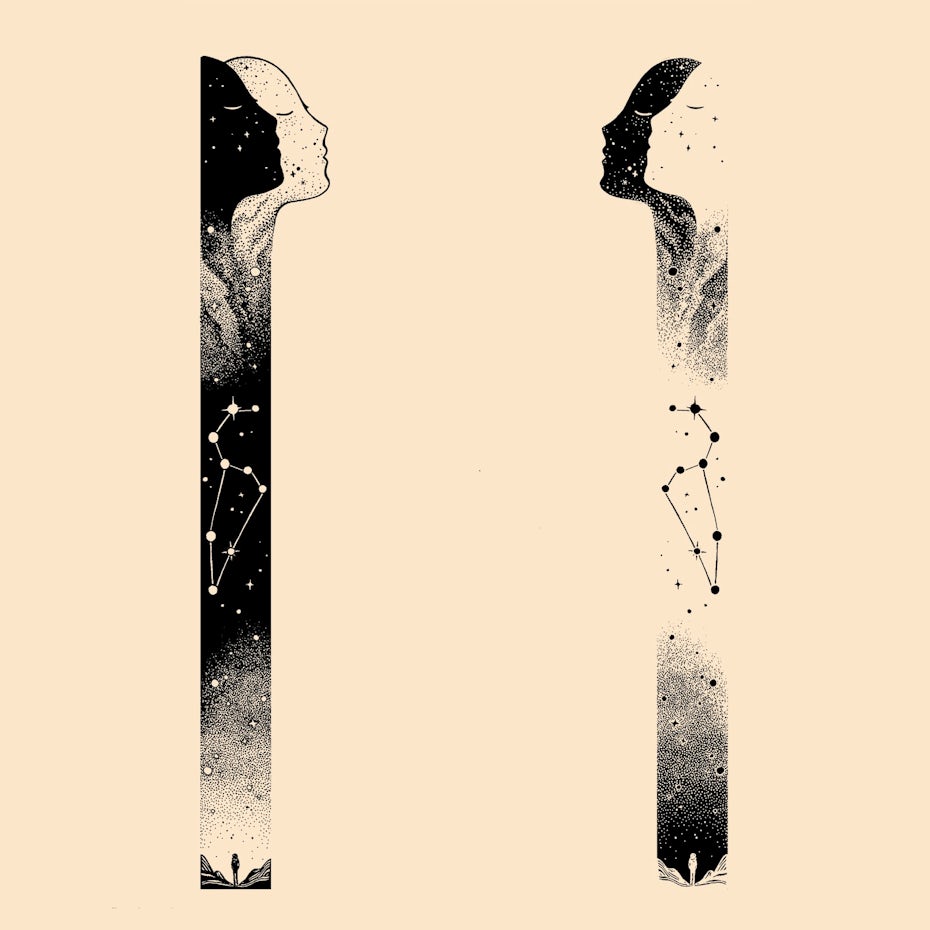

We’re not going to get into interpreting natal charts here because there are great sites for that, but you can pull design elements from natal charts to make your brand speak directly to the more advanced astrology fan. Instead of graphics that depict the signs as people and animals, use the glyphs for each sign and planet for a minimalist look in your design.
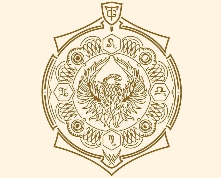
Other options for this kind of astrology branding are abstract geometric shapes that look like natal charts or constellations and patterns made up of dots.


Pull from other practices
Astrology is just one of the many, many metaphysical subjects you can study to gain a better understanding of yourself and the world. As an astrology brand, there’s a good chance your audience is into things like tarot, crystals, chakras and general “witchy” stuff. Embrace their other interests by bringing elements of them into your design.
For example, a great logo for a new age shop might have an image of The Magician tarot card standing in his signature pose with the signs of the zodiac making up a circular outline around him.
A design that incorporates elements from various metaphysical areas can show that you’ve got a wide variety to offer.


Your perfect design is written in the stars
—
No matter which sign best describes your brand, there’s a designer who can help you create otherworldly design to support it. Check out the talented designers on our platform to find the one who’s best aligned with your mission.
The post Astrology design: how to design for astrology brands appeared first on 99designs.
Astrology design: how to design for astrology brands posted first on https://www.lilpackaging.com
No comments:
Post a Comment