If you’ve spent any amount of time on the internet, you’ve seen memes. Memes are those captioned images that make jokes, express opinions, make comparisons and illustrate ironies. Think of “Doge,” “Success Kid”, Baby Yoda or the woman holding back her angry friend while an apathetic white cat sits at a dining table. Those are some of the most famous memes from the past two decades. But what happens when memes meet marketing?


Lots of famous brands—from BarkBox to Netflix—have used memes to build instant rapport with their followers by making them laugh. You can take it a step further by actually incorporating memes into your brand’s designs and marketing activities.

Memes are a cultural shorthand and a great tool for making points efficiently. But they’re also limited. You can’t just nab a meme template and make it mean whatever you want. You have to work within that meme’s “rules” to execute it properly.
If you’re thinking about working memes into your marketing, here’s how to do it right.
What is a meme?
—
Memes are the images you see repeated over and over again online, often captioned with white Impact font outlined in black. Usually the image or caption changes to make a joke or a witty observation.


The word “meme” was coined by author and evolutionary biologist Richard Dawkins, who defined it as “an idea, behavior or style that spreads from person to person within a culture.” Memes have been around forever. Thousands of years before the internet, memes showed up in art, graffiti and even architecture.
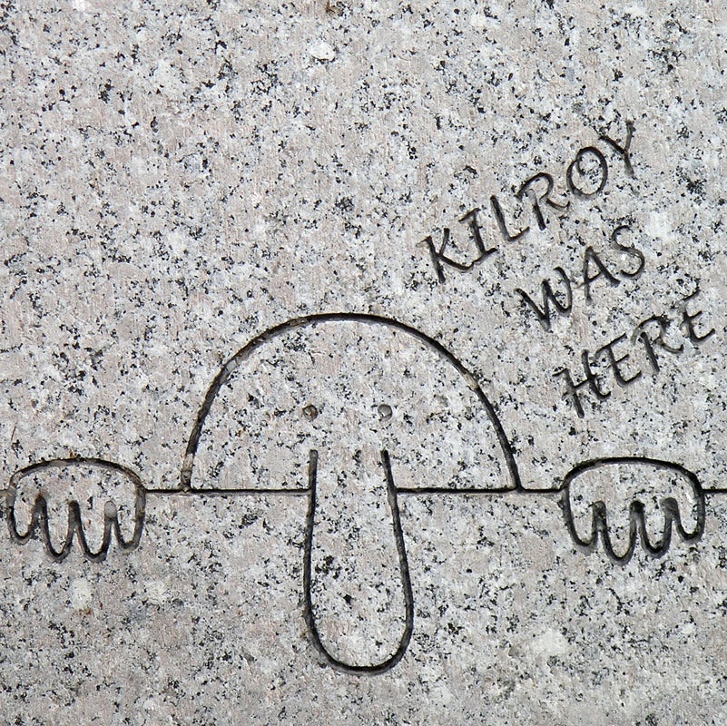
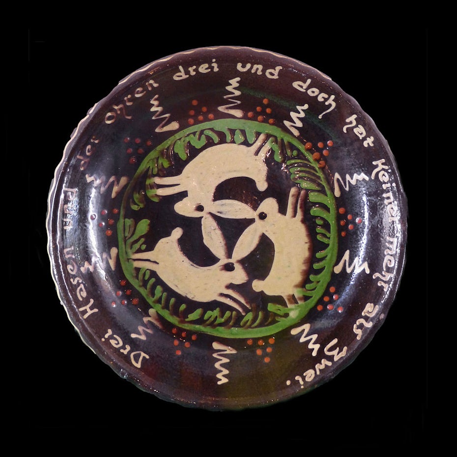
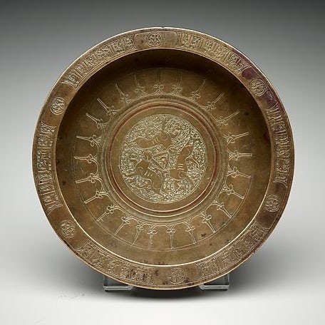
Like any other piece of pop culture, memes have life cycles. A meme originates somewhere on the internet and if it strikes a chord with people, they share it over and over again, adding something new each time, until it reaches its saturation point. Remember how Baby Yoda dominated your feeds last December? That was Baby Yoda’s saturation point. And when you see less and less of a meme, it’s on the decline.


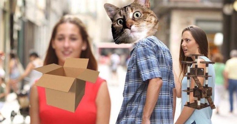
Most memes die eventually, but some, like the distracted boyfriend, have wormed their way into our lasting lexicon.
How to use memes in marketing
—
You can use memes almost anywhere. Email templates. Social media banners. Postcards. T-shirts. Flyers. Ads. Greeting cards. Presentations. Swag. And if you’re brave, you can even include memes in your logo. No matter where you use them, memes are an easy way to make your designs and marketing more fun.
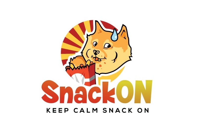
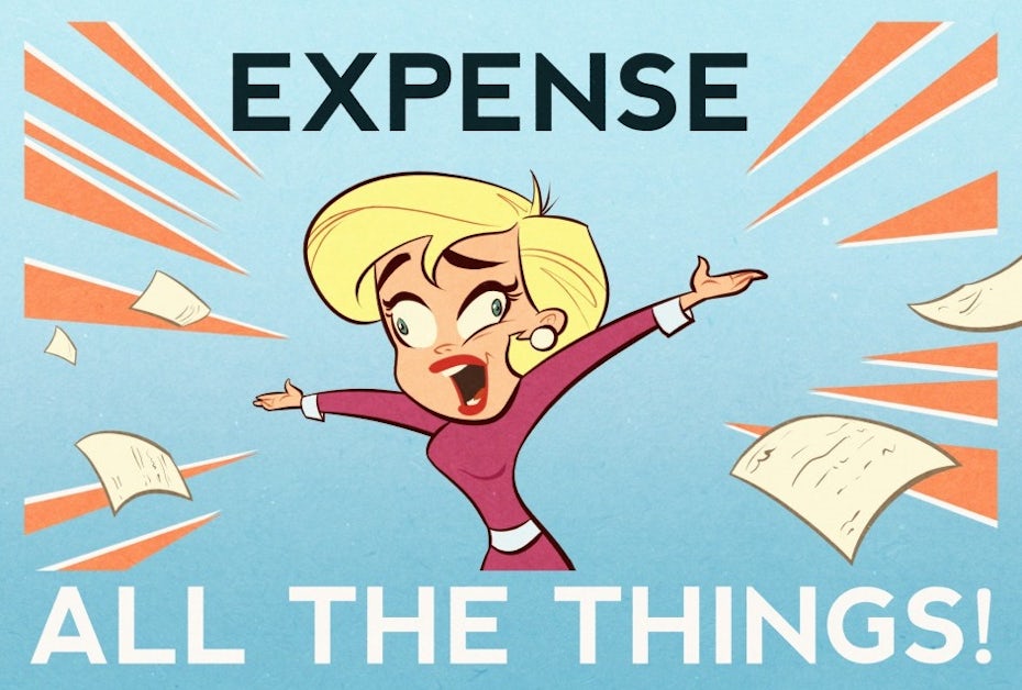
But using memes in marketing can be a risky move because you’re not just using them to engage with your audience, you’re using them to drive sales. When memes are part of your marketing strategy, you’re claiming them as an integral part of your brand in a way you don’t when you’re just sharing memes for fun.
1. Find memes that work for your brand (and know what they mean!)

Memes are a language. They’re shorthand. Before you can use memes in your design and marketing efforts, determine which memes mesh with your brand by knowing your target audience. Some brands, like video game companies and geeky apparel retailers, have huge meme vocabularies because their audiences see memes every day. Others have more limited meme vocabularies because of their audiences’ limited exposure to memes and their less playful brand personas.
So how can you find memes that are on the rise? Google Trends. Just type in the name of a meme and you can see data on how often people searched for it, going back to 2004.
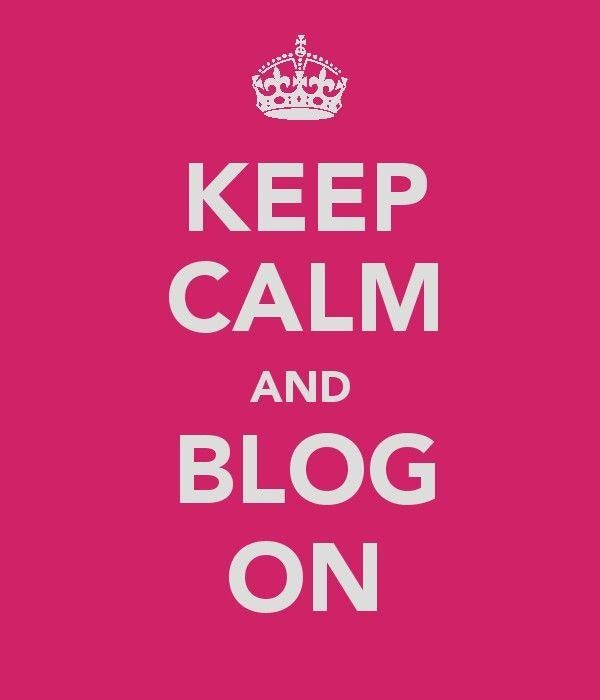
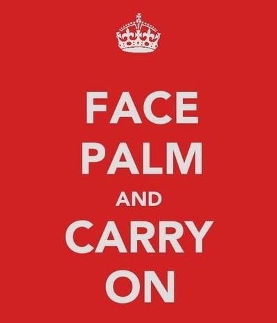

For example, the “Keep calm and _____” meme template only works when the second half of the phrase, the variable part, is a legitimate situation where keeping calm is the best course of action, but not always an automatic response. “Keep calm and pay your invoice” doesn’t work, because people are typically already calm when they’re paying invoices. But “Keep calm and consolidate your debts into one easy monthly payment” does because typically that’s hard to keep calm about. But a savvy debt consolidator can ease your mind by promising you a solution, and that promise might start with a meme on a website or business card.
Using a meme incorrectly makes you look tone-deaf. If you’re not 100 percent sure of what a specific meme means, look at variations of it until you completely get it. An easy way to do this is to visit Know your Meme, search for the meme you want to examine, then click through that meme’s gallery to see hundreds of different ways it’s been used.
2. Use memes in the right place
The next step in making your brand a meme machine is knowing the best spots to use them. Social media is an obvious choice, but other effective spots for memes are your website graphics and even within blog posts.
Think about what you’re saying with the memes you use. Once you’ve answered that, the right places for them are obvious. Let’s say you’re a grocery store looking to use memes to connect with younger shoppers and differentiate your marketing from competing chains. You might use “starterpack” memes in your circulars to showcase certain items you stock and why buyers might buy them together.


Knowing where to use memes also means knowing your audience. Will they chuckle at a meme you share but scratch their heads at a website design that has each button morphing into a different Advice Animal when you mouse over it? The more meme-savvy your audience is, the more ambitious you can get with memes in your design.
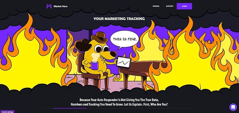
In the design for Market Hero above, the meme works because the ideal audience is internet marketers who spend a lot of time online and consume a lot of memes. Just as critically, the meme hits right at one of the prospective clients’ pain points: auto-responders that don’t provide accurate data on their performance.

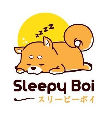
Like we said earlier, memes are a language. Sometimes, the meme isn’t the image, but the vocabulary. Among dog owners, words like “doggo,” “pupper” and “good boi” have become verbal memes. If your target audience speaks this language, speak it with them.
Denny’s is a great example of a brand using memes to connect with their audience. In 2013, the company embraced Tumblr as a marketing channel and built a reputation for posting smart, slightly snarky memes.
3. Timing is everything
Memes come and go super fast. One of the perils of working memes into your designs is that you’re choosing to work with a vocabulary that’s got a limited shelf life. Use a meme when it’s on the decline, and your brand looks like it’s behind the ball. Use a meme that’s dead, and you look totally out of touch.

Alternatively, going with a meme that’s already old-school can protect your brand from looking like you’re out of touch…if you’re willing to be self-aware with it. Maybe the “Ermahgerd, berks” girl sums up exactly who your brand is. If that’s the case, embracing its outdatedness in all its dorky glory can communicate that not only are you willing to get silly, you’re silly and you know it.
It might feel kind of weird to think about it this way, but retro memes are a thing. Nyan cat, Rickrolls, Kanye interrupting and “One does not simply…” are all memes that are long past their peaks. Which makes them perfect nostalgia fodder. Memes in design can be a total win if you’re playing with 2000s-inspired retro design. And there’s a huge backlog of old memes to choose from.
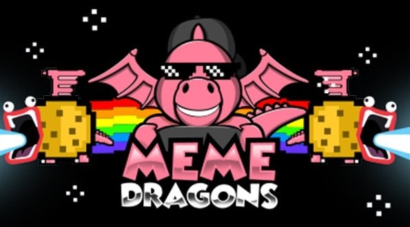
But if you’re not going retro with your memes, pay very close attention to which memes are trending up and which are trending down. A meme logo can be a really fun April Fool’s gag and memes in short-form marketing materials like Facebook ads and limited offer landing pages are an easy way to work with short-lived trends.
4. Know that memes evolve
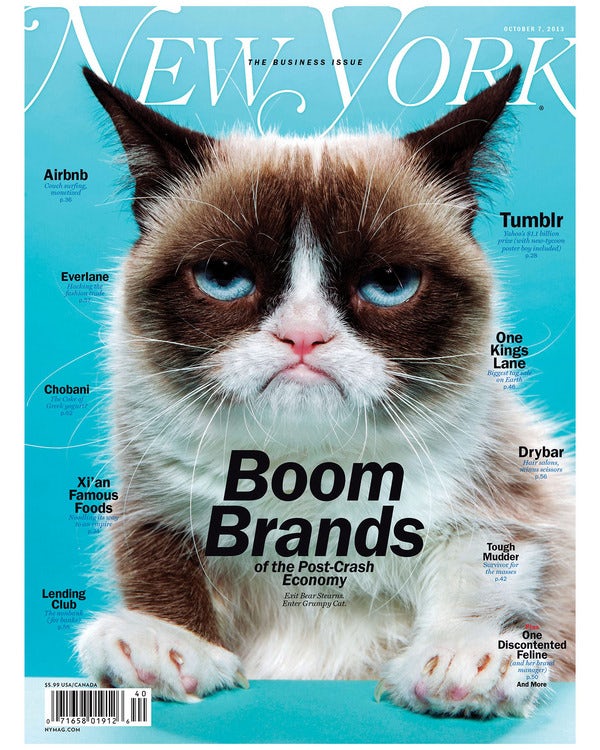
Some memes are damaged goods (like Pepe the Frog) and others were icky from the get-go (like Ugandan Knuckles.) Using them will only hurt your brand. When you’re researching memes to potentially incorporate into your designs, research them thoroughly. If you choose one that’s an edgelord favorite (and your brand isn’t edgy) you run the risk of being offensive.
Remember, nobody owns a meme, not even its creator (as Matt Furie found out after Pepe was co-opted and used in ways he didn’t condone). No meme is safe from being paired with unsavory captions, adopted as a symbol of something objectively awful, or simply morphing into something that simply feels overdone or too silly to match your brand voice anymore.
Make a joke. Don’t be a joke.
—
Using memes in your marketing and brand design can be a way to communicate that you’re a savvy internet citizen. This is critical for any brand that works with tech in any way, whether you’re an IT company or an ecommerce retailer. But that doesn’t mean memes are the only way to communicate your internet citizenship status or that they’re the right choice for your brand.
Ultimately, memes are jokes. If your brand is fun and jokey, using memes in your designs can be a great way to get your audience to laugh with you. But if you’re not careful, they’ll be laughing at you. And that’s not a good look for anyone. The key to using memes in design effectively is self-awareness. If you’re a brand that can pull off memes in design, work with a designer who’s just as meme-savvy as you are to get design that’s an epic win.
Work with a talented design pro!
Our designers can create amazing meme-inspired designs that fit your brand.
The post How to use memes in your marketing appeared first on 99designs.
How to use memes in your marketing posted first on https://www.lilpackaging.com
No comments:
Post a Comment