The past ten years have been a roller-coaster ride in the design world. With a new decade of design on the horizon, we’re going to help you take a long look back at the evolution of graphic design from 2010 to 2020.
An eventful decade in design
—
It’s New Year’s Eve 2009, and you’re a designer welcoming a brand new decade in graphic design. You find yourself making loud predictions about what the 2010s will deliver (you’ve also had a fair amount of champagne).

This expensive smartphone fad, you declare, will never last. Instead, you predict that physical devices will disappear altogether, and everyone will be designing on holographic screens. Typography won’t matter with Binary as the language of the land. And design schools will become irrelevant as people will download information Matrix-style directly into their brains.
Now 10 years older, you can’t believe that person was you—who even does that at a party? While most of your predictions missed the mark, the 2010s were no less an eventful decade in graphic design. It might not have been as dramatically futuristic as you imagined, but the decade revolutionized the modern designer’s relationship with technology in many ways.
How design needs changed in the 2010s
—
Technology changes over every decade, but in the 2010s, the digital sphere went through a rapid growth spurt, testing designers’ ability to adapt like never before. The following are a few notable tech advancements that had an impact on graphic design.
Smartphones
When you think “rapidly changing technology,” smartphones come first to mind, especially given how often we’re expected to update our devices. For designers, the advent of the smartphone meant a whole host of new, smaller spaces to design for as well as new design categories and careers.

Although the iPhone was first unveiled in 2007, its Android competitors showed up in 2010, solidifying the smartphone’s place in the market and in our pockets. Throughout the 2010s, these devices only increased in usage, with the introduction of 4G in 2012 making mobile websurfing faster and more accessible. By 2016, mobile usage had officially surpassed desktop usage.
Smartphones and the deluge of apps that followed introduced a new frontier for visual design, making app designers and responsive web designs essential around the world. Not only that, the fact that the most common design people interacted with in the 2010s could fit in the palm of their hand meant that designers had to focus on easy readability and sparse interfaces, paving the way for minimalist trends.

Tablets & e-readers
Keeping ahead of its competitors, Apple released the iPad in 2010—yet another screen designers had to take into account with responsive web design. And with everything else in this decade going digital, it was only a matter of time before books succumbed to the thrall of the Information Age.
Although Kindle and its Kindle Direct Publishing program (which opened the floodgates of self-publishing) released in the previous decade, Amazon reported that ebook sales had overtaken physical book sales for the first time in 2010. The popularity of ebooks changed the approach to book cover design, often necessitating a digital and physical version. This led to trends in large typography and simplified images so that the cover design would be easily understood when viewed as a tiny thumbnail.
VR & AR
When VR & AR (virtual and augmented reality) emerged in the 2010s, the world looked to graphic designers to help them navigate this new immersive tech.
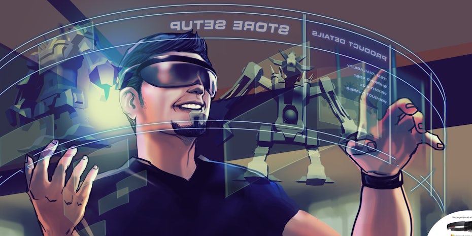
In 2014, Google Glass used AR technology to integrate app designs into our everyday world, though the hefty price tag led to its discontinuation. In the middle of the decade, Snapchat pioneered selfie lenses and face filters, with Instagram following suit in 2016 with its adoption of stories. Though it’s easy to dismiss these as mere social media amusements, they made AR accessible to the general public, combining graphic design, animation and photography in real time along the way.

At the moment, VR is much more heavily relegated to the gaming world, but the introduction of Google Cardboard in 2014 created a space for VR app designs. The release of the Oculus Rift and HTC Vive in 2016 made desktop VR a reality, opening the door for VR web designs, and in 2019, the Oculus Quest launched as the first wireless VR headset. If VR continues its momentum, we’re looking at a revolution in UX trends as designers strive to guide users through the intersection of technology and reality.
Depending on whom you ask, these developments are either the future or flash-in-the-pan fads. We’ll have to wait another decade to see, but if it does turn out that VR & AR were a 2010s only experience, it just goes to show how experimental and strange this decade was.
How graphic design tools evolved over the decade
—
With digital spaces growing at an exponential rate in the 2010s, designers found their workload on the rise, and their toolbox had to undergo some upgrades itself to keep up. Let’s look at the ways that the tools of graphic design transformed over the 2010s.
Graphic design software

For a while, the words “professional design software” and “Adobe” had been practically synonymous, and in the 2010s, Adobe took steps to solidify its hold on the marketplace. In 2011, Adobe reinvented its business model with the introduction of the Creative Cloud.
Instead of a single purchase software, this gave users access to all of its products for a subscription fee, making updates available on demand and emphasizing integration between products along the way. Many designers were none too happy, and to belay these concerns and justify subscriptions fees, Adobe promised to update its applications with more frequency than ever before. Notable improvements over the decade include:
- Content Awareness features in Photoshop (2012)
- Live Corners in Illustrator (2014)
- Perspective Warp and Linked Smart Objects in Photoshop (2014)
- Live Shapes in Illustrator (2015)
- Multiple layer styles in Photoshop (2015)
- Curvature tool in Illustrator (2017)


This decade also witnessed a number of competitors rise up to unseat Adobe, achieving unprecedented success and popularity. In 2014, Serif launched Affinity Designer as a direct challenge to Adobe’s subscription model, offering a one-time low cost fee. Procreate (2011), meanwhile, staked its claim on the tablet market, transforming iPads into portable digital drawing pads. All in all, the 2010s spoiled designers with software choice and new features, and most importantly, it made design applications more affordable and widespread than ever before.
Prototyping tools
To keep up with the differing sizes and many product pages dictated by evolving screen technology, design prototyping had to cover a lot of ground quickly. A number of new prototyping apps came to the rescue, including Sketch in 2010, Invision in 2011, and Adobe XD much later in 2017.

These apps have drag-and-drop interfaces, simplified canvases, and animation functionality that make it possible to showcase and test prototypes in rapid-fire. They must have been doing something right, considering their popularity went beyond prototyping to many designers favoring Sketch for web design over grandaddy Photoshop.
How the graphic design industry went digital in the 2010s
—
As we’ve seen, designers are no strangers to tech, but in the 2010s, they pretty much abandoned the analogue plane altogether. Between portfolio sites, freelancer platforms and online learning, this decade saw many graphic designers move their studios up into the cloud.

Graphic design self-education
The internet made all kinds of information immediately available, and graphic design education was no exception. But this decade in particular saw online learning become increasingly commonplace among everyone from industry veterans to complete beginners.
Many traditional schools, including MIT and Harvard, moved their classes online with edX in 2012 and coursera in 2011. Meanwhile, entirely new digital spaces emerged dedicated to DIY learning, such as udemy in 2010, Skillshare and General Assembly in 2011. All of this made design education more accessible than ever before and the talent pool more diverse than ever before.
Online freelancing
Though the social media revolution had already kicked off in the previous decade, it ramped up in the 2010s, largely in designers’ favor. Instagram kicked off in 2010, popularizing image-centric social media, and its user base had soared to 80 million by the time it was acquired by Facebook the next year.

>>Find more designers to follow on Instagram
Also in 2010, Dribbble became publicly available, and its invite-only approach allowed more experienced designers to separate themselves from the masses. Behance surged in popularity as well, so much so that it was eventually acquired by Adobe in 2012.
In the meantime, not only did designer’s portfolios move online but their workspaces did as well. Our very own 99designs introduced 1-to-1 Projects to create a robust workspace with secure payments and facilitated this with designer and client matching technology. All in all, in the 2010s, there was no shortage of ways for designers to market themselves and no shortage of competition.
How design trends changed over the decade
—
In the future, when someone says, “What were we thinking? That design is sooo 2010s!”— what will they mean? It will be years before the decade is distant enough that we can define its style, but for now here’s our best guesses for visual styles that dominated the 2010s.
Flat design
One of the decade’s biggest trends, flat design, was born out of a need to make digital apps clean and accessible.

In 2012, Windows 8 launched with a flat interface and Apple’s iOS 7 followed the next year, ditching skeuomorphism in favor of a flat aesthetic, and this solidified the trend in our everyday digital lives. Nowadays, it’s hard not to open a web page (or a brochure or a magazine) without being greeted by flat colors, minimal vectors and geometric sans serif fonts.
Animated and interactive branding
Branding was more versatile than ever before in the 2010s. Not only were there many more spaces for logos to inhabit, but the fact that these spaces were digital meant the sky was the limit as to what the logo could do. Hence, a wave of animated and interactive logos ensued.


Spotify’s Year In Music campaign (starting in 2017) meanwhile, took advantage of live user data and profiles to create shareable branded imagery, and contributed to the long-lasting trends of duotones, color transitions and photo filters in the process.
Rebrands
With every new startup on the block claiming to be an industry disruptor (and a good number of those claims proving to be true), the 2010s were a time of upheaval and change. Even well-established brands capitalized on this revolutionary spirit, resulting in a decade that saw more new brands, rebrands and rerebrands than anyone thought possible.

Startups were the most common—and most iterative—practitioners of the rebrand. Many had started up with a rush-job logo, and their sudden popularity necessitated a more strategic second pass. AirBnB’s rebrand in 2014 emphasized a subtly ambiguous logomark, OkCupid got cozy with a host of loveable illustrations in 2017, and even Google got in the game in 2015 with an animated logotype. Uber liked the rebrand process so much they did it twice, starting with a pair of polarizing icons in 2016 and course-correcting with a simplified wordmark in 2018.
This decade also saw long-established companies receive long overdue updates. The Premier League pounced onto 2016 with a new mascot and Burberry rebranded for the first time in 20 years with a cartoonish monogram.

Most rebrands focused on simplification, reinforcing the visual tone of the decade with flat design and geometric sans serif fonts. Meanwhile, Instagram’s rebrand repopularized gradients in 2016.
As these simplified rebrands came to embody the 2010s, we can only wonder whether the 20s will see opposite trends reacting. If MasterCard’s nameless logo in 2019 is any indication, aesthetic tendencies might be headed even further toward the minimalist direction in the 20s.
The 2010-2020 decade in graphic design: that’s a wrap!
—
So there you have it: everything that happened in the 2010s as it relates to graphic design contained in a single blog article. There’s not a chance anything was left out due to length constraints or this author’s forgetfulness, so we can all move on and look forward to the 20s.
Of course, if you happen to think of one or two other events of the decade, let us know in the comments below.
What will you remember most about the 2010s?
The post The evolution of design from 2010 to 2020: Looking back at a decade of design appeared first on 99designs.
The evolution of design from 2010 to 2020: Looking back at a decade of design posted first on https://www.lilpackaging.com
No comments:
Post a Comment