2020 is the perfect opportunity to refresh and refine your branding. We’ve analyzed design trends for logos, product packaging, web design, typography and graphic design in order to compile this list of branding trends 2020.
Before we dig into the biggest branding trends for 2020, let’s make one thing clear: branding is everything, so take it seriously. It starts with your logo, but it also includes your social media presence, your website, your packaging and more. We love well-designed branding and so do your customers and clients. When you’re able to portray who you are in a visually compelling way, your audience will react positively, and you’ll create brand-loyal followers.
Here are 8 big branding trends for 2020:
—
- Warm-toned, neon gradients
- Boldly minimal metallic materials
- Diverse, free-spirited typography
- Refined line art
- Sunny, optimistic brand designs
- Nuanced minimalism
- Visual storytelling
- Earth-toned, natural branding
1. Warm-toned, neon gradients
OK, so gradients aren’t a new thing. You know them and you love them. But have you seen them all warm and toasty lately, like in the newly revamped Mozilla Firefox logo? That’s what we’re talking about. Branding trends for 2020 see gradients heated up, and we’re here for it.
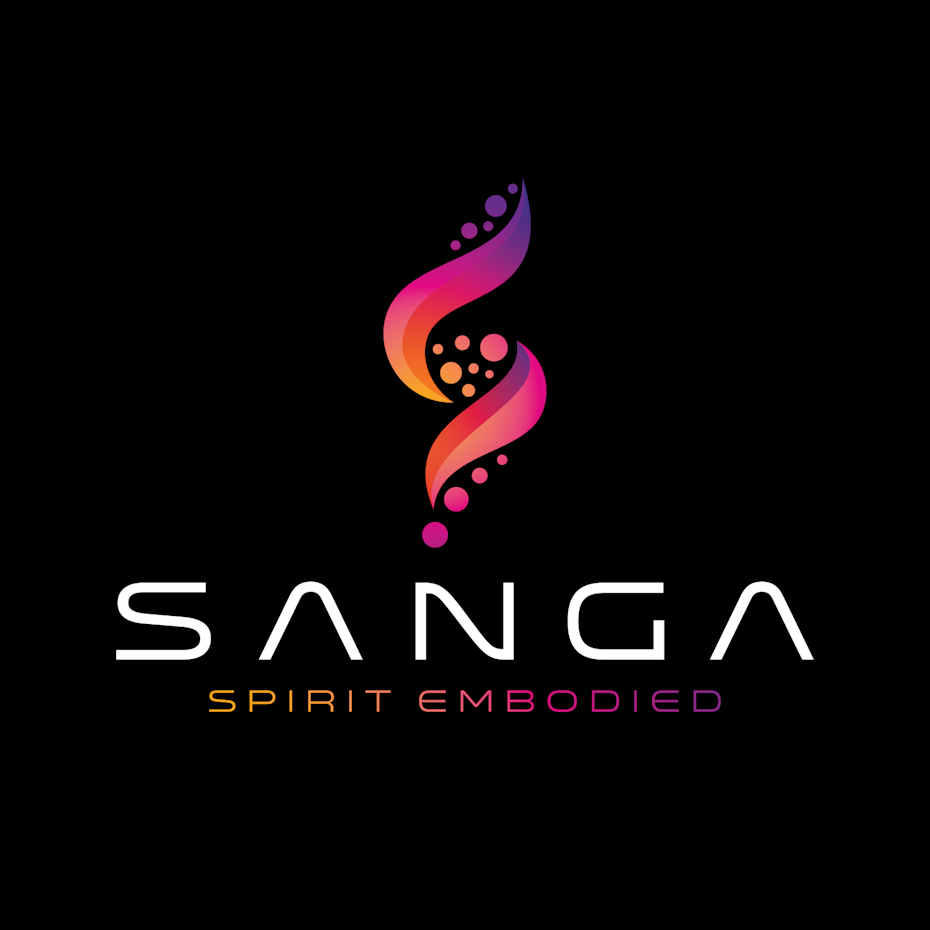
Gradients are incredibly versatile and brands are now combining them with the futuristic neon color trend to give them an uber-saturated, over-the-top vibe. And with warm, neon hues, there’s something distinct, refreshing and exciting about the whole thing. Picture the most psychedelic sunset you’ve ever seen, then channel that into your brand persona.


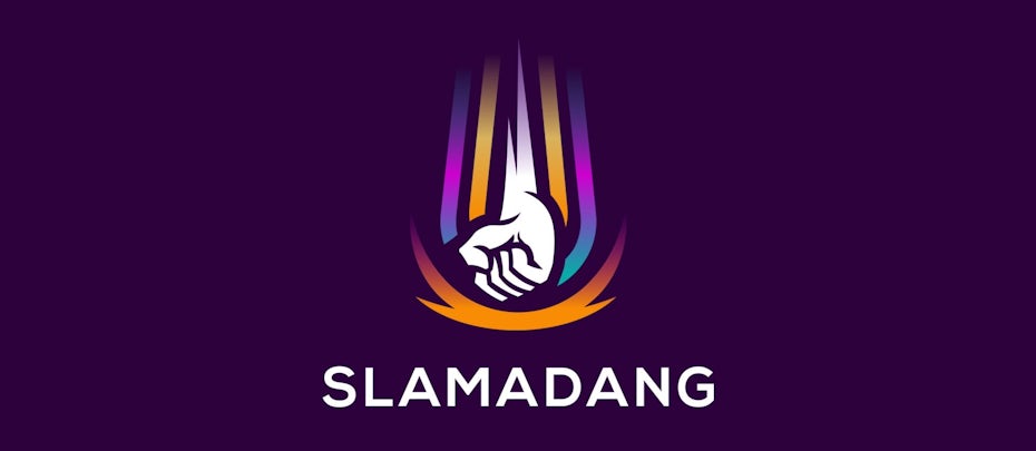
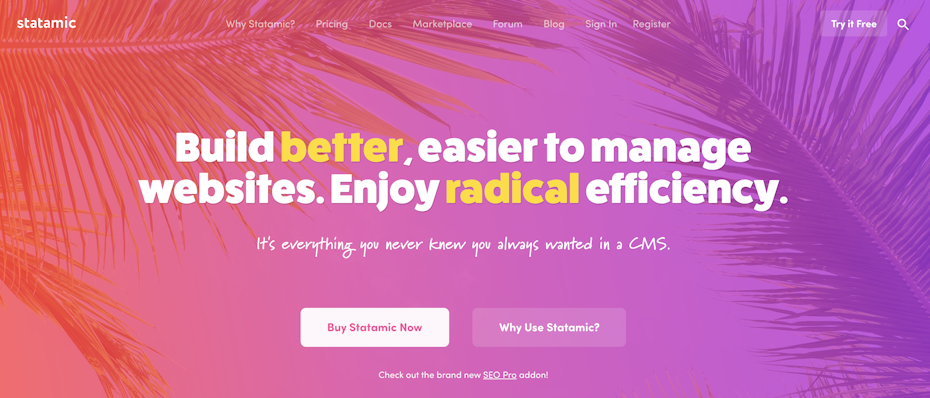
We’ve seen warm, neon gradients continually emerge in tech environments. It’s a look that pops digitally and catches the eye without overwhelming it.
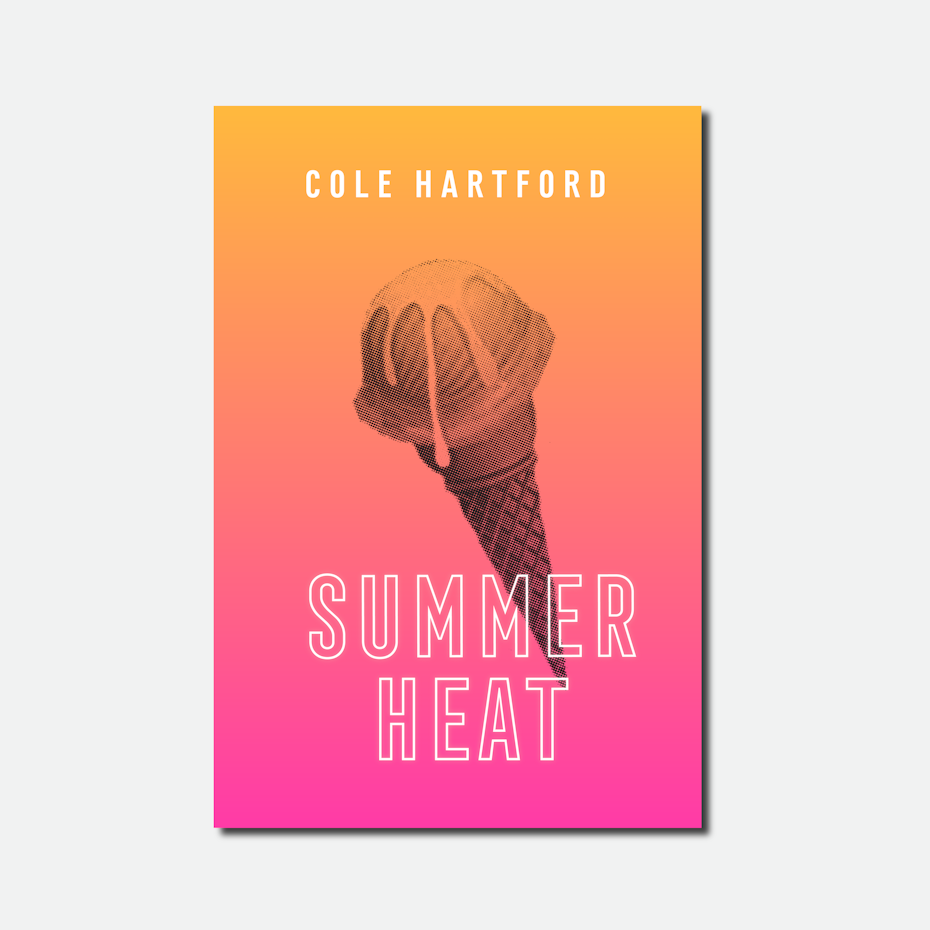
Take a look at the Summer Heat book cover that takes an ultra-modern approach with the addition of a grayscale graphic, while the Challenges web design below adds splashes of brilliant purple for increased visual depth. Even the Tinder app got on board with a saturated pink and orange gradient. That’s right, it’s 2020: bring on the heat.

2. Boldly minimal metallic materials
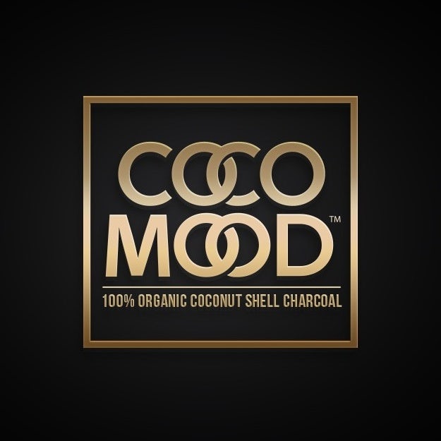
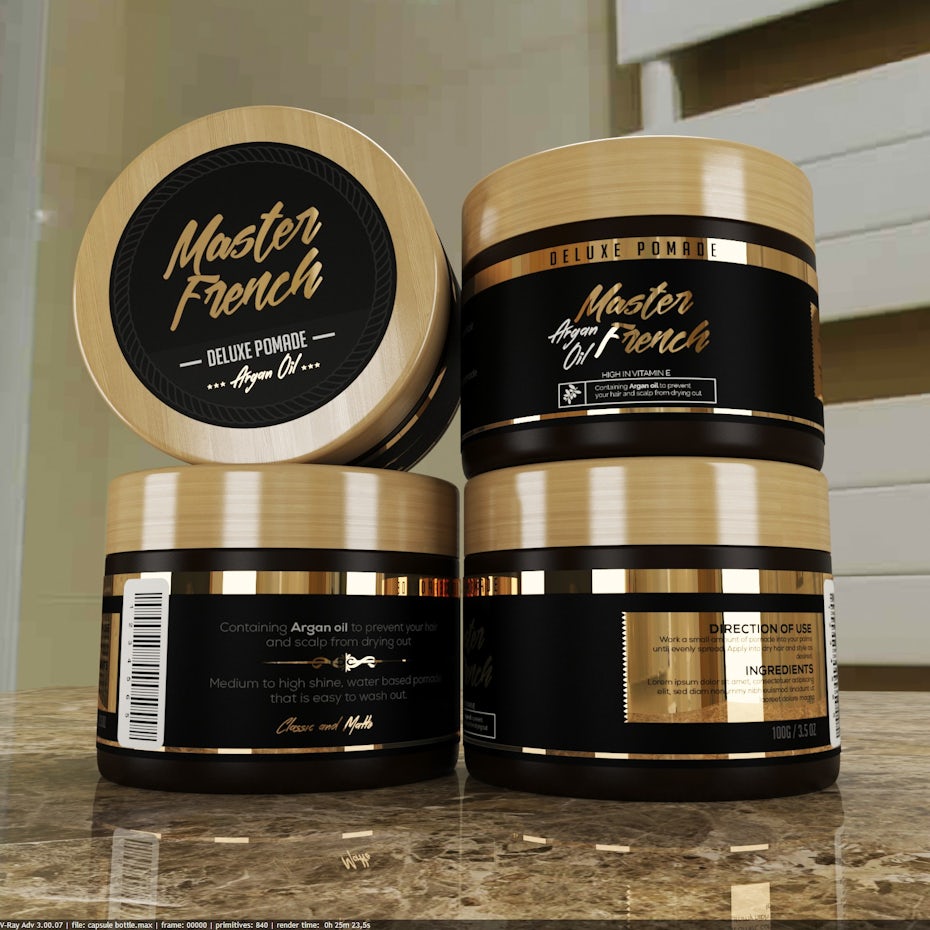
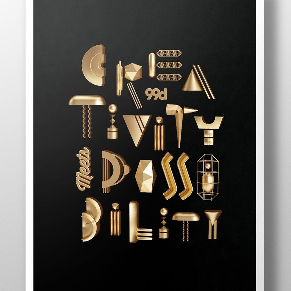
It’s common to see an influx of metallics near the bustle and boom of the holiday season. But branding trends for 2020 take it to the next level by making bold metallic materials the star of the show. We’re seeing monochrome, metallic branding that keeps things super minimal, so metallics can take center stage. In 2020, metallics aren’t frilly or ornate, but cool, bold and modern.
These metallics are striking, yet clean and easy to digest. Even though there’s something so over the top about the concept of making your brand sparkle, this aesthetic thrives in a minimalist setting. Adding a dash of metallic to a black-and-white logo can really elevate an entire brand concept.
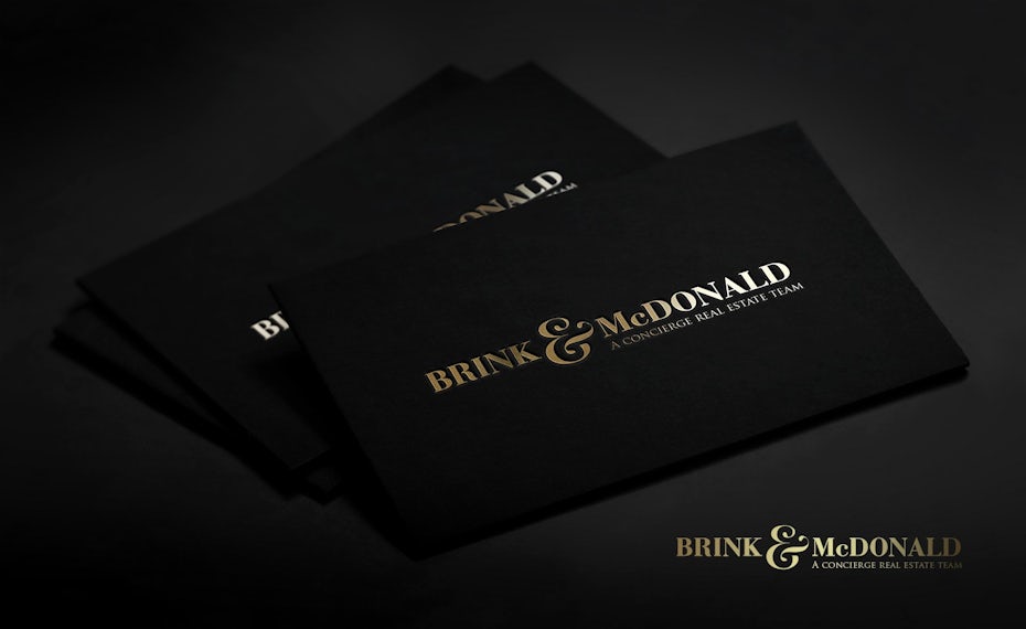
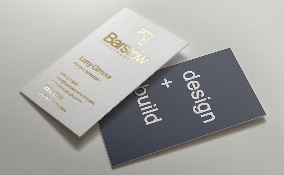


Metallics also help evoke an understated sense of luxury. Vibrant gold, dark platinum and lustrous rose gold or copper will make a lasting impact on print materials (like packaging or business cards), yet they also make a seamless transition when used in digital spaces.
There’s something incredibly satisfying about a solid-looking metallic design. In times where people want luxury but without the fuss this trend makes total sense.
3. Free-spirited typography
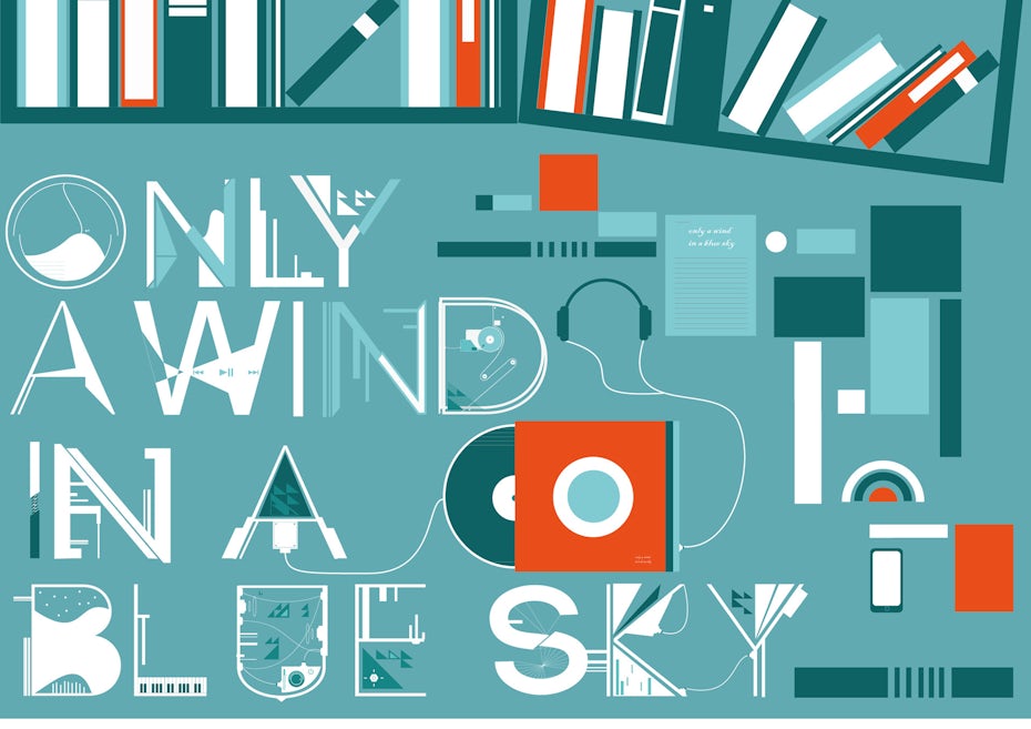
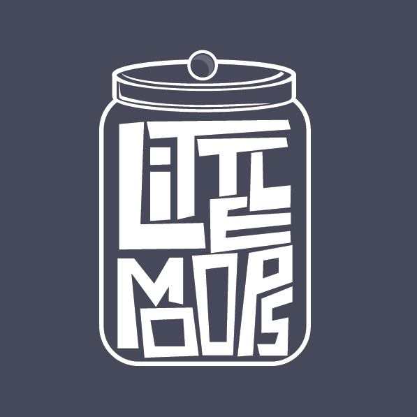
Typography can talk and it has a lot to say this year. Right now, it’s breaking away from the constraints of usual fonts and shapes. It’s a real rebel, that typography.
This trend is all about the phenomenal, shapeshifting powers of modern lettering. Unique characters and unexpected shapes have replaced traditional serifs and sans serifs, letting a brand speak for itself in ways like never before.



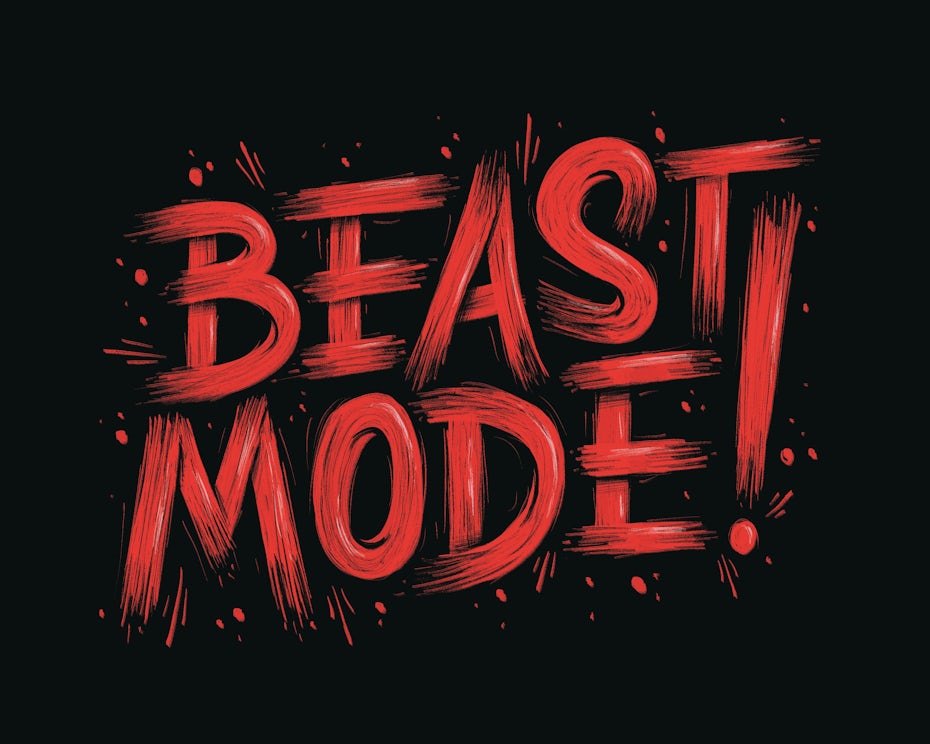
For example, the “beast mode” typography really has a way of shouting, even when simply glancing at it. Styles like this work well for brands that don’t take themselves too seriously, as they tend to lighten up the mood but still feel distinguished and elevated.
Think of this trend as Casual Friday: It’s a break from the norm, but still within reach for a broad audience. It’s “out there,” but not too “out there.”

4. Refined line art
Adult coloring books made a resurgence a few years back. The craze is still on a roll today, and we’re now seeing it influence design and branding itself. In a world where we constantly feel glued to devices, coloring takes us back to a simpler time. And in terms of branding, the trend has influenced an interesting design aesthetic that feels both nostalgic and uber-charming: refined line art.

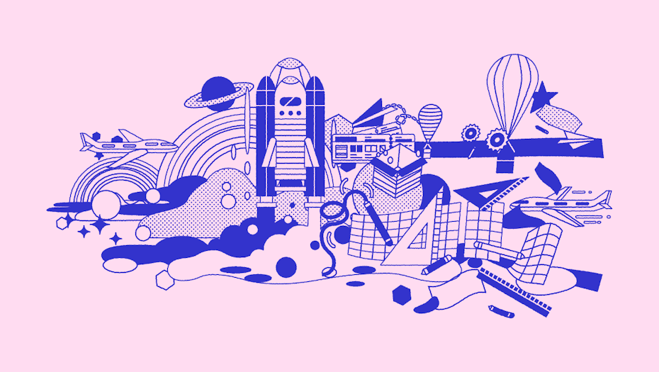

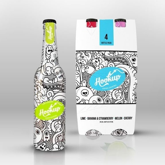
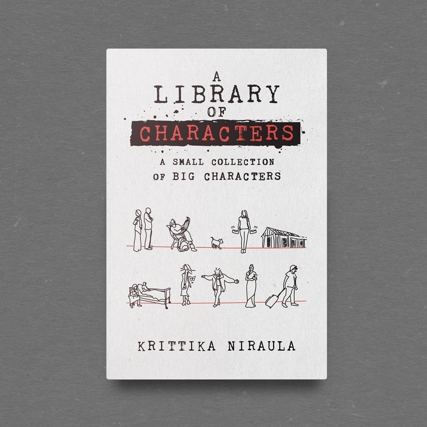
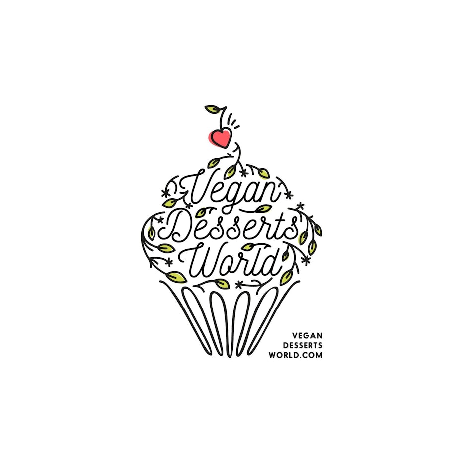
The phrase “line art” will often bring to mind a simple black-and-white figure drawing, but this trend kicks it up a notch with engaging scenery, multi-dimensional concepts and an almost tattoo-like aesthetic. Refined line art keeps a brand simple while still having a good deal of fun. There’s a bit of wiggle room with this style, allowing for interesting flexibility, like the script within the illustration for the Vegan Desserts World logo.
As everything has a bit of a DIY feel to it, there’s certainly a hardcore element of nostalgia within the artwork, but not the kind of dusty antique vibes that you’d find in a thrift store. Think personalized, yet professional. Think hipster-ish, but the lovable kind of hipster who won’t judge you for not listening to The Decemberists.



5. Sunny, optimistic brand designs
On the high fashion runways for spring/summer 2020 collections we saw an influx of saffron, goldenrod and other yellow hues. Let the sunshine in.
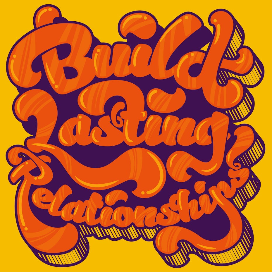
These sunny yellows and oranges are the perfect representation of the youthful, uplifting brand designs we’ll be seeing in 2020. Feel-good shades combined with simple, playful shapes create a wonderfully happy and youthful vibe, which consumers are craving as we enter this new decade full of doubt and uncertainty. That’s why branding that projects a positive, optimistic outlook really hits the spot right now.

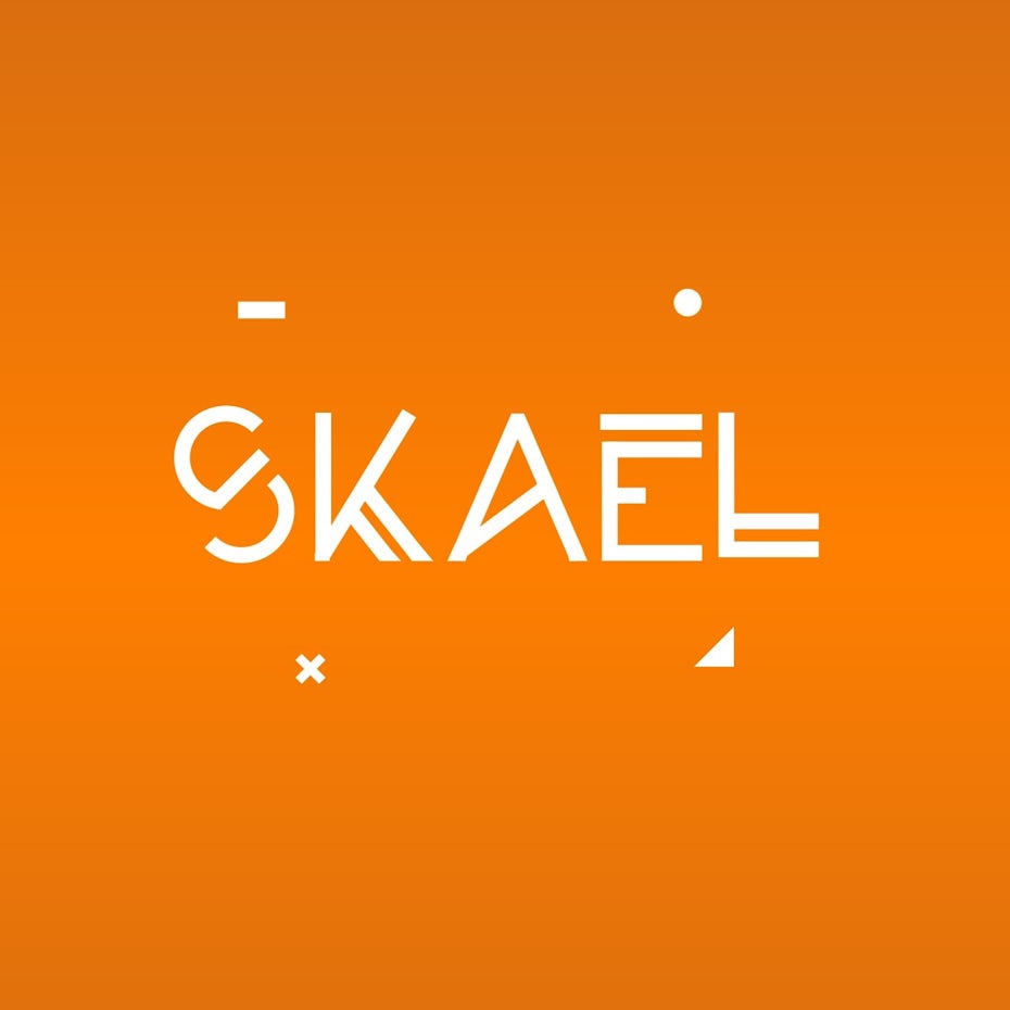

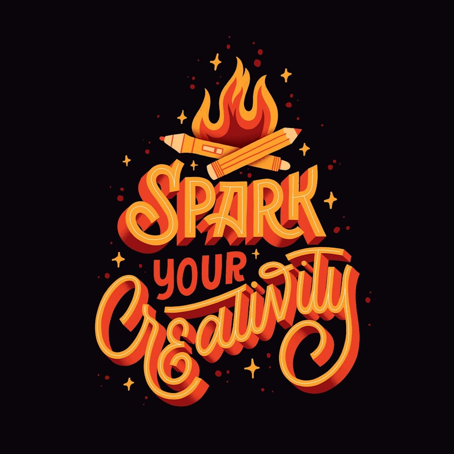

Bringing sunny yellows and oranges into your branding provides an instant kick of lightheartedness. In the Spark Your Creativity graphic, the mood feels instantly bold. Strategic placement of these warm, cheerful shades can really help make a statement. We’re not saying to make everything yellow, but when used in moderation and paired with friendly graphics, youthful fonts and coordinating, summery shades, it’s a winner.

6. Nuanced minimalism
In our roundup of branding trends for 2019, we touched on the idea of neo-minimalism: a subcategory which offered updated perspective for the new era. For 2020, we’re continuing to see alluring iterations on minimalism—this time with a refreshed approach and some surprising shapes.
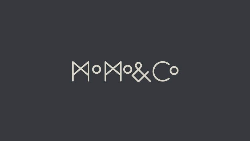
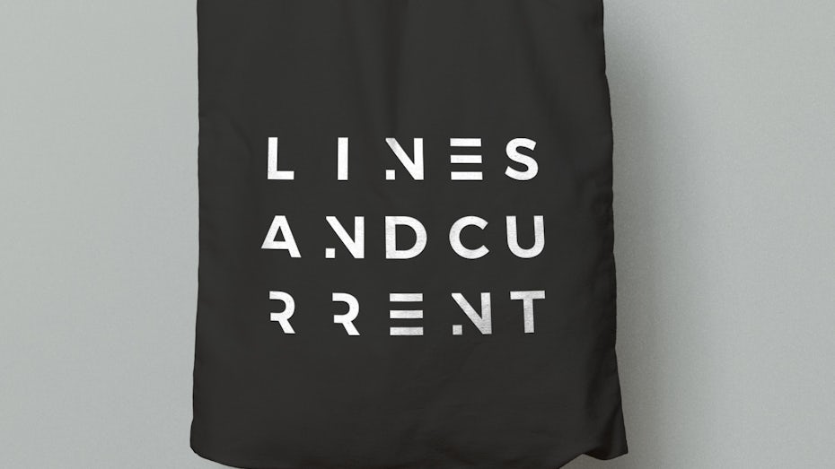

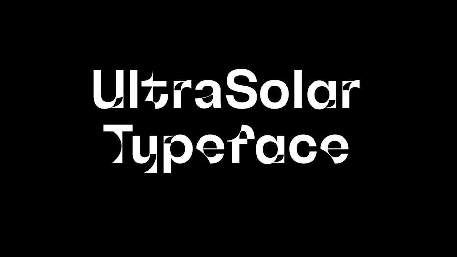
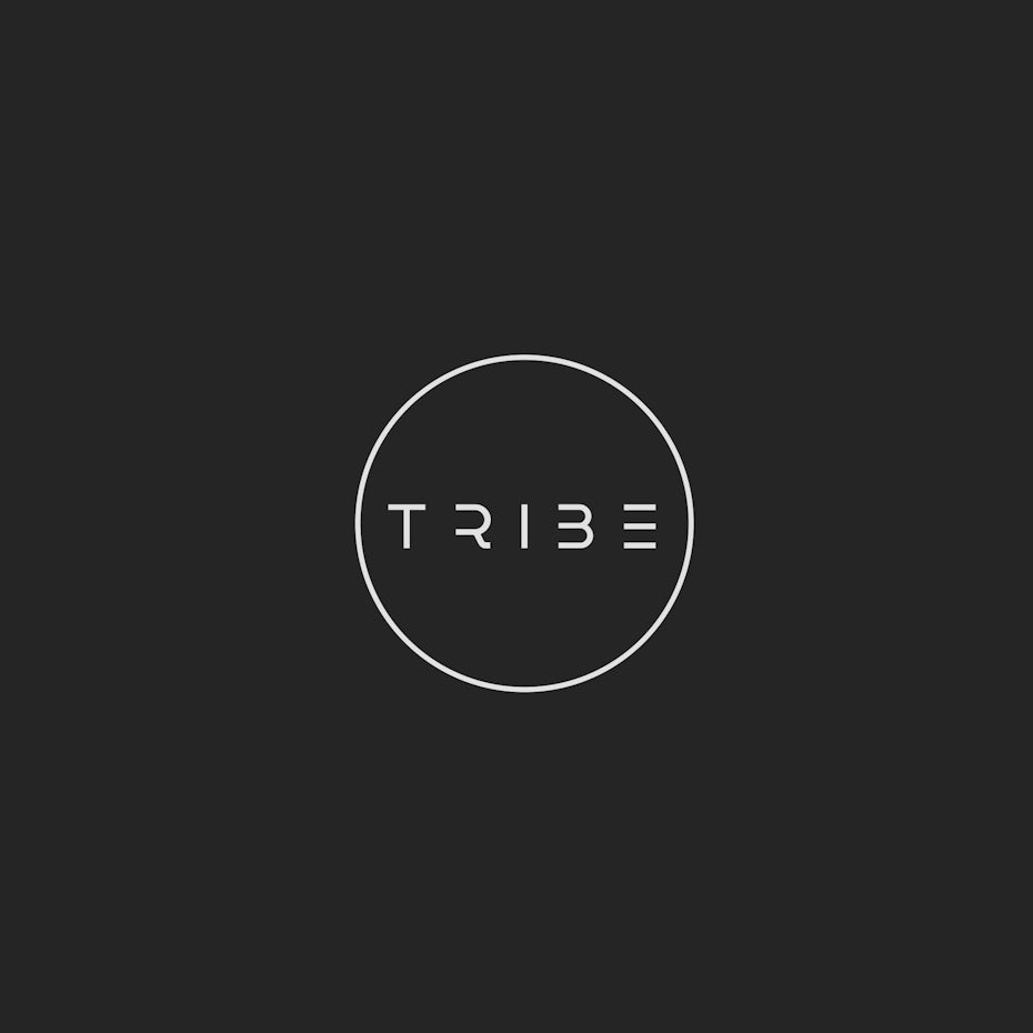
We’ll call it nuanced minimalism, which offers cleanliness and simplicity, but with diverse inspirations and intriguing components—like the TRIBE logo, which features sleek cutouts where you wouldn’t expect them. Within nuanced minimalism, there’s a strong focus on negative space and creating a trompe l’oeil effect, like 3 stacked lines to replace a letter E.
Nuanced minimalism works particularly well for web design, where ultra-simple techniques can result in a pristine, fuss-free user interface. Plus, there’s an element of luxury which comes from keeping things very simple (just ask all those high-end fashion brands who decided to start using the same font).


7. Visual storytelling
Developing a strong brand goes beyond great packaging and an iconic logo. It’s about your approach to telling the story of your brand. In both digital and print design we’re seeing solid visual-heavy branding that takes storytelling outside of its usual realms.
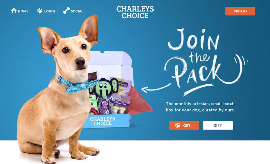
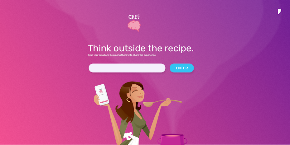
Visual storytelling can be successfully achieved in many ways, like numbered lists, animated gifs and thoughtful infographics. The “How It Works” component on the Charleys Choice website takes a whimsical approach.



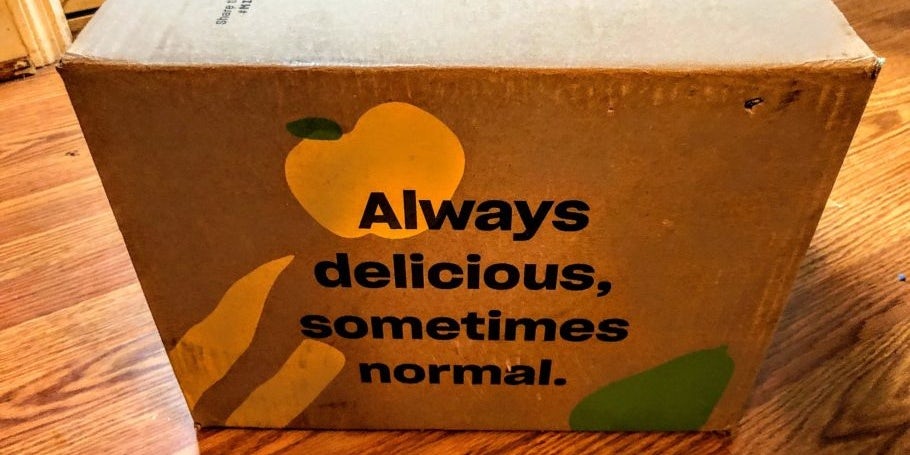
Misfits Market surged to popularity and prosperity with their ugly produce subscription box. The key to their success? Great advertising, eye-catching photography, a sense of humor and—yep, you guessed it—an amazing ability to visually tell a story through their branding. From the tongue-in-cheek typography on their packaging to their engaging animated infographic about the “Misfits journey,” they tell a compelling story which supports their overall goals as a business.
Visual storytelling is all about making your brand digestible for as many possible audiences as you can reach, and sometimes this means breaking down your story into quick, snackable bites. Stories can be told through print materials, an app, a landing page—anywhere, really.
It’s all about artistic expression. Think big with this one.


8. Earth-toned, natural branding
Going green. Being eco-friendly. Reducing waste. Climate change. These are essential concepts to consider as we look to the future of branding, art and design.
These earth-friendly concepts have evolved from mega trends to cultural phenomena, and we even saw a teenage activist gain 3 million Twitter followers for the cause. While eco-focused trends certainly aren’t brand new, we’re continuing to see them evolve and thrive. With this cultural shift comes a branding trend as well: the rise of the earth tones and brand designs that are close to nature.
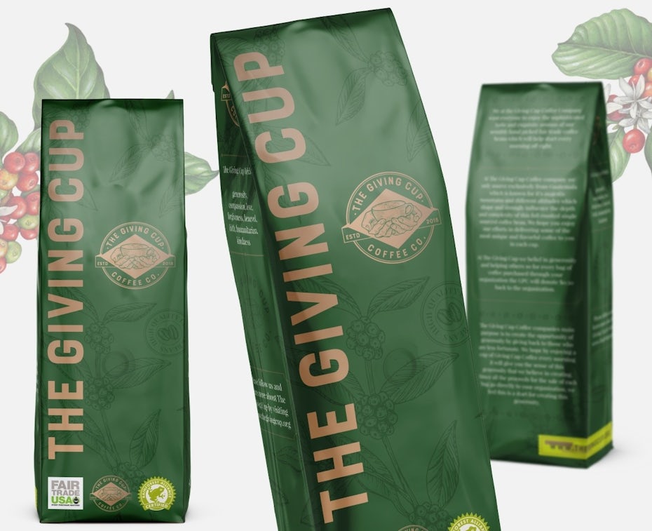


Woodsy browns, low-saturated greens and other autumnal shades have a way of enhancing a vintage-inspired design concept without making it feel too outdated. The aesthetic feels especially modern with white typography on these deep, sophisticated colors. Particularly in the case of food and beverage branding, earth tones just feel spot on.
Combined with natural packaging and hand-drawn plant illustrations, nature-evoking branding creates a harmonious feeling that is hard to resist.
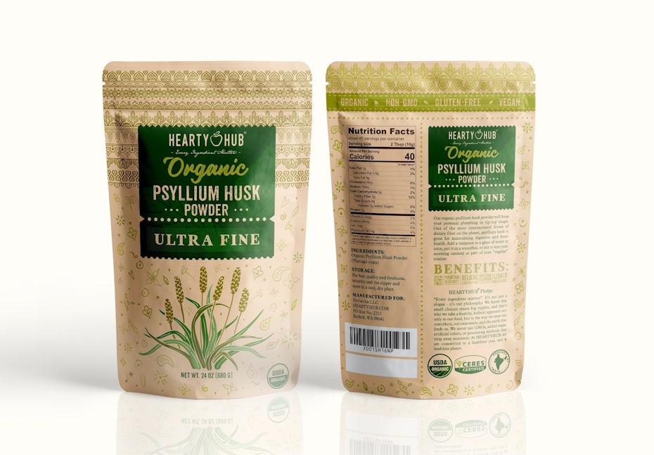
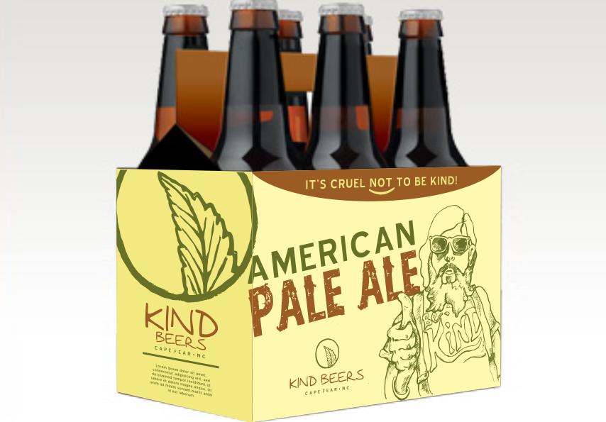
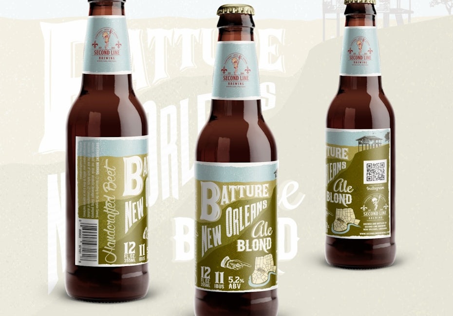
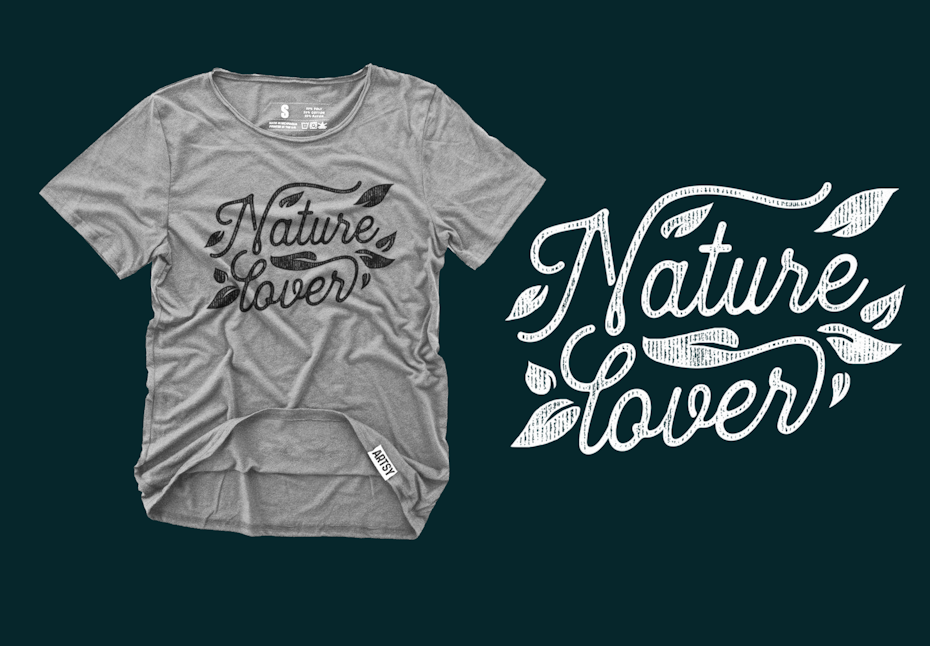
This trend goes hand-in-hand with a general movement towards sustainability and consciousness in branding. The biggest branding trends 2020 are all about reacting to the times we live in and taking a stand with your brand, representing your values to the world.
The consciousness & sustainability movement will take over 2020, establishing a strong online marketing trend to hire people based on ‘conscious values’, such as sharing a higher purpose in business, fair pay, respect and care for all stakeholders.
Revitalize your brand with 2020 branding trends
—
Whether you’re developing a brand in its grassroots stages or simply looking to amplify the amazing aesthetic that you already have, it’s important to pay impeccable attention to your brand presence. These 2020 branding trends show how you can boost a brand with color, typography and layout to tell an epic visual story.
Whatever route you take, remember what branding is all about: showing off what makes you, you.
The post 8 branding trends for 2020 to keep your brand fresh appeared first on 99designs.
8 branding trends for 2020 to keep your brand fresh posted first on https://www.lilpackaging.com
No comments:
Post a Comment