Want to create an anime logo design? You’re in the right place! You also picked an industry which—according to the most recent assessment by The Association of Japanese Animations—made $19.1 billion in revenue in 2017 and continues to grow! The anime style is also a great logo choice because the genre caters to diverse audiences. So, there will surely be an anime logo design style that’ll fit your specific brand voice and tone.
We’re going to show you: how to make a logo look anime, what the features of an anime logo are, who this aesthetic works best for, and what classic anime logos you should pay attention to.
- What is anime?
- Why the appeal of anime?
- A brief history of anime
- How to give all types of logos an anime look
- Ride the anime wave
What is anime?
—
The term is an abbreviation of the word “animation.” In western culture, anime basically applies to cartoons from Japan. The style has been going on in Japan since the late 1940s but has only been adopted by the outside world since the late 90s.
Why the appeal of anime?
—
Anime evokes a spectacular sense of the scale and drama. Take the Dragon Ball series for example. Just one battle scene can happen over the course of several episodes. Or look at shows like Mushishi or The Tatami Galaxy. On the surface it can seem like nothing’s happening. But take a closer look, and you’ll find an undercurrent of emotional meditative contemplation. Or take the coming of age drama, Aria the Animation, or Kill La Kill’s commentary on cultural imperialism, or any number of other occult and horror titles. The list of subgenres goes on!
If your brand relates to any of these larger-than-life topics or motifs, consider patterning your anime logo after their styles. You’ll have a built-in audience!
A brief history of anime design
—
Before we get into anime logos, let’s start with anime history, so you’ll have more options for your own anime logo design. Don’t worry, instead of a boring history lesson, take a scroll through our quick visual tour of the evolution of the anime style!

Osamu Tezuka started what would be known as anime in the mid-1940s. He was not only inspired by American animation in general and Walt Disney, he was known as the Japanese version of Walt Disney.
1963—Astro Boy Anime TV series

Astro Boy’s arms and legs had close to no detail. This was smart because Tezuka’s team could animate him inexpensively.
Details were in his belt and hair. His facial gestures, eyes, and body positions showed his emotions.
In the late 60s color was introduced, and backgrounds became more specific and started moving a bit.
Character design elements became more detailed. Things like clothes and hair started moving, enhancing drama.
1969—Dororo
The anime show Dororo marked a change in target group from kids to mature audiences.
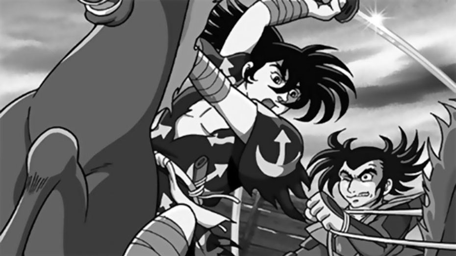
Dororo showed violence and death, but used cinematic composition and lighting to represent it beautifully.
1971—Lupin III
With shows like Lupin III, the early 70s saw an increase in character detail
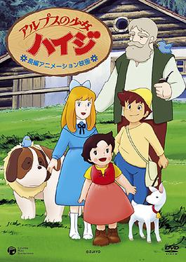
1974—Heidi, Girl of the Alps
Anime shows like Heidi, Girl of the Alps didn’t have loads of action, so the drama was in the details of the characters’ expressions or the running streams and blowing flowers of the Alps background art.
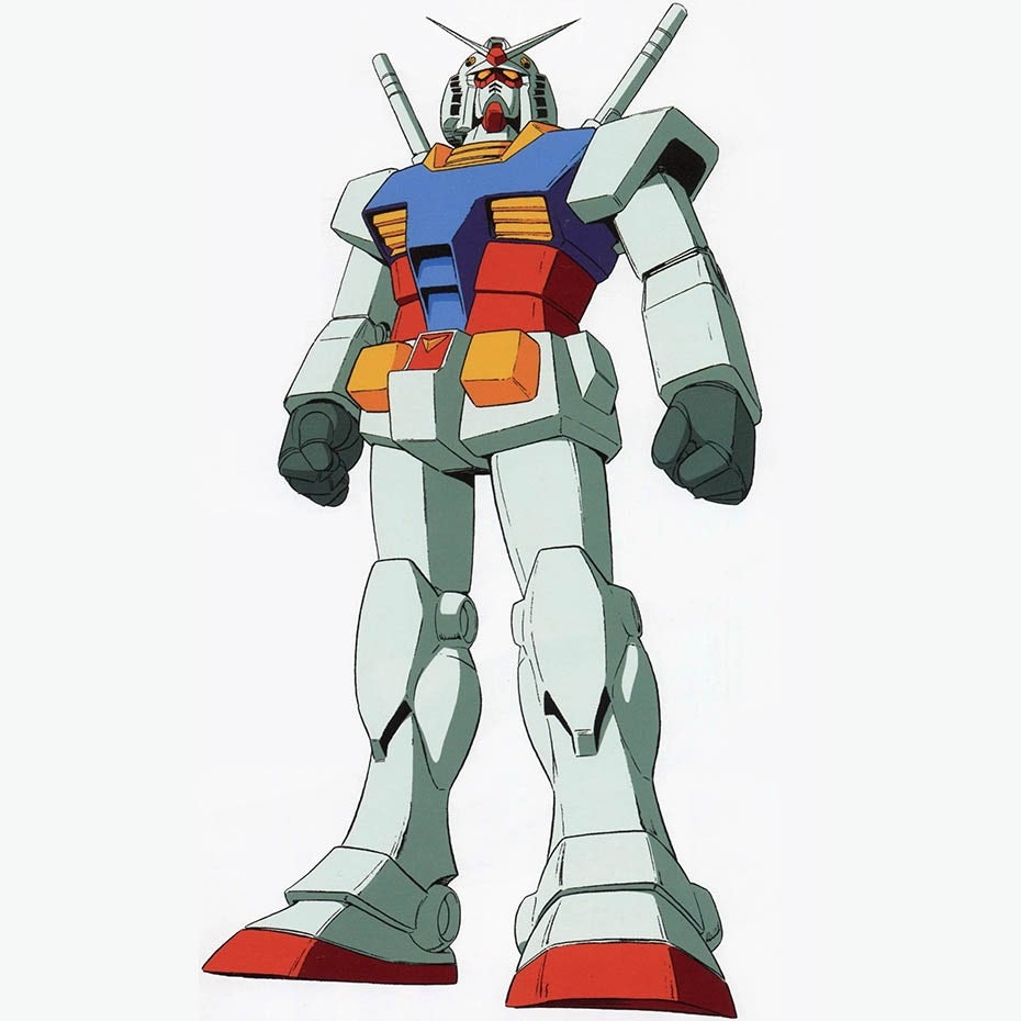
1979—Mobile Suit Gundam

The 70s also brought what anime might be most famous for: mech (mechanical war-fighting suits). Anime’s ability to render complex machinery was second to none. 1979’s Mobile Suit Gundam perfected this mech art.
1982—Macross

Macross in 1982 contributed a significant leap in dynamic background animation. Before this, backgrounds were clearly distinguishable from the foreground.
1984—Angel’s egg
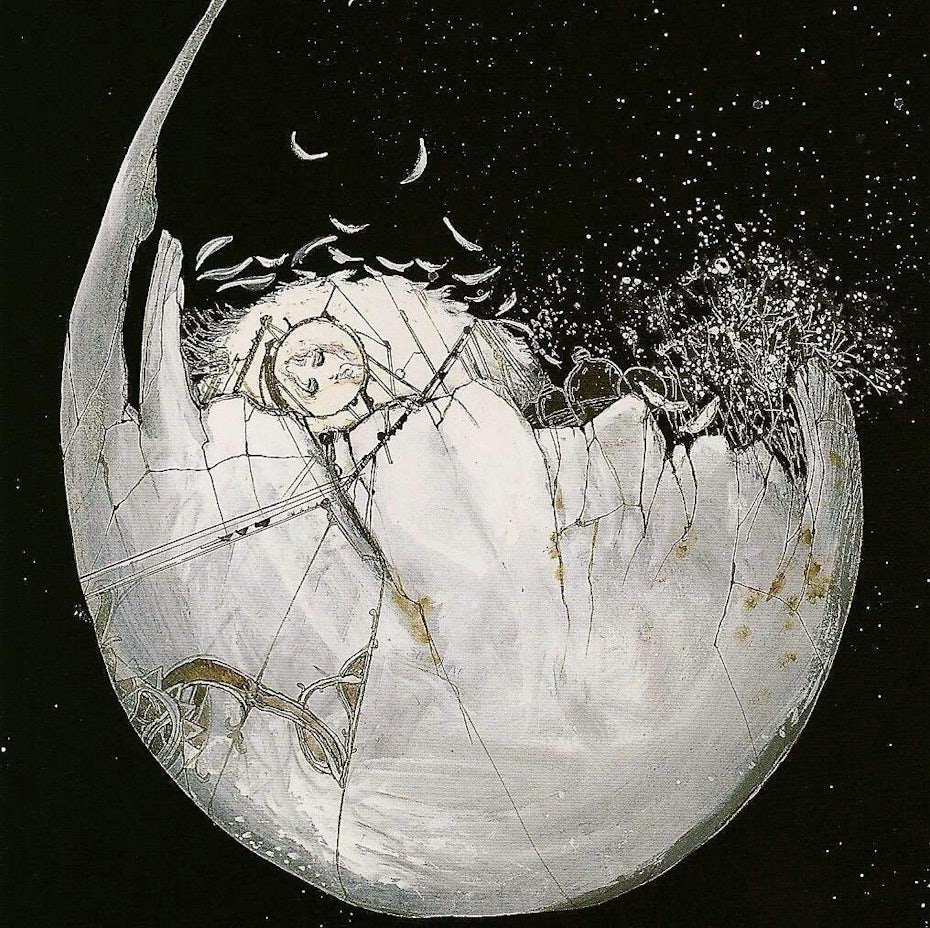
Arthouse moved anime away from the mainstream and toward experimentation.
This brought a more expressionistic look, blending reality with dream realms.
1984’s Angel’s egg pioneered this look.
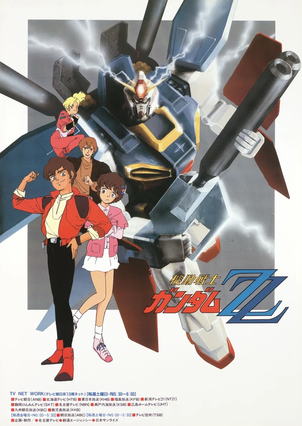
1986—Gundam ZZ
Line work and shading detail also evolved in the 80s with Gundam ZZ.
1986—Castle in the Sky

Studio Ghibli raised the bar again in the realism department. Even though their characters weren’t photo-real, their smooth moving animation made them feel real. They also upped the background art game, employing more background artists than before to create intricate scenic detail.
1987—Bubblegum Crisis

Japanese cyberpunk’s future cityscapes and neon colors has its roots in anime like 1987’s Bubblegum Crisis.
1988—Akira

Akira… the biggest dog in the yard. Akira is famous in part for being the most technically advanced and detailed anime of its time. It arguably had the biggest and most wide-reaching impact of any anime that came before. Akira recruits a more sophisticated audience and does everything we’ve described, to the ultimate degree.
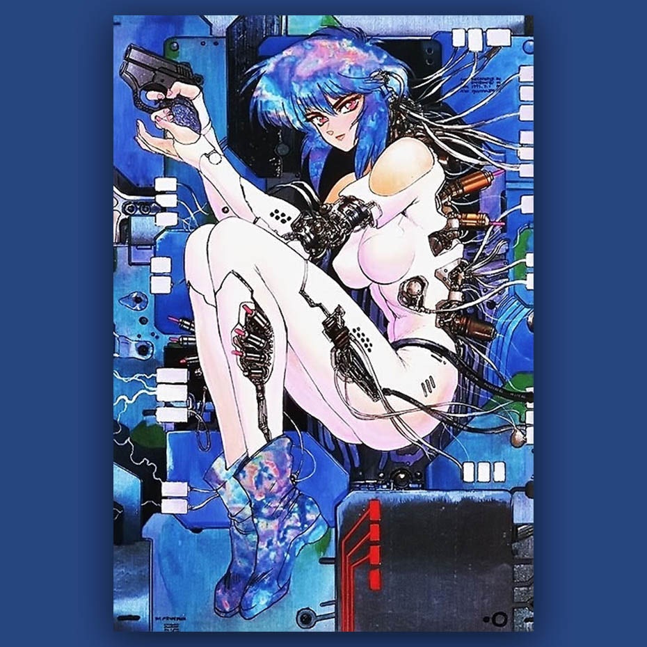
1995—Ghost in the Shell

Ghost in the Shell pushes the 90’s into realism. Particularly in the photorealistic background and correct body proportion departments. The Matrix franchise imitated many elements of Ghost in the Shell.
1998—Cowboy Bebop

Cowboy Bebop brings expressionism back to end the 90’s. This anime seamlessly blends most anime styles.
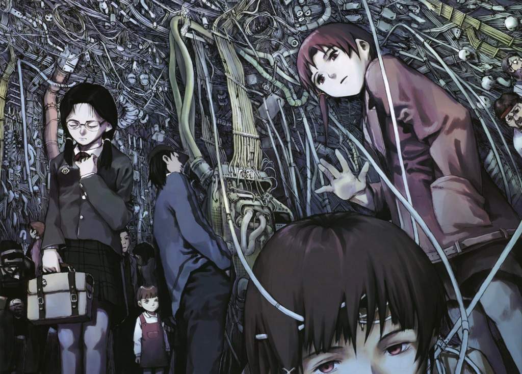
1998—Serial Experiments Lain
Serial Experiments Lain leads us into the experimental 2000’s. Visuals were a direct representation of the subtle psychological oddities we experience daily. This anime brought big differences with muted color palettes and dream-like lighting.
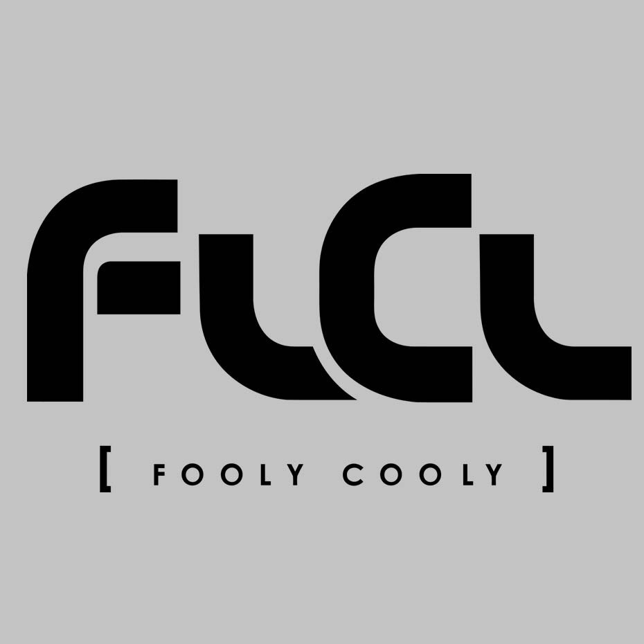
2000—FLCL
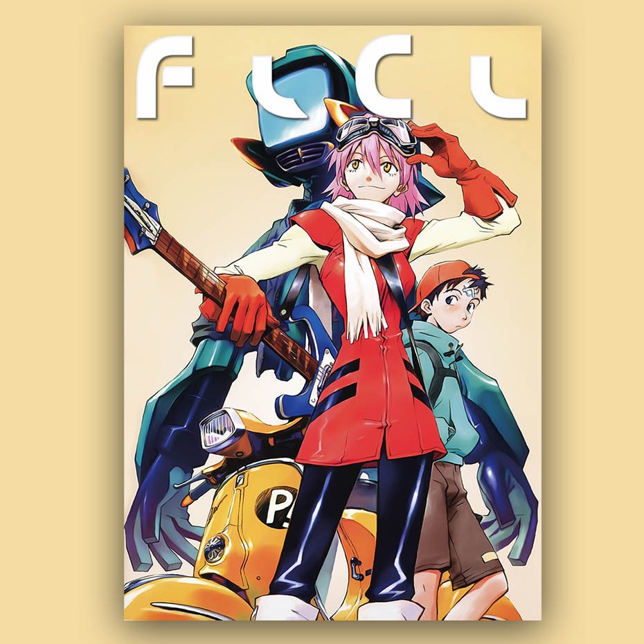
FLCL starts this decade off with a bang! A proper mix of colorfulness, beautiful composition and all around technical mastery, while dipping from reality into the expressionistic anime of the 70’s.
2006—Ergo Proxy
Ergo Proxy takes the muted color palettes and dream-like lighting of Serial Experiments Lain into a darker, moodier style.
2017—Lu Over the Wall

2017’s Lu Over the Wall brings us full circle back to the simple line work, lack of detail, and cuteness of Astro Boy. But unlike Astro Boy, Lu Over the Wall’s color pallet is so vivid, it might pop you into another dimension!
How to give all types of logos an anime look
—
We’re going to walk you through how to incorporate anime style into logo design, and we’ll take a look at how these logo examples represent their brand. Even if your brand has nothing to do with cartoons, the anime look can infuse the magic of another world into any logo design.
1. Anime typography and lettering
You can usually tell if you’ll like an anime show before you even see it. That’s because the typography of the title draws you in. Its elements are targeted to your age group and psychological preferences. Whether they’re rendered to remind you of Japanese writing or geometric machines, these anime typography logos express the style and tone of the show they represent.
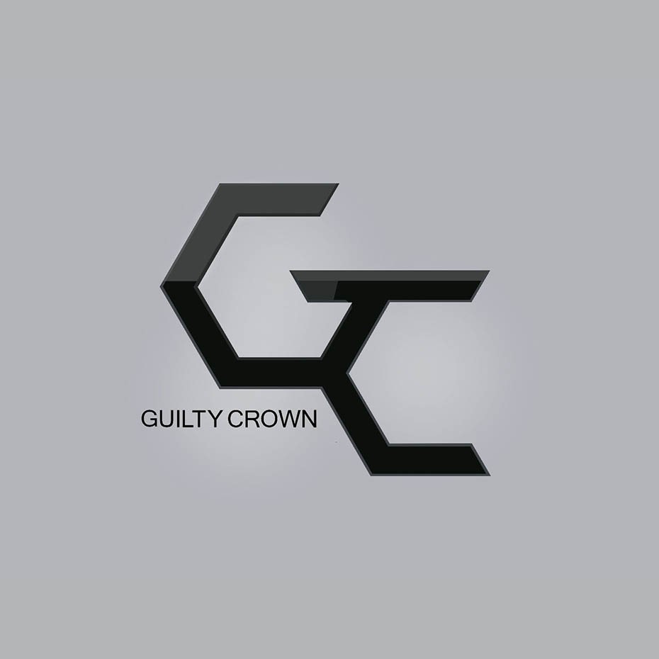
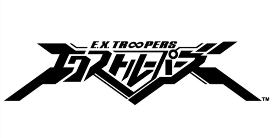

Anime lettering is great for businesses looking to get their name out there. If the brand initials fit together well geometrically, or if there’s an appealing repetition, consider using a monogram logo (a logo made of initials). Also, use a monogram if your brand name is too long to look good written out.
What if your brand has nothing to do with anime? Anime typography can still be a good idea. There are so many sub-genres of anime that there’s bound to be some crossover. For instance, the geometric, mech anime style fits with technology companies.

2. Anime icons and logomarks
The anime logomark is often an object, icon or an abstract symbol worn by a character within the story. These are hugely popular with fans because they can show their support by wearing the logo as a tattoo, patch, t-shirt, hat, etc.
Since anime logomarks are pure geometric forms, they have the power to represent character traits or an ethos (think Christian cross or Jewish star). This cuts through the customer’s logical brain into their emotional brain, giving the anime icon tremendous potential for instant brand recall.
If you’re a designer or business who’d like for your customers to be sporting your symbol, an anime style icon might be for you. Symbols are traditionally revered in Japanese culture as possessing power, and you can imagine how this can translate to a logo icon wherein your entire ethos and vision is distilled into a single mark.
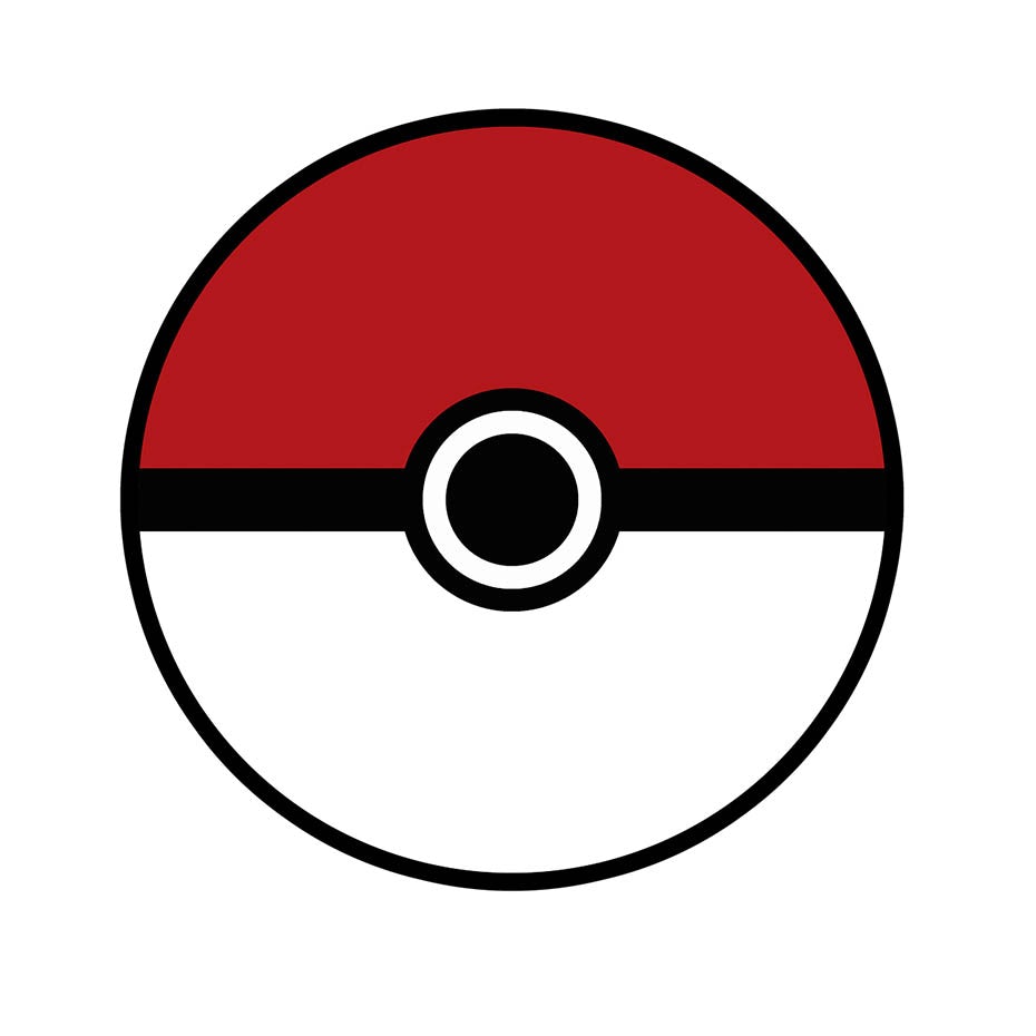
Anime often uses icons that hold significance within their own unique worlds (the Pokeball wouldn’t work for Dragonball merch!). While this approach might seem like it can exclude the uninitiated, it can also be a good way to drum up business via the curiosity factor—the unique and surreal style of the icon generating intrigue. The anime logomark is great for earning you more than customers—when done right, it can earn you loyal fans!
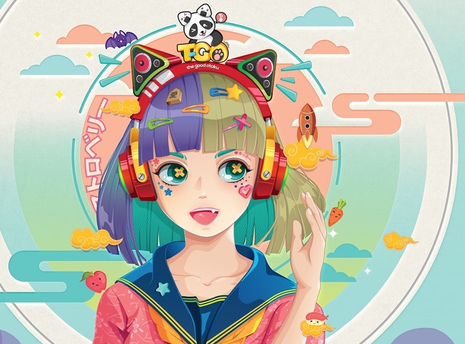
3. Anime characters and mascots
An anime’s most charismatic figure or main character will generally become their mascot logo. When fans see this character, they see the embodiment of the beliefs they hold sacred. They see their hero. They get emotional.
A huge benefit of using an anime mascot is they have certain instantly recognizable signatures: Blocky wild anime hairstyles influence real-life cosplayers and Japanese pro wrestlers alike. Biomechanical plugs are a cyberpunk staple. Heroic angles and body language inspire confidence and conviction. Anime characters also show a wider range of emotions than in other cartoons. It’s common to see expressions like puppy eyes, nervous, hungry, content, and many more.

Companies with a charismatic spokesperson or a character whose look represents the brand ethos can benefit from a mascot logo. Who would be the champion for your business? Who by their very presence would get your customers on board? Give that character an anime makeover, and that’s your mascot!
Non anime/Japan-related brands can benefit from using an anime mascot logo, even a subtle one. The playful, youthful, and modern style elements of anime mascots can be appealing whether your audience is into anime or not. Also, non-anime/Japan related brands can hint at an anime character the way movies like The Matrix hint at anime forerunners while maintaining their own style. This means mixing and matching common anime character features like eyes, hair, and inking into another style of illustration. The result is a mascot that crosses borders and sticks with you.

Ride the anime design wave
—
Anime is an influence tsunami: Sales to Netflix, Amazon and Chinese streamers have helped triple overseas sales in the last four years. Cosplay. Comic Con. The Matrix franchise. Pokemon. Akira. Naruto. Dragon Ball. Sailor Moon. Anime has left an indelible mark on world culture, and continues to dominate. Now you know what makes the anime tide so powerful, ride the wave on your own anime logo!
Want a logo design that's tougher than any super saiyan?
Work with a designer to create an anime logo today!
The post Anime logo design: how to use an anime style for branding appeared first on 99designs.
Anime logo design: how to use an anime style for branding posted first on https://www.lilpackaging.com
No comments:
Post a Comment